

Product
PHP and Composer Support Is Now in Beta
Socket’s PHP and Composer support is now in Beta for all customers, with PHP reachability analysis generally available.
By Trevor Norris, Benjamin Barslev - Aug 21, 2026
@inquirer/select
Advanced tools
@inquirer/selectSimple interactive command line prompt to display a list of choices (single select.)
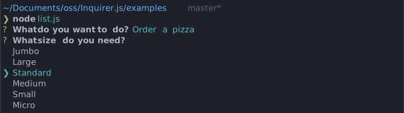
| npm | yarn |
|---|---|
|
|
| Or | |
|
|
import { select, Separator } from '@inquirer/prompts';
// Or
// import select, { Separator } from '@inquirer/select';

const answer = await select({
  message: 'Select a package manager',
  choices: [
    {
      name: 'npm',
      value: 'npm',
      description: 'npm is the most popular package manager',
    },
    {
      name: 'yarn',
      value: 'yarn',
      description: 'yarn is an awesome package manager',
    },
    new Separator(),
    {
      name: 'jspm',
      value: 'jspm',
      disabled: true,
    },
    {
      name: 'pnpm',
      value: 'pnpm',
      disabled: '(pnpm is not available)',
    },
  ],
});
| Property | Type | Required | Description |
|---|---|---|---|
| message | string | yes | The question to ask |
| choices | Choice[] | yes | List of the available choices. |
| default | string | no | Defines in front of which item the cursor will initially appear. When omitted, the cursor will appear on the first selectable item. |
| pageSize | number | no | By default, lists of choice longer than 7 will be paginated. Use this option to control how many choices will appear on the screen at once. |
| loop | boolean | no | Defaults to true. When set to false, the cursor will be constrained to the top and bottom of the choice list without looping. |
| theme | See Theming | no | Customize look of the prompt. |
Separator objects can be used in the choices array to render non-selectable lines in the choice list. By default it'll render a line, but you can provide the text as argument (new Separator('-- Dependencies --')). This option is often used to add labels to groups within long list of options.
Choice objectThe Choice object is typed as
type Choice<Value> = {
  value: Value;
  name?: string;
  description?: string;
  short?: string;
  disabled?: boolean | string;
};
Here's each property:
value: The value is what will be returned by await select().name: This is the string displayed in the choice list.description: Option for a longer description string that'll appear under the list when the cursor highlight a given choice.short: Once the prompt is done (press enter), we'll use short if defined to render next to the question. By default we'll use name.disabled: Disallow the option from being selected. If disabled is a string, it'll be used as a help tip explaining why the choice isn't available.choices can also be an array of string, in which case the string will be used both as the value and the name.
Set INQUIRER_KEYBINDINGS=vim, INQUIRER_KEYBINDINGS=emacs, or INQUIRER_KEYBINDINGS=vim,emacs to enable alternative navigation keybindings globally.
When Vim keybindings are enabled, the prompt disables type-to-search so navigation keys are not interpreted as search input. You can override the environment setting per prompt with theme.keybindings.
You can theme a prompt by passing a theme object option. The theme object only need to includes the keys you wish to modify, we'll fallback on the defaults for the rest.
type Theme = {
  prefix: string | { idle: string; done: string };
  spinner: {
    interval: number;
    frames: string[];
  };
  style: {
    answer: (text: string) => string;
    message: (text: string, status: 'idle' | 'done' | 'loading') => string;
    error: (text: string) => string;
    help: (text: string) => string;
    highlight: (text: string) => string;
    description: (text: string) => string;
    disabled: (text: string) => string;
    keysHelpTip: (keys: [key: string, action: string][]) => string | undefined;
  };
  icon: {
    cursor: string;
  };
  indexMode: 'hidden' | 'number';
  keybindings: readonly ('emacs' | 'vim')[];
};
theme.style.keysHelpTipThis function allows you to customize the keyboard shortcuts help tip displayed below the prompt. It receives an array of key-action pairs and should return a formatted string. You can also hook here to localize the labels to different languages.
It can also returns undefined to hide the help tip entirely.
theme: {
  style: {
    keysHelpTip: (keys) => {
      // Return undefined to hide the help tip completely.
      return undefined;

      // Or customize the formatting. Or localize the labels.
      return keys.map(([key, action]) => `${key}: ${action}`).join(' | ');
    };
  }
}
theme.indexModeControls how indices are displayed before each choice:
hidden (default): No indices are shownnumber: Display a number before each choice (e.g. "1. Option A")Copyright (c) 2023 Simon Boudrias (twitter: @vaxilart)
Licensed under the MIT license.
FAQs
Inquirer select/list prompt
The npm package @inquirer/select receives a total of 16,230,956 weekly downloads. As such, @inquirer/select popularity was classified as popular.
We found that @inquirer/select demonstrated a healthy version release cadence and project activity because the last version was released less than a year ago. It has 2 open source maintainers collaborating on the project.
Product
Socket’s PHP and Composer support is now in Beta for all customers, with PHP reachability analysis generally available.

Product
Socket is bringing experimental protection to Firefox, scanning 97,000+ extensions in Mozilla's official directory for malware and risky updates.
Research
/Security News
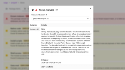
Three compromised Rust crates pulled in a malicious dependency that downloaded and executed cross-platform malware during Cargo builds.