

Company News
AWS Security Hub Adds Socket for Supply Chain Security
Socket is now in the AWS Security Hub Extended plan. Adopt it through AWS, apply committed spend, and block malicious open source packages.
By Feross Aboukhadijeh - Aug 04, 2026
@isoftdata/svelte-checkbox
Advanced tools

Checkbox and radio button components for Svelte 5
If you want to create a group of radio buttons with arbitrary options, see here for RadioButtonGroup docs.
pnpm i @isoftdata/svelte-checkbox
| Name | Type | Description | Default Value |
|---|---|---|---|
btnGroupClass | string | Any additional classes to apply to the radio buttons' div.btn-group | "" |
checked | boolean | The checked state of the checkbox. | false |
disabled | boolean | Whether to disable the checkbox | false |
falseLabel | string | The label for the "false" button when type="radio" | 'No' |
falseIcon | IconName | IconProps | The icon shown on the false button | undefined |
id | string | The id of the input | (defaults to a uuid generated at runtime) |
indeterminate | boolean | The indeterminate property on the input checkbox element | false |
inline | boolean | Whether the label and input's parent div should have the Bootstrap form-check-inline class applied. | |
label | string | The label to be show to the user for the checkbox | '' |
labelClass | string | Any classes to add to the label | '' |
name | string | Passed to the input when type="checkbox" | |
radioButtonColor | "primary" | "secondary" | "success" | "danger" | "warning" | "info" | "light" | "dark" | The buttons' color when type="radio" | |
required | boolean | Whether the checkbox is required. For checkbox/switch types, the checkbox must be checked. For radio, either radio button must be checked (which is always true). | false |
showLabel | boolean | Whether to show the label | true |
title | string | title attribute for the input element. Browsers treat this like a tooltip | '' |
trueLabel | string | The label for the "true" button when type="radio" | 'Yes' |
trueIcon | IconName | IconProps | The icon shown on the true button | undefined |
type | "checkbox" | "radio" | "switch" | How to display the checkbox. | "checkbox" |
onchange - Fired when the checkbox is checked or uncheckedIn radio mode, use
event.target.valueinstead ofevent.target.checked, ascheckedwill always betruefor the clicked radio button.
<script lang="ts">
	import Checkbox from '@isoftdata/svelte-checkbox'

	let isTheCheckboxChecked = $state(false)
</script>

<Checkbox
	label="Checkbox!"
	bind:checked={isTheCheckboxChecked}
/>
FAQs
Unknown package
The npm package @isoftdata/svelte-checkbox receives a total of 54 weekly downloads. As such, @isoftdata/svelte-checkbox popularity was classified as not popular.
We found that @isoftdata/svelte-checkbox demonstrated a healthy version release cadence and project activity because the last version was released less than a year ago. It has 13 open source maintainers collaborating on the project.
Did you know?

Socket for GitHub automatically highlights issues in each pull request and monitors the health of all your open source dependencies. Discover the contents of your packages and block harmful activity before you install or update your dependencies.
Company News
Socket is now in the AWS Security Hub Extended plan. Adopt it through AWS, apply committed spend, and block malicious open source packages.
Research
/Security News
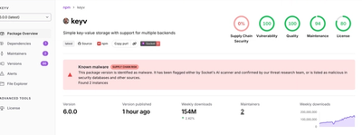
Popular npm packages keyv and cacheable compromised.

Security News
A misconfiguration gave three Anthropic models internet access, and one, believing it was in a simulation, shipped a credential-stealing package to PyPI.