
Research
/Security News
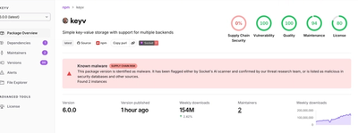
Popular npm Packages in the keyv and Cacheable Namespaces Compromised in Active Supply Chain Attack
Popular npm packages keyv and cacheable compromised.
By Socket Research Team - Aug 04, 2026
@isoftdata/svelte-modal
Advanced tools


pnpm i @isoftdata/svelte-modal
backdrop event/callbackclose callback arg is now a MouseEvent or a KeyboardEvent, and is now also fired when the modal is triggered by pressing "Escape"$props.id() (uniqueId below) in the default value of "id" related props
modalId value is now modal-body-${uniqueId} rather than itModalcloseId value is now close-modal-${uniqueId} rather than close-modalm-0 from the div around the footer snippet, which was previous the modalFooter slot.| Name | Type | Description | Default Value |
|---|---|---|---|
| backdropClickCancels | boolean | Determines whether clicking on the backdrop should close the modal. | true |
| bodyClass | ClassValue | Additional CSS classes to apply to the modal body element. | '' |
| cancelButtonColor | ButtonColors | The Bootstrap class to apply to the cancel button. | "secondary" |
| cancelButtonIcon | IconName | IconProps | The FontAwesome icon to display on the cancel button, without the preceeding fa-. | "times" |
| cancelButtonOutline | boolean | Whether the button should be outlined, instead of solid. | false |
| cancelButtonText | string | The text to display on the cancel button. | "Close" |
| cancelShown | boolean | Determines whether the cancel button is shown in the modal (This is the Cancel button at the bottom)footer. | true |
| cancelButton | HTMLButtonElement | A reference to the cancel HTMLButtonElement. | undefined (bindable) |
| closeId | string | The ID of the close button. | "close-modal" |
| closeShown | boolean | Determines whether the close button is shown in the modal (This is the X in the top right corner) header. | true |
| confirmButtonColor | ButtonColors | The Bootstrap color class to apply to the confirm button. | "success" |
| confirmButtonDisabled | boolean | Determines whether the confirm button is disabled. | false |
| confirmButtonIcon | IconName | IconProps | The FontAwesome icon to display on the confirm button, without the preceeding fa-. | "check" |
| confirmButtonIsLoading | boolean | Whether to disable and show a spinner on the "Confirm" button. | false |
| confirmButtonOutline | boolean | Whether the button should be outlined, instead of solid. | false |
| confirmButtonText | string | The text to display on the confirm button. | "Confirm" |
| confirmButtonTitle | string | The title of the confirm button | "" |
| confirmDropdownItems | Snippet | A snippet that, if passed, turns the confirm Button into a Dropdown. The contents of this snippet will be applied to the dropdownItems slot of that dropdown | undefined |
| confirmShown | boolean | Determines whether the confirm button is shown in the modal footer. | true |
| confirmButton | HTMLButtonElement | A reference to the confirm HTMLButtonElement. | undefined (bindable) |
| dialogClass | ClassValue | Additional CSS classes to apply to the modal dialog element. | '' |
| footerClass | ClassValue | Custom CSS class to apply to the modal footer element. | "align-items-end" |
| footerShown | boolean | Determines whether the modal footer is shown. | true |
| footerStyle | string | Any additional CSS styles to add to the modal footer. | "" |
| form | boolean | Whether to wrap the modal body content in a <form> element. See the Making the confirm button submit the form section below. | false |
| formProps | Omit<HTMLFormAttributes, 'onsubmit'> | Additional attributes to add to the <form> element when the form prop is set to true. For onsubmit, use the confirm callback instead. | {} |
| fullscreen | boolean | 'sm' | 'md' | 'lg' | 'xl' | 'xxl' | Breakpoint to apply fullscreen from that size and down. Boolean true for all sizes. This option is only available with Bootstrap 5. | false |
| headerShown | boolean | Determines whether the modal header is shown. | true |
| id | string | The ID of the modal-body element. | "itModal" |
| savingInProgress | boolean | Whether to disable the confirm/cancel buttons and show "Saving..." on the confirm button. | false |
| setFocusInModal | boolean | Determines whether to set focus to the modal when it is opened, and restore focus to the previously focused element when it is closed. Learn more in Handling Element Focus. | true |
| show | boolean | Determines whether the modal is currently visible or hidden. You probably want to bind: to this. | false (bindable) |
| showModalContent | boolean | Determines whether to show the modal content (header, body, and footer) or hide it (can be used for a loading state). | true |
| size | "sm" | "" | "lg" | "xl" | "xxl" | Determines the maximum width of the modal. | "" |
| subtitle | string | An optional subtitle to display below the main title. | '' |
| title | string | The main title of the modal. | "Confirm" |
| transitionMode | string | The transition mode for the modal and its content (possible values: "present", "cardMovePrevious", "cardMoveNext"). | "present" |
| zIndex | number | The z-index of the modal element. | 20000 |
header - The modal header.footer - the modal footer.close(event: MouseEvent | KeyboardEvent) => void - Called when the modal is closed, either through clicking on the backdrop, clicking a close button, or pressing "Escape"confirm(event: MouseEvent | SubmitEvent) => void - Called when Confirm button is clicked.prompt() => Promise<boolean> - Opens the modal and returns a promise that resolves once the user has completed their work in the modal. Return is true if the confirm button is clicked, or false if the modal is closed.<script lang="ts">
import Modal from '@isoftdata/svelte-modal'
</script>
<Modal
bind:show
confirm={() => show = false}
>
Modal content goes here.
</Modal>
A common need is for the modal-body to contain form elements that are in a <form> element. When the user presses the modal's confirm button, you want it to be the same as submitting the form.
To do this, set the form prop to true.
Applying the form prop will ensure the following happen automatically:
children snippet goes inside a <form> element.type is submit and will submit the form when clicked.preventDefault will be called on the form's SubmitEvent, so the page doesn't reload.<script lang="ts">
import Modal from '@isoftdata/svelte-modal'
</script>
<Modal
form
bind:show
confirm={() => {
// This will get called when the form is submitted, either by clicking the confirm button or pressing Enter in a form field.
show = false
}}
>
<!-- Everything in this modal body will be in a form element since the form prop is set -->
<Input bind:value={name} label="Name" />
</Modal>
By default, when the modal is shown, it will attempt to set focus to the .modal-body element if the active element is not already within the .modal-body. When the modal is closed, it will attempt to restore focus to the element that was focused before the modal was opened.
This behavior can be disabled with the setFocusInModal prop(default true). If setFocusInModal is set to false, the modal will not change the focus when it is opened or closed.
You may want to set setFocusInModal to false if you are managing focus manually or if the automatic focus behavior is causing issues in your application. For example, you open Modal B after closing Modal A, and Modal A restores focus back to the previous element in the app, stealing focus away from Modal B.
FAQs
Unknown package
The npm package @isoftdata/svelte-modal receives a total of 55 weekly downloads. As such, @isoftdata/svelte-modal popularity was classified as not popular.
We found that @isoftdata/svelte-modal demonstrated a healthy version release cadence and project activity because the last version was released less than a year ago. It has 13 open source maintainers collaborating on the project.
Did you know?

Socket for GitHub automatically highlights issues in each pull request and monitors the health of all your open source dependencies. Discover the contents of your packages and block harmful activity before you install or update your dependencies.
Research
/Security News
Popular npm packages keyv and cacheable compromised.

Security News
A misconfiguration gave three Anthropic models internet access, and one, believing it was in a simulation, shipped a credential-stealing package to PyPI.

Security News
/Company News
Socket has joined the new Composer and Packagist sponsorship program as a launch sponsor, supporting the team that keeps PHP's package ecosystem secure.