Product
Introducing License Enforcement in Socket
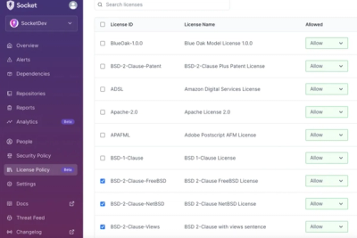
Ensure open-source compliance with Socket’s License Enforcement Beta. Set up your License Policy and secure your software!
@material-symbols/font-400
Advanced tools
Latest variable icon fonts with weight 400 for Material Symbols.
Latest variable icon fonts with weight 400 for Material Symbols.
This package is automatically updated, so it will always have the latest icons from Google.
This package
includes only fonts with grade (
GRAD) 0 and optical size (opsz) 48px. For other variations, seematerial-symbols.
For SVGs, see
@material-symbols/svg-400
Install the latest version using:
npm install @material-symbols/font-400@latest
The package @material-symbols/font-400 includes only fonts with weight 400. To use a different weight, replace 400 in the package name with the desired weight.
Import in JS (example: src/index.js in Create React App, src/main.js in Vue CLI):
import '@material-symbols/font-400';
or import in CSS (example: src/styles.css in Angular CLI):
@import '@material-symbols/font-400';
or import in HTML:
<link href="/path/to/@material-symbols/font-400/index.css" rel="stylesheet">
To display an icon, use one of the following:
<span class="material-symbols-outlined">face</span> <!-- Outlined -->
<span class="material-symbols-rounded">face</span>  <!-- Rounded -->
<span class="material-symbols-sharp">face</span>    <!-- Sharp -->
To customize the variable font axes (fill), use:
.material-symbols-outlined {
  font-variation-settings: 'FILL' 0;
}
The default index.css includes CSS for all fonts. This may cause build tools such as webpack to copy all fonts to the build directory even if you are not using all of them. To reduce the build size, import only the styles you need. For example, if you only need outlined icons, import outlined.css instead of the default index.css:
-import '@material-symbols/font-400';
+import '@material-symbols/font-400/outlined.css';
| Icons | CSS | Sass |
|---|---|---|
| Outlined | outlined.css | outlined.scss |
| Rounded | rounded.css | rounded.scss |
| Sharp | sharp.css | sharp.scss |
Import in Sass (example: src/styles.scss in Angular CLI):
@import '@material-symbols/font-400';
If you are getting errors with webpack or Vue CLI, add this line before importing:
$material-symbols-font-path: '~@material-symbols/font-400/';
mat-iconTo display an icon, use one of the following:
<mat-icon fontSet="material-symbols-outlined">face</mat-icon>
<mat-icon fontSet="material-symbols-rounded">face</mat-icon>
<mat-icon fontSet="material-symbols-sharp">face</mat-icon>
See demo.
Material Symbols are created by Google.
We have made these icons available for you to incorporate into your products under the Apache License Version 2.0. Feel free to remix and re-share these icons and documentation in your products. We'd love attribution in your app's about screen, but it's not required.
FAQs
Latest variable icon fonts with weight 400 for Material Symbols.
The npm package @material-symbols/font-400 receives a total of 3,286 weekly downloads. As such, @material-symbols/font-400 popularity was classified as popular.
We found that @material-symbols/font-400 demonstrated a healthy version release cadence and project activity because the last version was released less than a year ago. It has 0 open source maintainers collaborating on the project.
Did you know?

Socket for GitHub automatically highlights issues in each pull request and monitors the health of all your open source dependencies. Discover the contents of your packages and block harmful activity before you install or update your dependencies.

Product
Ensure open-source compliance with Socket’s License Enforcement Beta. Set up your License Policy and secure your software!

Product
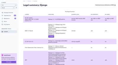
We're launching a new set of license analysis and compliance features for analyzing, managing, and complying with licenses across a range of supported languages and ecosystems.

Product
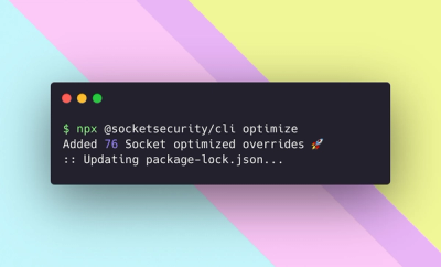
We're excited to introduce Socket Optimize, a powerful CLI command to secure open source dependencies with tested, optimized package overrides.