Research
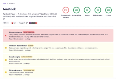
Malicious npm Package Brand-Squats TanStack to Exfiltrate Environment Variables
A brand-squatted TanStack npm package used postinstall scripts to steal .env files and exfiltrate developer secrets to an attacker-controlled endpoint.
@material/image-list
Advanced tools
MDC Image List provides a RTL-aware Material Design image list component. An Image List consists of several items, each containing an image and optionally supporting content (i.e. a text label).
npm install @material/image-list
The HTML structure for a Standard Image List is as follows:
<ul class="mdc-image-list my-image-list">
  <li class="mdc-image-list__item">
    <div class="mdc-image-list__image-aspect-container">
      <img class="mdc-image-list__image" src="...">
    </div>
    <div class="mdc-image-list__supporting">
      <span class="mdc-image-list__label">Text label</span>
    </div>
  </li>
  ...
</ul>
@use "@material/image-list/mdc-image-list";
The HTML structure above would be combined with an invocation of the standard-columns mixin,
to establish how many columns should be displayed per line:
@use "@material/image-list";

.my-image-list {
  @include image-list.standard-columns(5);
}
Images in a Standard Image list are constrained to 1:1 aspect ratio by default; this can be overridden using the
aspect mixin documented below.
The Masonry Image List variant presents images vertically arranged into several columns, using CSS Columns. In this layout, images may be any combination of aspect ratios.
<ul class="mdc-image-list mdc-image-list--masonry my-masonry-image-list">
  <li class="mdc-image-list__item">
    <img class="mdc-image-list__image" src="...">
    <div class="mdc-image-list__supporting">
      <span class="mdc-image-list__label">Text label</span>
    </div>
  </li>
  ...
</ul>
Note: Masonry Image List items do not include the
mdc-image-list__image-aspect-containerelement, since images in the list are not expected to be locked to a common aspect ratio.
This would be combined with an invocation of the mdc-image-list-masonry-columns mixin, to establish how many columns
should be displayed:
.my-masonry-image-list {
  @include image-list.masonry-columns(5);
}
| CSS Class | Description |
|---|---|
mdc-image-list | Mandatory. Indicates the root Image List element. |
mdc-image-list--masonry | Optional. Indicates that this Image List should use the Masonry variant. |
mdc-image-list--with-text-protection | Optional. Indicates that supporting content should be positioned in a scrim overlaying each image (instead of positioned separately under each image). |
mdc-image-list__item | Mandatory. Indicates each item in an Image List. |
mdc-image-list__image-aspect-container | Optional. Parent of each item's image element, responsible for constraining aspect ratio. This element may be omitted entirely if images are already sized to the correct aspect ratio. |
mdc-image-list__image | Mandatory. Indicates the image element in each item. |
mdc-image-list__supporting | Optional. Indicates the area within each item containing the supporting text label, if the Image List contains text labels. |
mdc-image-list__label | Optional. Indicates the text label in each item, if the Image List contains text labels. |
| Mixin | Description |
|---|---|
aspect($width-height-ratio) | Styles the aspect container elements within an Image List to conform to the given ratio, where 1 is 1:1, greater than 1 is wider, and less than 1 is taller. |
shape-radius($radius, $rtl-reflexive) | Sets the rounded shape to image list item with given radius size. Set $rtl-reflexive to true to flip radius values in RTL context, defaults to false. |
standard-columns($column-count, $gutter-size) | Styles a Standard Image List to display the given number of columns. $gutter-size is optional and overrides the default amount of space between items. |
masonry-columns($column-count, $gutter-size) | Styles a Masonry Image List to display the given number of columns. $gutter-size is optional and overrides the default amount of space between items. |
Note: Only one of the
*-columnsmixins should be used for any given Image List. Use the mixin appropriate to the variant being used.
The *-columns mixins will grow and shrink items based on the Image List's overall width. Depending on
placement, this could be directly related to the viewport width, and images could become exceedingly large compared to
their actual rendered size. This can be restricted by using any of min-width, width, or max-width on the Image
List:
@use "@material/image-list";

.my-image-list {
  @include image-list.standard-columns(5);

  max-width: 960px;
}
Note: Remember that any specified width will apply to the entire list, so be sure to account for the gutters as well.
Presenting a different number of columns for different viewport sizes is straightforward, since the only thing that needs to be changed are styles:
.my-image-list {
  @include image-list.standard-columns(5);
}

@media (max-width: 599px) {
  .my-image-list {
    @include image-list.standard-columns(3);
  }
}
Note: This advice is not applicable to Masonry Image List, where images do not share a common aspect ratio.
Images in an Image List typically use the img element. However, if your assets don't have the same aspect ratio as
specified for list items, they will become distorted. In these cases, you can use a div element in place of img,
and set the background-image of each.
Note: Ensuring your images are appropriately-sized prior to serving them to browsers is the most efficient and ideal approach to using MDC Image List. The
divalternative is provided as a convenience. If you use this alternative, make sure to also include themdc-image-list__image-aspect-containerelement around each item's image.
FAQs
The Material Components for the web image list component
The npm package @material/image-list receives a total of 230,699 weekly downloads. As such, @material/image-list popularity was classified as popular.
We found that @material/image-list demonstrated a not healthy version release cadence and project activity because the last version was released a year ago. It has 15 open source maintainers collaborating on the project.
Did you know?

Socket for GitHub automatically highlights issues in each pull request and monitors the health of all your open source dependencies. Discover the contents of your packages and block harmful activity before you install or update your dependencies.

Research
A brand-squatted TanStack npm package used postinstall scripts to steal .env files and exfiltrate developer secrets to an attacker-controlled endpoint.

Research
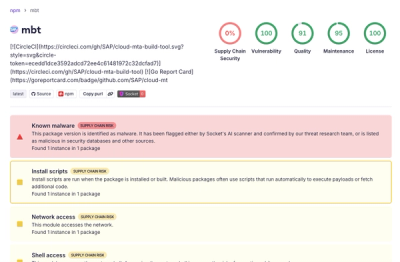
Compromised SAP CAP npm packages download and execute unverified binaries, creating urgent supply chain risk for affected developers and CI/CD environments.

Company News
Socket has acquired Secure Annex to expand extension security across browsers, IDEs, and AI tools.