Research
Security News
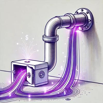
Malicious npm Package Targets Solana Developers and Hijacks Funds
A malicious npm package targets Solana developers, rerouting funds in 2% of transactions to a hardcoded address.
By Socket Research Team - Dec 02, 2024
@material/mwc-fab
Advanced tools
<mwc-fab> 
IMPORTANT: The Material Web Components are a work in progress and subject to major changes until 1.0 release.
A floating action button (FAB) represents the primary action of a screen.


Material Design Guidelines: Floating Action Button
npm install @material/mwc-fab
NOTE: The Material Web Components are distributed as ES2017 JavaScript Modules, and use the Custom Elements API. They are compatible with all modern browsers including Chrome, Firefox, Safari, Edge, and IE11, but an additional tooling step is required to resolve bare module specifiers, as well as transpilation and polyfills for IE11. See here for detailed instructions.
<link rel="stylesheet" href="https://fonts.googleapis.com/icon?family=Material+Icons&display=block">

<mwc-fab icon="edit"></mwc-fab>

<script type="module">
  import '@material/mwc-fab/mwc-fab.js';
  const fab = document.querySelector('mwc-fab');
  fab.addEventListener('click', () => {
    edit();
  });
</script>
<link rel="stylesheet" href="https://fonts.googleapis.com/icon?family=Material+Icons&display=block">

<mwc-fab label="edit">
  <mwc-icon slot="icon">edit</mwc-icon>
</mwc-fab>

<script type="module">
  import '@material/mwc-fab/mwc-fab.js';
  import '@material/mwc-icon/mwc-icon.js';
</script>
Note: label should still be set for button accessibility purposes.
<mwc-fab mini icon="add"></mwc-fab>
<mwc-fab extended icon="shopping_cart" label="Add to cart"></mwc-fab>
mwc-fab {
  --mdc-theme-secondary: white;
  --mdc-theme-on-secondary: black;
}
| Name | Description |
|---|---|
icon | An icon to be slotted into the fab. Note: the label property should still be set for button accessibility. |
| Name | Type | Description |
|---|---|---|
icon | string | The icon to display. |
label | string | The label to display when using the extended layout, and the aria-label attribute in all layouts. |
mini | boolean | Modifies the FAB to be a smaller size, for use on smaller screens. Defaults to false. |
reducedTouchTarget | boolean | Sets the minimum touch target of the default-sized mini fab to recommended 48x48px. |
extended | boolean | Enable the extended layout which includes a text label. Defaults to false. |
showIconAtEnd | boolean | When in the extended layout, position the icon after the label, instead of before. Defaults to false. |
None
None
| Name | Default | Description |
|---|---|---|
--mdc-fab-box-shadow | mdc elevation 6, 8, 12 | Sets the box shadow of the fab. Elevation 6 when idle, 8 when focused or hovered, and 12 when active. |
--mdc-fab-extended-label-padding | 20px | Sets the padding on either horizontal side of an extended fab. |
--mdc-fab-extended-icon-padding | 12px | Sets the padding between the icon and the label of an extended fab. |
--mdc-fab-focus-outline-color | initial | The color of the focus outline ring (off by default). |
--mdc-fab-focus-outline-width | 0px | Sets the width of the focus outline ring. |
| Elevation Level | CSS Value |
|---|---|
6 | 0px 3px 5px -1px rgba(0, 0, 0, 0.2), 0px 6px 10px 0px rgba(0, 0, 0, 0.14), 0px 1px 18px 0px rgba(0, 0, 0, 0.12) |
8 | 0px 5px 5px -3px rgba(0, 0, 0, 0.2), 0px 8px 10px 1px rgba(0, 0, 0, 0.14), 0px 3px 14px 2px rgba(0, 0, 0, 0.12) |
12 | 0px 7px 8px -4px rgba(0, 0, 0, 0.2), 0px 12px 17px 2px rgba(0, 0, 0, 0.14), 0px 5px 22px 4px rgba(0, 0, 0, 0.12) |
This component exposes the following global theming custom properties.
| Name | Description |
|---|---|
--mdc-icon-font | Font to use for the icon. |
--mdc-theme-secondary | Background color of the FAB. |
--mdc-theme-on-secondary | Foreground color of the label and icon. |
FAQs
Material design floating action button component
The npm package @material/mwc-fab receives a total of 2,755 weekly downloads. As such, @material/mwc-fab popularity was classified as popular.
We found that @material/mwc-fab demonstrated a not healthy version release cadence and project activity because the last version was released a year ago. It has 15 open source maintainers collaborating on the project.
Did you know?

Socket for GitHub automatically highlights issues in each pull request and monitors the health of all your open source dependencies. Discover the contents of your packages and block harmful activity before you install or update your dependencies.
Research
Security News
A malicious npm package targets Solana developers, rerouting funds in 2% of transactions to a hardcoded address.
Security News
Research
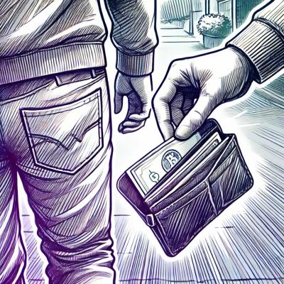
Socket researchers have discovered malicious npm packages targeting crypto developers, stealing credentials and wallet data using spyware delivered through typosquats of popular cryptographic libraries.
Security News
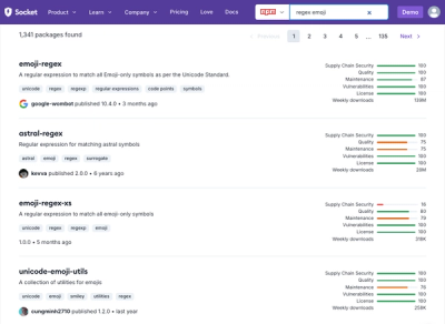
Socket's package search now displays weekly downloads for npm packages, helping developers quickly assess popularity and make more informed decisions.