

Security News
The Unpaid Backbone of Open Source: Solo Maintainers Face Increasing Security Demands
Solo open source maintainers face burnout and security challenges, with 60% unpaid and 60% considering quitting.
By Sarah Gooding - Sep 20, 2024
@melloware/coloris
Advanced tools
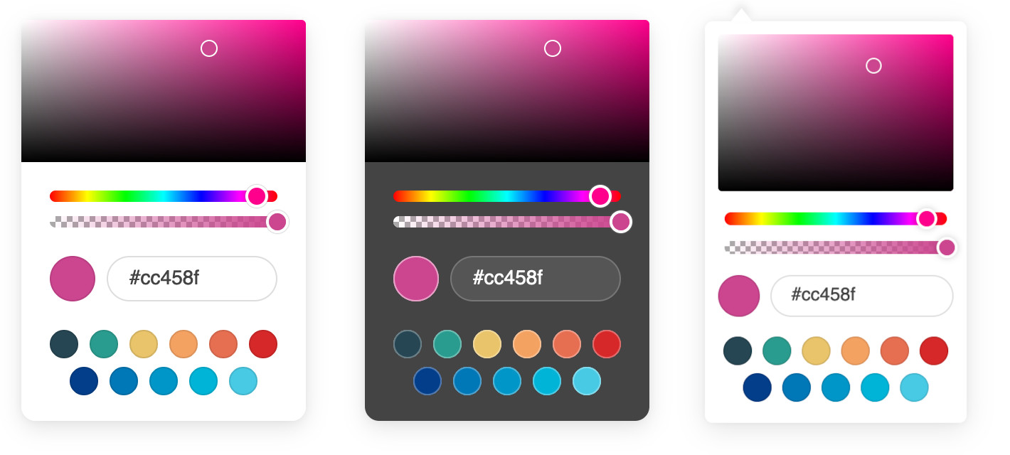
A lightweight and elegant JavaScript color picker written in vanilla ES6. Convert any text input field into a color field.
NOTE: Forked from https://github.com/mdbassit/Coloris so we could provide TypeScript and NPM support.
Download the latest version, and add the script and style to your page:
<link rel="stylesheet" href="coloris.min.css"/>
<script src="coloris.min.js"></script>
Then just add the data-coloris attribute to your input fields:
<input type="text" data-coloris>
That's it. All done!
You can also download the color picker from NPM
# using NPM
npm install @melloware/coloris
# using Yarn
yarn add @melloware/coloris
And then use it within a module environment, e.g. with browserify, rollup, webpack etc. In this case, you must initialize the color picker before its first use (which has several side-effects such as adding DOM elements):
import "@melloware/coloris/dist/coloris.css";
import Coloris from "@melloware/coloris";
Coloris.init();
Coloris({el: "#coloris"});
The color picker also works with AMD / require.js:
requirejs(['@melloware/coloris'], function (Coloris) {
  Coloris.init();
  Coloris({
    el: "#coloris",
  });
});
The colorpicker can also be downloaded as a Java JAR for use in Java web applicatons:
<dependency>
   <groupId>org.webjars.npm</groupId>
   <artifactId>melloware__coloris</artifactId>
   <version>0.6.0</version>
</dependency>
Coloris({
  // The default behavior is to append the color picker's dialog to the end of the document's
  // body. but it is possible to append it to a custom parent instead. This is especially useful
  // if the color fields are in a scrollable container and you want color picker' dialog to stay
  // anchored to them. You will need to set the position of the container to relative or absolute.
  parent: '.container',

  // A custom selector to bind the color picker to. This must point to input fields.
  el: '.color-field',

  // The bound input fields are wrapped in a div that adds a thumbnail showing the current color
  // and a button to open the color picker (for accessibility only). If you wish to keep your
  // fields unaltered, set this to false, in which case you will lose the color thumbnail and
  // the accessible button (not recommended).
  wrap: true,

  // Available themes: light, dark, large, large-dark, polaroid, polaroid-dark.
  // More themes might be added in the future.
  theme: 'light',

  // The margin in pixels between the input fields and the color picker's dialog.
  margin: 2,

  // Set the preferred color string format:
  //  * hex: outputs #RRGGBB or #RRGGBBAA (default).
  //  * rgb: outputs rgb(R, G, B) or rgba(R, G, B, A).
  //  * hsl: outputs hsl(H, S, L) or hsla(H, S, L, A).
  //  * auto: guesses the format from the active input field. Defaults to hex if it fails.
  //  * mixed: outputs #RRGGBB when alpha is 1; otherwise rgba(R, G, B, A).
  format: 'hex',

  // Enable or disable alpha support.
  // When disabled, it will strip the alpha value from the existing color value in all formats.
  alpha: true,

  // Show an optional clear button and set its label
  clearButton: {
    show: true,
    label: 'Clear'
  },

  // An array of the desired color swatches to display. If omitted or the array is empty,
  // the color swatches will be disabled.
  swatches: [
    '#264653',
    '#2a9d8f',
    '#e9c46a',
    'rgb(244,162,97)',
    '#e76f51',
    '#d62828',
    'navy',
    '#07b',
    '#0096c7',
    '#00b4d880',
    'rgba(0,119,182,0.8)',
  ]
});
An "input" event is triggered on the bound input field whenever a new color is selected. A "change" event is triggered when the color picker is closed and if the color has changed since it was opened.
The color picker dialog can be closed by clicking anywhere on the page or by pressing the ESC on the keyboard. The later will also revert the color to its original value.
If you would like to close the dialog programmatically, you can do so by calling the close() method:
// Close the dialog
Coloris.close();

// Close the dialog and revert the color to its original value
Coloris.close(true);
This package includes TypeScript declarations. When you use it in a module environment, just import it:
import "@melloware/coloris/dist/coloris.css";
import Coloris from "@melloware/coloris";

Coloris.init();
Coloris({el: "#coloris"});
Coloris.close();
If you wish to write a global script file, use a triple slash reference:
/// <reference types="@melloware/coloris" />
Coloris({
    el: "#coloris",
});
Clone the git repo:
git clone git@github.com:melloware/Coloris.git
Enter the Coloris directory and install the development dependencies:
cd Coloris && npm install
Run the build script:
npm run build
The built version will be in the dist directory in both minified and full copies.
Alternatively, you can start a gulp watch task to automatically build when the source files are modified:
npm run start
Adjust the version in the package.json if necessary, then
npm login
# This will run npm run build automatically
npm publish --access public
Then upload code to github, create tag & release.
Copyright (c) 2021 Momo Bassit. Coloris is licensed under the MIT license.
FAQs
A lightweight and elegant color picker.
The npm package @melloware/coloris receives a total of 10,227 weekly downloads. As such, @melloware/coloris popularity was classified as popular.
We found that @melloware/coloris demonstrated a healthy version release cadence and project activity because the last version was released less than a year ago. It has 2 open source maintainers collaborating on the project.
Did you know?

Socket for GitHub automatically highlights issues in each pull request and monitors the health of all your open source dependencies. Discover the contents of your packages and block harmful activity before you install or update your dependencies.
Security News
Solo open source maintainers face burnout and security challenges, with 60% unpaid and 60% considering quitting.

Security News
License exceptions modify the terms of open source licenses, impacting how software can be used, modified, and distributed. Developers should be aware of the legal implications of these exceptions.

Security News
A developer is accusing Tencent of violating the GPL by modifying a Python utility and changing its license to BSD, highlighting the importance of copyleft compliance.