@mingcute/react
Carefully crafted Mingcute icon components for React




Overview
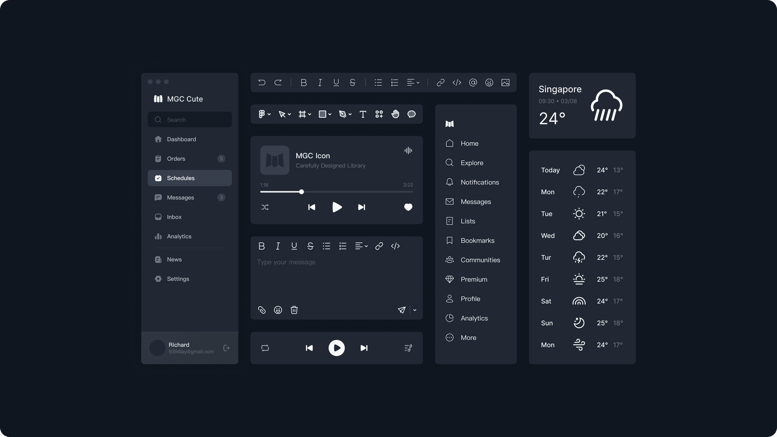
@mingcute/react renders Core Regular and Filled as typed React components. Geometry comes from @mingcute/icons, so the adapter remains focused on rendering, accessibility, prop precedence, refs, and framework lifecycle behavior.
Why Use This Adapter?
- Idiomatic React components with strict TypeScript types.
- Style and direct-icon subpaths designed for tree shaking.
- Decorative accessibility defaults with caller-controlled labels and roles.
- Instance-scoped SVG resources for repeated icons and SSR.
- No duplicated definition catalogue inside the adapter.
Installation
npm i @mingcute/react
pnpm add @mingcute/react
yarn add @mingcute/react
bun add @mingcute/react
Compatibility: React 18 or 19.
Quick Start
import { Home1Regular } from '@mingcute/react/core-regular';

export function NavigationIcon() {
  return <Home1Regular size={24} color="currentColor" title="Home" />;
}
Imports
import { Home1Regular, Search2Regular } from '@mingcute/react/core-regular';
import Home1Regular from '@mingcute/react/core-regular/home-1';
The package root exports the shared Icon utility and public types only. It does not export every icon.
API Reference
size | number | string | 24 | Sets width and height unless either is overridden |
width, height | React SVG values | size | Override one dimension |
color | string | currentColor | Sets the inherited SVG paint color |
title | string | none | Adds an accessible <title> |
titleId | string | generated | Overrides the title association ID |
ref | Ref<SVGSVGElement> | none | Accesses the rendered SVG element |
| Other props | SVGProps<SVGSVGElement> | none | Forwards SVG attributes, events, classes, styles, and ARIA |
Each generated component uses React.forwardRef and scopes gradient, mask, clip-path, and pattern IDs with useId, including SSR-safe hydration behavior.
Accessibility
Icons without a title or explicit accessible name are hidden from assistive technology. Supplying title, aria-label, or aria-labelledby exposes the icon with image semantics unless the caller overrides them. Keep icons decorative when adjacent text already provides the label.
<button type="button">
  <Home1Regular aria-hidden />
  Home
</button>
Production Guidance
- The package is ESM-only, side-effect free, and compatible with React 18 and 19.
- Prefer direct icon subpaths in libraries and bundle-sensitive entry points.
- Preserve React's
useId() output during server rendering; do not rewrite generated resource IDs.
- Style with
color, className, or style. Explicit width and height take precedence over size.
Troubleshooting
- Import not found: use the kebab-case direct path (
regular/home-1) or the PascalCase named export (Home1Regular).
- Hydration warning: confirm the server and client use the same React tree and package version.
- Icon has the wrong color: check for a more specific CSS rule on the SVG or its paths; most themeable geometry uses
currentColor.
- Bundle is unexpectedly large: replace a style barrel or namespace import with the direct icon subpath.
Available Styles
core-regular | Core Regular | 1,663 |
core-filled | Core Filled | 1,663 |
Integration with Definitions
The adapter consumes canonical geometry from @mingcute/icons. That package owns icon names, paths, layers, and metadata; @mingcute/react owns React rendering and accessibility behavior. Keeping those responsibilities separate prevents duplicate icon data and keeps every framework adapter visually consistent.
Development
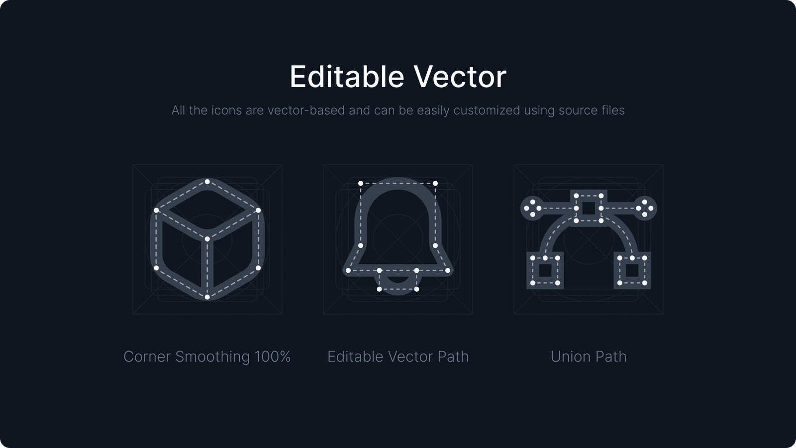
This package is generated from canonical SVG sources. Do not edit generated output by hand.
pnpm --filter @mingcute/react check
License
Licensed under Apache-2.0.
Links