Product
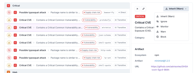
Introducing Enhanced Alert Actions and Triage Functionality
Socket now supports four distinct alert actions instead of the previous two, and alert triaging allows users to override the actions taken for all individual alerts.
@mui/x-data-grid
Advanced tools
Package description
@mui/x-data-grid is a powerful data grid component for building complex and feature-rich data tables in React applications. It is part of the Material-UI (MUI) library and provides a wide range of functionalities such as sorting, filtering, pagination, and more.
Basic Data Grid
This code demonstrates a basic data grid with columns and rows. It includes features like pagination and checkbox selection.
import * as React from 'react';
import { DataGrid } from '@mui/x-data-grid';
const columns = [
{ field: 'id', headerName: 'ID', width: 90 },
{ field: 'firstName', headerName: 'First name', width: 150 },
{ field: 'lastName', headerName: 'Last name', width: 150 },
{ field: 'age', headerName: 'Age', type: 'number', width: 110 },
{ field: 'fullName', headerName: 'Full name', description: 'This column has a value getter and is not sortable.', sortable: false, width: 160, valueGetter: (params) => `${params.row.firstName || ''} ${params.row.lastName || ''}`, },
];
const rows = [
{ id: 1, lastName: 'Snow', firstName: 'Jon', age: 35 },
{ id: 2, lastName: 'Lannister', firstName: 'Cersei', age: 42 },
{ id: 3, lastName: 'Lannister', firstName: 'Jaime', age: 45 },
{ id: 4, lastName: 'Stark', firstName: 'Arya', age: 16 },
{ id: 5, lastName: 'Targaryen', firstName: 'Daenerys', age: null },
{ id: 6, lastName: 'Melisandre', firstName: null, age: 150 },
{ id: 7, lastName: 'Clifford', firstName: 'Ferrara', age: 44 },
{ id: 8, lastName: 'Frances', firstName: 'Rossini', age: 36 },
{ id: 9, lastName: 'Roxie', firstName: 'Harvey', age: 65 },
];
export default function DataTable() {
return (
<div style={{ height: 400, width: '100%' }}>
<DataGrid rows={rows} columns={columns} pageSize={5} checkboxSelection />
</div>
);
}Sorting and Filtering
This code demonstrates how to enable sorting and filtering in the data grid. The grid can be sorted in ascending or descending order, and it can be filtered based on specific column values.
import * as React from 'react';
import { DataGrid } from '@mui/x-data-grid';

const columns = [
  { field: 'id', headerName: 'ID', width: 90 },
  { field: 'firstName', headerName: 'First name', width: 150 },
  { field: 'lastName', headerName: 'Last name', width: 150 },
  { field: 'age', headerName: 'Age', type: 'number', width: 110 },
  { field: 'fullName', headerName: 'Full name', description: 'This column has a value getter and is not sortable.', sortable: false, width: 160, valueGetter: (params) => `${params.row.firstName || ''} ${params.row.lastName || ''}`, },
];

const rows = [
  { id: 1, lastName: 'Snow', firstName: 'Jon', age: 35 },
  { id: 2, lastName: 'Lannister', firstName: 'Cersei', age: 42 },
  { id: 3, lastName: 'Lannister', firstName: 'Jaime', age: 45 },
  { id: 4, lastName: 'Stark', firstName: 'Arya', age: 16 },
  { id: 5, lastName: 'Targaryen', firstName: 'Daenerys', age: null },
  { id: 6, lastName: 'Melisandre', firstName: null, age: 150 },
  { id: 7, lastName: 'Clifford', firstName: 'Ferrara', age: 44 },
  { id: 8, lastName: 'Frances', firstName: 'Rossini', age: 36 },
  { id: 9, lastName: 'Roxie', firstName: 'Harvey', age: 65 },
];

export default function DataTable() {
  return (
    <div style={{ height: 400, width: '100%' }}>
      <DataGrid rows={rows} columns={columns} pageSize={5} checkboxSelection sortingOrder={['asc', 'desc']} filterModel={{ items: [{ columnField: 'firstName', operatorValue: 'contains', value: 'a' }] }} />
    </div>
  );
}
Custom Pagination
This code demonstrates how to implement custom pagination in the data grid. Users can select the number of rows to display per page from the provided options.
import * as React from 'react';
import { DataGrid } from '@mui/x-data-grid';

const columns = [
  { field: 'id', headerName: 'ID', width: 90 },
  { field: 'firstName', headerName: 'First name', width: 150 },
  { field: 'lastName', headerName: 'Last name', width: 150 },
  { field: 'age', headerName: 'Age', type: 'number', width: 110 },
  { field: 'fullName', headerName: 'Full name', description: 'This column has a value getter and is not sortable.', sortable: false, width: 160, valueGetter: (params) => `${params.row.firstName || ''} ${params.row.lastName || ''}`, },
];

const rows = [
  { id: 1, lastName: 'Snow', firstName: 'Jon', age: 35 },
  { id: 2, lastName: 'Lannister', firstName: 'Cersei', age: 42 },
  { id: 3, lastName: 'Lannister', firstName: 'Jaime', age: 45 },
  { id: 4, lastName: 'Stark', firstName: 'Arya', age: 16 },
  { id: 5, lastName: 'Targaryen', firstName: 'Daenerys', age: null },
  { id: 6, lastName: 'Melisandre', firstName: null, age: 150 },
  { id: 7, lastName: 'Clifford', firstName: 'Ferrara', age: 44 },
  { id: 8, lastName: 'Frances', firstName: 'Rossini', age: 36 },
  { id: 9, lastName: 'Roxie', firstName: 'Harvey', age: 65 },
];

export default function DataTable() {
  return (
    <div style={{ height: 400, width: '100%' }}>
      <DataGrid rows={rows} columns={columns} pageSize={5} rowsPerPageOptions={[5, 10, 20]} pagination />
    </div>
  );
}react-table is a lightweight, fast, and extendable data grid built for React. It provides a hook-based API and is highly customizable. Compared to @mui/x-data-grid, react-table offers more flexibility but requires more manual setup for features like sorting, filtering, and pagination.
ag-grid-react is a feature-rich data grid component for React applications. It offers a wide range of functionalities, including sorting, filtering, and pagination, similar to @mui/x-data-grid. However, ag-grid-react is known for its performance and scalability, making it suitable for large datasets.
react-data-grid is a powerful and customizable data grid component for React. It provides features like sorting, filtering, and pagination out of the box. Compared to @mui/x-data-grid, react-data-grid offers more customization options but may require more effort to integrate with Material-UI.
Changelog
7.6.2
Jun 6, 2024
We'd like to offer a big thanks to the 9 contributors who made this release possible. Here are some highlights ✨:
Readme
This package is the Community plan edition of the Data Grid components. It's part of MUI X, an open-core extension of MUI Core, with advanced components.
Install the package in your project directory with:
npm install @mui/x-data-grid
This component has the following peer dependencies that you will need to install as well.
"peerDependencies": {
  "@mui/material": "^5.15.14",
  "react": "^17.0.0 || ^18.0.0",
  "react-dom": "^17.0.0 || ^18.0.0"
},
Visit https://mui.com/x/react-data-grid/ to view the full documentation.
FAQs
The Community plan edition of the Data Grid components (MUI X).
We found that @mui/x-data-grid demonstrated a healthy version release cadence and project activity because the last version was released less than a year ago. It has 0 open source maintainers collaborating on the project.
Did you know?

Socket for GitHub automatically highlights issues in each pull request and monitors the health of all your open source dependencies. Discover the contents of your packages and block harmful activity before you install or update your dependencies.

Product
Socket now supports four distinct alert actions instead of the previous two, and alert triaging allows users to override the actions taken for all individual alerts.

Security News
Polyfill.io has been serving malware for months via its CDN, after the project's open source maintainer sold the service to a company based in China.

Security News
OpenSSF is warning open source maintainers to stay vigilant against reputation farming on GitHub, where users artificially inflate their status by manipulating interactions on closed issues and PRs.