Security News
The Unpaid Backbone of Open Source: Solo Maintainers Face Increasing Security Demands
Solo open source maintainers face burnout and security challenges, with 60% unpaid and 60% considering quitting.
@mythologi/react-native-sfsymbols
Advanced tools
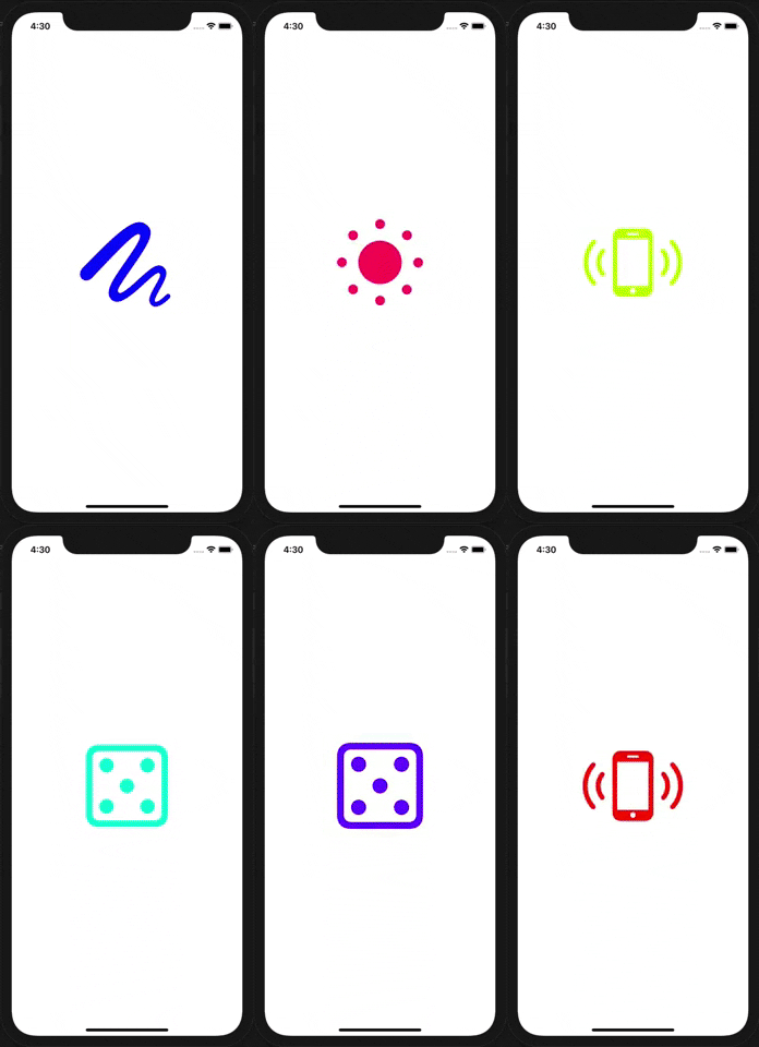
Use SF Symbols in React Native for iOS


npm install --save react-native-sfsymbols
# --- or ---
yarn add react-native-sfsymbols
Don't forget to run cd ios && pod install && cd .. after that !
Libraries ➜ Add Files to [your project's name]node_modules ➜ react-native-sfsymbols and add RNSfsymbols.xcodeprojlibRNSfsymbols.a to your project's Build Phases ➜ Link Binary With LibrariesCmd+R)<Note that some symbols require higher minimum iOS targets. handbag for instance, requires iOS 16.1, whereas lightbulb has been available since iOS 13.0.
import { SFSymbol } from "react-native-sfsymbols";

export function Example() {
  return (
    <SFSymbol
      name="sun.and.horizon"
      fallback="sun.haze.fill"
      weight="semibold"
      scale="large"
      color="red"
      size={16}
      resizeMode="center"
      multicolor={false}
      style={{ width: 32, height: 32 }}
    />
  );
}
They can be animated with Animated
import { Animated } from "react-native";
import { SFSymbol } from "react-native-sfsymbols";

const AnimatedSFSymbol = Animated.createAnimatedComponent(SFSymbol);

<AnimatedSFSymbol
  name="sun.min.fill"
  style={{
    opacity: new Animated.Value(1),
  }}
/>;
The symbol name you want to display, can be seen in the SF Symbols application.
The color of the symbol written as a hex or color value. PlatformColor and DynamicColorIOS also works.
The (font) weight of the symbol.
ultralight
light
thin
regular
medium
semibold
bold
heavy
Multicolor has issues with this "thin" weight.
The scale of the symbol, it will optimise the thickness of detail strokes in the icon for different sizes.
small
medium
large
Enable multicolor, don't pass a "color" for it to work properly.
Font size of the icon as a number.
Resize mode of the icon. When "size" is given, it will default to "center" otherwise "scale-aspect-fill".
scale-to-fill
scale-aspect-fit
scale-aspect-fill
redraw
center
top
bottom
left
right
top-left
top-right
bottom-left
bottom-right
cover
contain
stretch
FAQs
Use SF Symbols in iOS apps
The npm package @mythologi/react-native-sfsymbols receives a total of 2 weekly downloads. As such, @mythologi/react-native-sfsymbols popularity was classified as not popular.
We found that @mythologi/react-native-sfsymbols demonstrated a not healthy version release cadence and project activity because the last version was released a year ago. It has 1 open source maintainer collaborating on the project.
Did you know?

Socket for GitHub automatically highlights issues in each pull request and monitors the health of all your open source dependencies. Discover the contents of your packages and block harmful activity before you install or update your dependencies.

Security News
Solo open source maintainers face burnout and security challenges, with 60% unpaid and 60% considering quitting.

Security News
License exceptions modify the terms of open source licenses, impacting how software can be used, modified, and distributed. Developers should be aware of the legal implications of these exceptions.

Security News
A developer is accusing Tencent of violating the GPL by modifying a Python utility and changing its license to BSD, highlighting the importance of copyleft compliance.