Better fields plugin (beta)
This plugin aims to provide you with very specific and improved fields for the admin panel.
We've tried to keep styling as consistent as possible with the existing admin UI, however if there are any issues please report them!
Every field will come with its own usage instructions and structure. These are subject to change!
Installation
yarn add @nouance/payload-better-fields-plugin
npm i @nouance/payload-better-fields-plugin
Fields
Styling
We've tried to re-use the internal components of Payload as much as possible. Where we can't we will re-use the CSS variables used in the core theme to ensure as much compatibility with user customisations.
If you want to further customise the CSS of these components, every component comes with a unique class wrapper in the format of bf<field-name>Wrapper, eg bfPatternFieldWrapper, to help you target these inputs consistently.
Slug field
source
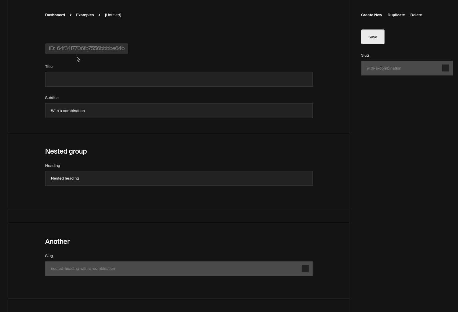
Usage
import { CollectionConfig } from 'payload/types'
import { SlugField } from '@nouance/payload-better-fields-plugin'

const Examples: CollectionConfig = {
  slug: 'examples',
  admin: {
    useAsTitle: 'title',
  },
  fields: [
    {
      name: 'title',
      type: 'text',
    },
    ...SlugField(['title'], undefined, {
      admin: {
        position: 'sidebar',
      },
    }),
  ],
}
Options
The SlugField accepts the following parameters
@default
{ lower: true, remove: /[*+~.()'"!?#\.,:@]/g }
-
slugOverrides - TextField Slug field overrides, use this to rename the machine name or label of the field
-
enableEditSlug - boolean @default true Enable or disable the checkbox field
-
editSlugOverrides - CheckboxField @default ['title'] Checkbox field overrides
Combo field
source
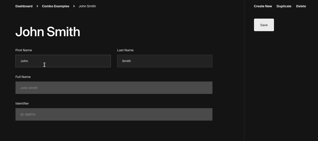
Usage
import { CollectionConfig } from 'payload/types'
import { ComboField } from '@nouance/payload-better-fields-plugin'

const Examples: CollectionConfig = {
  slug: 'examples',
  admin: {
    useAsTitle: 'fullName',
  },
  fields: [
    {
      type: 'row',
      fields: [
        {
          name: 'firstName',
          type: 'text',
        },
        {
          name: 'lastName',
          type: 'text',
        },
      ],
    },
    ...ComboField(['firstName', 'lastName'], { name: 'fullName' }),
  ],
}
Options
The ComboField accepts the following parameters
Number field
source | react-number-format NumericFormat
Usage
import { CollectionConfig } from 'payload/types'
import { NumberField } from '@nouance/payload-better-fields-plugin'

const Examples: CollectionConfig = {
  slug: 'examples',
  admin: {
    useAsTitle: 'fullName',
  },
  fields: [
    {
      name: 'title',
      type: 'text',
    },
    ...NumberField(
      {
        prefix: '$ ',
        thousandSeparator: ',',
        decimalScale: 2,
        fixedDecimalScale: true,
      },
      {
        name: 'price',
        required: true,
      },
    ),
  ],
}
Options
The NumberField accepts the following parameters
-
format - NumericFormatProps required, accepts props for NumericFormat
callback - you can override the internal callback on the value, the value will be a string so you need to handle the conversion to an int or float yourself via parseFloat
callback: (value) => parseFloat(value) + 20,
-
overrides - NumberField required for name attribute
Pattern field
source | react-number-format PatternFormat
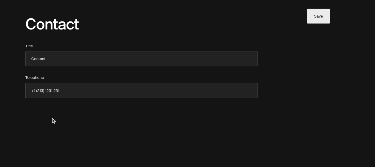
Usage
import { CollectionConfig } from 'payload/types'
import { PatternField } from '@nouance/payload-better-fields-plugin'

const Examples: CollectionConfig = {
  slug: 'examples',
  admin: {
    useAsTitle: 'fullName',
  },
  fields: [
    {
      name: 'title',
      type: 'text',
    },
    ...PatternField(
      {
        format: '+1 (###) #### ###',
        prefix: '% ',
        allowEmptyFormatting: true,
        mask: '_',
      },
      {
        name: 'telephone',
        type: 'text',
        required: false,
        admin: {
          placeholder: '% 20',
        },
      },
    ),
  ],
}
Options
The PatternField accepts the following parameters
-
format - PatternFormatProps required, accepts props for PatternFormat
-
format required, input for the pattern to be applied
-
callback - you can override the internal callback on the value, the value will be a string so you need to handle the conversion to an int or float yourself via parseFloat
callback: (value) => value + 'ID',
-
overrides - TextField required for name attribute
Notes
We recommend using a text field in Payload.
Range field
source
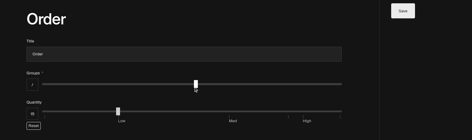
Usage
import { CollectionConfig } from 'payload/types'
import { RangeField } from '@nouance/payload-better-fields-plugin'

const Examples: CollectionConfig = {
  slug: 'examples',
  admin: {
    useAsTitle: 'title',
  },
  fields: [
    {
      name: 'title',
      type: 'text',
    },
    ...RangeField(
      { min: 5, max: 200, step: 5 },
      {
        name: 'groups',
      },
    ),
  ],
}

export default Examples
Options
The RangeField accepts the following parameters
Colour Text field
source | validate-color
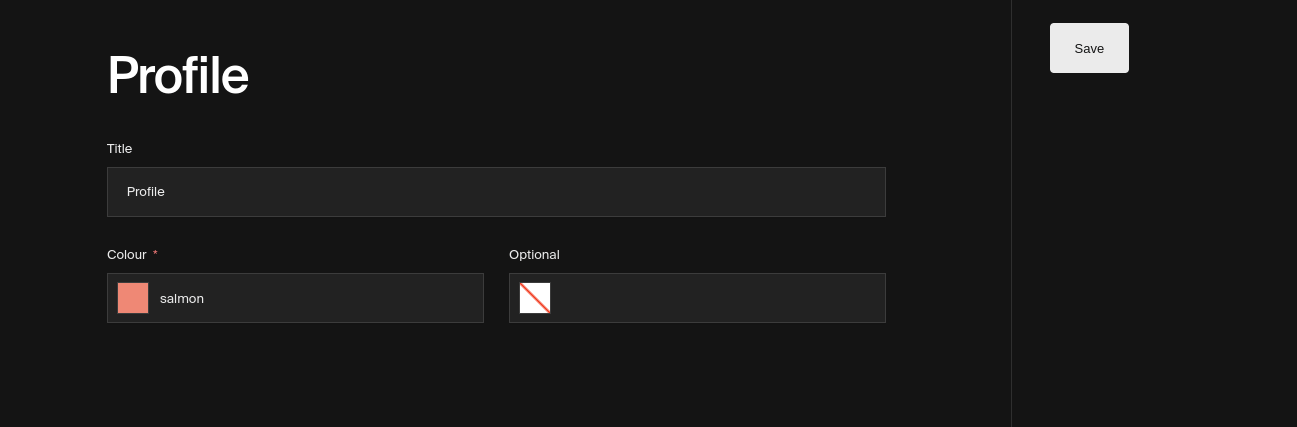
Usage
import { CollectionConfig } from 'payload/types'
import { ColourTextField } from '@nouance/payload-better-fields-plugin'

const Examples: CollectionConfig = {
  slug: 'examples',
  admin: {
    useAsTitle: 'title',
  },
  fields: [
    {
      name: 'title',
      type: 'text',
    },
    ...ColourTextField({
      name: 'colour',
    }),
  ],
}

export default Examples
Options
The ColourTextField accepts the following parameters
overrides - TextField required for name attribute
Contributing
For development purposes, there is a full working example of how this plugin might be used in the dev directory of this repo.
git clone git@github.com:NouanceLabs/payload-better-fields-plugin.git \
cd payload-better-fields-plugin && yarn \
cd demo && yarn \
cp .env.example .env \
vim .env \
yarn dev


