Product
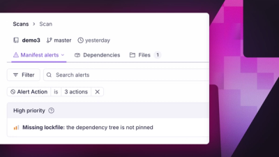
Introducing Manifest Alerts
Socket now detects supply chain risks in project manifests, starting with missing lockfiles that can make dependency installs non-reproducible.
By André Staltz, Trevor Norris - Jun 16, 2026
@opensite/ui
Advanced tools
Foundational UI component library for OpenSite Semantic Site Builder with tree-shakable exports and abstract styling

Foundational UI component library for the OpenSite Semantic Site Builder ecosystem. Provides tree-shakable, performance-optimized components with abstract styling support.
pnpm add @opensite/ui
# or
npm install @opensite/ui
This library requires React 16.8.0 or higher:
pnpm add react react-dom
For optimal bundle sizes, import components individually:
// Import specific components
import { Container } from "@opensite/ui/components/container";
import { Section } from "@opensite/ui/components/section";

// Or import multiple from grouped export
import { Container, Section, Button } from "@opensite/ui/components";
// Import all (larger bundle)
import * as UI from "@opensite/ui";
Layout container for consistent content width and centering.
import { Container } from "@opensite/ui/components/container";

<Container maxWidth="xl">
  <h1>Page Content</h1>
</Container>
Props:
maxWidth?: "sm" | "md" | "lg" | "xl" | "2xl" | "4xl" | "full" - Maximum width (default: "xl")as?: keyof JSX.IntrinsicElements - HTML element to render (default: "div")className?: string - Additional CSS classesSection wrapper with optional title, subtitle, and background variants.
import { Section } from "@opensite/ui/components/section";

<Section
  id="features"
  title="Our Features"
  subtitle="What we offer"
  background="gradient"
  spacing="lg"
>
  <p>Section content here</p>
</Section>
Props:
id?: string - Section ID for anchor linkstitle?: string - Section title (renders as h2)subtitle?: string - Section subtitle/eyebrowbackground?: "white" | "gray" | "dark" | "gradient" | "primary" | "secondary" | "muted" (default: "white")spacing?: "sm" | "md" | "lg" | "xl" (default: "lg")className?: string - Additional CSS classesAnimated modal dialog component using framer-motion with polished default styles.
import { AnimatedDialog } from "@opensite/ui/components/animated-dialog";
import { useState } from "react";

function MyComponent() {
  const [open, setOpen] = useState(false);

  return (
    <AnimatedDialog
      open={open}
      onOpenChange={setOpen}
      title="Welcome"
      eyebrow="Hello"
      description="This is a modal dialog"
      size="lg"
      footer={
        <button onClick={() => setOpen(false)}>Close</button>
      }
    >
      <p>Dialog content here</p>
    </AnimatedDialog>
  );
}
Props:
open: boolean - Whether the dialog is open (required)onOpenChange: (open: boolean) => void - Callback when dialog state changes (required)title?: string - Dialog titleeyebrow?: string - Eyebrow text above titledescription?: string - Dialog descriptionheader?: ReactNode - Custom header (overrides title/eyebrow/description)footer?: ReactNode - Footer contentsize?: "sm" | "md" | "lg" | "xl" | "full" (default: "lg")className?: string - Additional CSS classes for containercontentClassName?: string - Additional CSS classes for content areaDefault Styles:
Hero banner component with image or video background support.
import { PageHeroBanner } from "@opensite/ui/components/page-hero-banner";

<PageHeroBanner
  imageUrl="https://example.com/hero.jpg"
  alt="Hero banner"
  minHeight="600px"
  showOverlay={true}
  overlayOpacity={0.6}
  contentMaxWidth="4xl"
>
  <h1>Welcome to Our Site</h1>
  <p>Discover amazing content</p>
</PageHeroBanner>
Props:
imageUrl?: string - Image URL or Media ID (either imageUrl or videoUrl required)videoUrl?: string - Video URL or Media ID (either imageUrl or videoUrl required)alt?: string - Alt text for image (default: "Hero banner")loading?: "eager" | "lazy" (default: "eager")minHeight?: string (default: "500px")showOverlay?: boolean (default: true)overlayOpacity?: number (default: 0.6)contentMaxWidth?: ContainerMaxWidth (default: "4xl")className?: string - Additional CSS classesInteractive button component with multiple variants and sizes.
import { Button } from "@opensite/ui/components/button";

<Button variant="default" size="md">
  Click Me
</Button>
Props:
variant?: "default" | "destructive" | "outline" | "secondary" | "ghost" | "link" (default: "default")size?: "default" | "sm" | "lg" | "icon" | "icon-sm" | "icon-lg" (default: "default")asChild?: boolean - Render as child component using Radix Slot (default: false)Additional components from shadcn/ui are available:
import { Card, CardHeader, CardContent, CardFooter } from "@opensite/ui/components/card";
import { Badge } from "@opensite/ui/components/badge";
import { Popover, PopoverTrigger, PopoverContent } from "@opensite/ui/components/popover";
Pre-configured, reusable UI blocks for common content patterns.
Display content sections with alternating left/right media placement. Uses the Section component for consistent spacing, backgrounds, and optional titles. Located in the about category.
import { AlternatingBlocks } from "@opensite/ui/blocks/about/alternating-blocks";

<AlternatingBlocks
  title="Our Journey"
  subtitle="About Us"
  background="gray"
  spacing="xl"
  sections={[
    {
      content: (
        <div>
          <h3 className="mb-3 text-2xl font-semibold">Our Story</h3>
          <p className="text-muted-foreground">Started in 2018...</p>
        </div>
      ),
      media: <img src="story.jpg" alt="Our story" />,
      mediaLeft: false
    },
    {
      content: <div>...</div>,
      media: <img src="mission.jpg" alt="Our mission" />,
      mediaLeft: true
    }
  ]}
/>
Props:
sections: AlternatingBlockSection[] - Array of content sections (required)
content: ReactNode - Content to display (text, headings, etc.)media: ReactNode - Media to display (image, video, icon, etc.)mediaLeft?: boolean - Place media on left side (default: false)title?: string - Section title (optional)subtitle?: string - Section subtitle/eyebrow (optional)background?: SectionBackground - Background variant ("white" | "gray" | "accent", default: "white")spacing?: SectionSpacing - Vertical spacing ("none" | "sm" | "md" | "lg" | "xl", default: "lg")className?: string - Additional CSS classes for Section wrappercontentClassName?: string - Additional CSS classes for content containerNote: Blocks are now organized by category. Import path includes category: @opensite/ui/blocks/[category]/[block-name]
Semantic registry for AI-driven component selection. Maps semantic concepts to available UI blocks.
import {
  BLOCK_REGISTRY,
  getBlocksBySemanticTag,
  getBlocksByCategory,
  searchBlocks
} from "@opensite/ui/registry";

// Get blocks by semantic tag
const aboutBlocks = getBlocksBySemanticTag("about");

// Get blocks by category
const featureBlocks = getBlocksByCategory("features");

// Search blocks
const results = searchBlocks("alternating");
Available Functions:
getBlocksBySemanticTag(tag: string) - Find blocks matching semantic taggetBlocksByCategory(category: BlockCategory) - Find blocks in categorygetBlockById(id: string) - Get specific block by IDgetAllBlocks() - Get all registered blocksgetAllCategories() - Get all available categoriessearchBlocks(query: string) - Search blocks by name/description/tagsBlock Categories:
For comprehensive styling documentation including all CSS variables, theming guides, and customization examples, see STYLES.md.
Components use CSS variables for theming. Define these in your global CSS:
:root {
  --background: 0 0% 100%;
  --foreground: 222.2 84% 4.9%;
  --primary: 222.2 47.4% 11.2%;
  --primary-foreground: 210 40% 98%;
  --secondary: 210 40% 96.1%;
  --secondary-foreground: 222.2 47.4% 11.2%;
  --muted: 210 40% 96.1%;
  --muted-foreground: 215.4 16.3% 46.9%;
  /* ... more variables */
}
Ensure your tailwind.config.js includes the library components:
module.exports = {
  content: [
    "./src/**/*.{js,ts,jsx,tsx}",
    "./node_modules/@opensite/ui/dist/**/*.{js,mjs}",
  ],
  theme: {
    extend: {
      // Your custom theme
    },
  },
};
Override component styles using the className prop:
<Container className="bg-blue-500 text-white px-8">
  Custom styled container
</Container>
Full TypeScript support with exported types:
import type {
  ContainerProps,
  ContainerMaxWidth,
  SectionProps,
  SectionBackground,
  SectionSpacing,
  AnimatedDialogProps,
  PageHeroBannerProps,
  AlternatingBlocksProps,
  AlternatingBlockSection,
  BlockRegistryEntry,
  BlockCategory,
} from "@opensite/ui/types";
All components are optimized for:
The library is fully tree-shakable. Import only what you need:
// ✅ Good - Only imports Container (~1KB)
import { Container } from "@opensite/ui/components/container";

// ❌ Avoid - Imports everything (~50KB)
import * as UI from "@opensite/ui";
pnpm build
# Run tests
pnpm test

# Run tests in watch mode
pnpm test:watch

# Run tests with coverage
pnpm test -- --coverage
pnpm type-check
MIT
FAQs
Foundational UI component library for OpenSite Semantic Site Builder with tree-shakable exports and abstract styling
The npm package @opensite/ui receives a total of 115 weekly downloads. As such, @opensite/ui popularity was classified as not popular.
We found that @opensite/ui demonstrated a healthy version release cadence and project activity because the last version was released less than a year ago. It has 2 open source maintainers collaborating on the project.
Did you know?

Socket for GitHub automatically highlights issues in each pull request and monitors the health of all your open source dependencies. Discover the contents of your packages and block harmful activity before you install or update your dependencies.
Product
Socket now detects supply chain risks in project manifests, starting with missing lockfiles that can make dependency installs non-reproducible.

Research
/Security News
The trojanized extensions use TinyGo-compiled WebAssembly and Solana transaction memos to resolve command-and-control infrastructure.

Security News
Anthropic says the directive cited national security concerns over a narrow jailbreak, but offered no specific technical details.