Research
/Security News
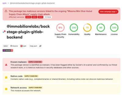
Miasma Mini Shai-Hulud Hits ImmobiliareLabs npm Packages
Miasma Mini Shai-Hulud hits @immobiliarelabs Backstage plugins, targeting GitLab and LDAP auth packages on npm.
By Socket Research Team - Jun 26, 2026
@ophiuchus/calendar
Advanced tools
日历组件用于选择日期或日期区间。
import Vue from 'vue';
import Calendar from '@ophiuchus/calendar';
Vue.use(Calendar);
下面演示了结合单元格来使用日历组件的用法,日期选择完成后会触发 confirm 事件。
<sf-cell title="选择单个日期" :value="date" @click="show = true" />
<sf-calendar v-model="show" @confirm="onConfirm" />
export default {
  data() {
    return {
      date: '',
      show: false,
    };
  },
  methods: {
    formatDate(date) {
      return `${date.getMonth() + 1}/${date.getDate()}`;
    },
    onConfirm(date) {
      this.show = false;
      this.date = this.formatDate(date);
    },
  },
};
设置 type 为 multiple 后可以选择多个日期,此时 confirm 事件返回的 date 为数组结构,数组包含若干个选中的日期。
<sf-cell title="选择多个日期" :value="text" @click="show = true" />
<sf-calendar v-model="show" type="multiple" @confirm="onConfirm" />
export default {
  data() {
    return {
      text: '',
      show: false,
    };
  },
  methods: {
    onConfirm(date) {
      this.show = false;
      this.text = `选择了 ${date.length} 个日期`;
    },
  },
};
设置 type 为 range 后可以选择日期区间,此时 confirm 事件返回的 date 为数组结构,数组第一项为开始时间,第二项为结束时间。
<sf-cell title="选择日期区间" :value="date" @click="show = true" />
<sf-calendar v-model="show" type="range" @confirm="onConfirm" />
export default {
  data() {
    return {
      date: '',
      show: false,
    };
  },
  methods: {
    formatDate(date) {
      return `${date.getMonth() + 1}/${date.getDate()}`;
    },
    onConfirm(date) {
      const [start, end] = date;
      this.show = false;
      this.date = `${this.formatDate(start)} - ${this.formatDate(end)}`;
    },
  },
};
Tips: 默认情况下,日期区间的起止时间不能为同一天,可以通过设置 allow-same-day 属性来允许选择同一天。
将 show-confirm 设置为 false 可以隐藏确认按钮,这种情况下选择完成后会立即触发 confirm 事件。
<sf-calendar v-model="show" :show-confirm="false" />
通过 color 属性可以自定义日历的颜色,对选中日期和底部按钮生效。
<sf-calendar v-model="show" color="#1989fa" />
通过 min-date 和 max-date 定义日历的范围。
<sf-calendar v-model="show" :min-date="minDate" :max-date="maxDate" />
export default {
  data() {
    return {
      show: false,
      minDate: new Date(2010, 0, 1),
      maxDate: new Date(2010, 0, 31),
    };
  },
};
通过 confirm-text 设置按钮文字,通过 confirm-disabled-text 设置按钮禁用时的文字。
<sf-calendar
  v-model="show"
  type="range"
  confirm-text="完成"
  confirm-disabled-text="请选择结束时间"
/>
通过传入 formatter 函数来对日历上每一格的内容进行格式化。
<sf-calendar v-model="show" type="range" :formatter="formatter" />
export default {
  methods: {
    formatter(day) {
      const month = day.date.getMonth() + 1;
      const date = day.date.getDate();

      if (month === 5) {
        if (date === 1) {
          day.topInfo = '劳动节';
        } else if (date === 4) {
          day.topInfo = '青年节';
        } else if (date === 11) {
          day.text = '今天';
        }
      }

      if (day.type === 'start') {
        day.bottomInfo = '入住';
      } else if (day.type === 'end') {
        day.bottomInfo = '离店';
      }

      return day;
    },
  },
};
通过 position 属性自定义弹出层的弹出位置,可选值为 top、left、right。
<sf-calendar v-model="show" :round="false" position="right" />
选择日期区间时,可以通过 max-range 属性来指定最多可选天数,选择的范围超过最多可选天数时,会弹出相应的提示文案。
<sf-calendar type="range" :max-range="3" :style="{ height: '500px' }" />
通过 first-day-of-week 属性设置一周从哪天开始。
<sf-calendar first-day-of-week="1" />
将 poppable 设置为 false,日历会直接展示在页面内,而不是以弹层的形式出现。
<sf-calendar
  title="日历"
  :poppable="false"
  :show-confirm="false"
  :style="{ height: '500px' }"
/>
| 参数 | 说明 | 类型 | 默认值 |
|---|---|---|---|
| type | 选择类型:single表示选择单个日期,multiple表示选择多个日期,range表示选择日期区间 | string | single |
| title | 日历标题 | string | 日期选择 |
| color | 主题色,对底部按钮和选中日期生效 | string | #ee0a24 |
| min-date | 可选择的最小日期 | Date | 当前日期 |
| max-date | 可选择的最大日期 | Date | 当前日期的六个月后 |
| default-date | 默认选中的日期,type 为 multiple 或 range 时为数组,传入 null 表示默认不选择 | Date | Date[] | null | 今天 |
| row-height | 日期行高 | number | string | 64 |
| formatter | 日期格式化函数 | (day: Day) => Day | - |
| poppable | 是否以弹层的形式展示日历 | boolean | true |
| lazy-render | 是否只渲染可视区域的内容 | boolean | true |
| show-mark | 是否显示月份背景水印 | boolean | true |
| show-title | 是否展示日历标题 | boolean | true |
| show-subtitle | 是否展示日历副标题(年月) | boolean | true |
| show-confirm | 是否展示确认按钮 | boolean | true |
| readonly | 是否为只读状态,只读状态下不能选择日期 | boolean | false |
| confirm-text | 确认按钮的文字 | string | 确定 |
| confirm-disabled-text | 确认按钮处于禁用状态时的文字 | string | 确定 |
| first-day-of-week | 设置周起始日 | 0-6 | 0 |
当 Calendar 的 poppable 为 true 时,支持以下 props:
| 参数 | 说明 | 类型 | 默认值 |
|---|---|---|---|
| v-model | 是否显示日历弹窗 | boolean | false |
| position | 弹出位置,可选值为 top right left | string | bottom |
| round | 是否显示圆角弹窗 | boolean | true |
| close-on-popstate | 是否在页面回退时自动关闭 | boolean | true |
| close-on-click-overlay | 是否在点击遮罩层后关闭 | boolean | true |
| safe-area-inset-bottom | 是否开启底部安全区适配 | boolean | true |
| get-container | 指定挂载的节点,用法示例 | string | () => Element | - |
当 Calendar 的 type 为 range 时,支持以下 props:
| 参数 | 说明 | 类型 | 默认值 |
|---|---|---|---|
| max-range | 日期区间最多可选天数 | number | string | 无限制 |
| range-prompt | 范围选择超过最多可选天数时的提示文案 | string | 选择天数不能超过 xx 天 |
| allow-same-day | 是否允许日期范围的起止时间为同一天 | boolean | false |
当 Calendar 的 type 为 multiple 时,支持以下 props:
| 参数 | 说明 | 类型 | 默认值 |
|---|---|---|---|
| max-range | 日期最多可选天数 | number | string | 无限制 |
| range-prompt | 选择超过最多可选天数时的提示文案 | string | 选择天数不能超过 xx 天 |
日历中的每个日期都对应一个 Day 对象,通过formatter属性可以自定义 Day 对象的内容
| 键名 | 说明 | 类型 |
|---|---|---|
| date | 日期对应的 Date 对象 | Date |
| type | 日期类型,可选值为selected、start、middle、end、disabled | string |
| text | 中间显示的文字 | string |
| topInfo | 上方的提示信息 | string |
| bottomInfo | 下方的提示信息 | string |
| className | 额外类名 | string |
| 事件名 | 说明 | 回调参数 |
|---|---|---|
| select | 点击并选中任意日期时触发 | value: Date | Date[] |
| confirm | 日期选择完成后触发,若show-confirm为true,则点击确认按钮后触发 | value: Date | Date[] |
| open | 打开弹出层时触发 | - |
| close | 关闭弹出层时触发 | - |
| opened | 打开弹出层且动画结束后触发 | - |
| closed | 关闭弹出层且动画结束后触发 | - |
| unselect | 当日历组件的 type 为 multiple 时,取消选中日期时触发 | value: Date |
| month-show | 当某个月份进入可视区域时触发 | { date: Date, title: string } |
| 名称 | 说明 | 参数 |
|---|---|---|
| title | 自定义标题 | - |
| footer | 自定义底部区域内容 | - |
| top-info | 自定义日期上方的提示信息 | day: Day |
| bottom-info | 自定义日期下方的提示信息 | day: Day |
通过 ref 可以获取到 Calendar 实例并调用实例方法,详见组件实例方法。
| 方法名 | 说明 | 参数 | 返回值 |
|---|---|---|---|
| reset | 将选中的日期重置到指定日期,未传参时会重置到默认日期 | date?: Date | Date[] | - |
| scrollToDate | 滚动到某个日期 | date: Date | - |
组件提供了下列 Less 变量,可用于自定义样式,使用方法请参考主题定制。
| 名称 | 默认值 | 描述 |
|---|---|---|
| @calendar-background-color | @white | - |
| @calendar-popup-height | 80% | - |
| @calendar-header-box-shadow | 0 2px 10px rgba(125, 126, 128, 0.16) | - |
| @calendar-header-title-height | 44px | - |
| @calendar-header-title-font-size | @font-size-lg | - |
| @calendar-header-subtitle-font-size | @font-size-md | - |
| @calendar-weekdays-height | 30px | - |
| @calendar-weekdays-font-size | @font-size-sm | - |
| @calendar-month-title-font-size | @font-size-md | - |
| @calendar-month-mark-color | fade(@gray-2, 80%) | - |
| @calendar-month-mark-font-size | 160px | - |
| @calendar-day-height | 64px | - |
| @calendar-day-font-size | @font-size-lg | - |
| @calendar-range-edge-color | @white | - |
| @calendar-range-edge-background-color | @red | - |
| @calendar-range-middle-color | @red | - |
| @calendar-range-middle-background-opacity | 0.1 | - |
| @calendar-selected-day-size | 54px | - |
| @calendar-selected-day-color | @white | - |
| @calendar-info-font-size | @font-size-xs | - |
| @calendar-info-line-height | @line-height-xs | - |
| @calendar-selected-day-background-color | @red | - |
| @calendar-day-disabled-color | @gray-5 | - |
| @calendar-confirm-button-height | 36px | - |
| @calendar-confirm-button-margin | 7px 0 | - |
如果你遇到了在 iOS 上无法渲染组件的问题,请确认在创建 Date 对象时没有使用new Date('2020-01-01')这样的写法,iOS 不支持以中划线分隔的日期格式,正确写法是new Date('2020/01/01')。
对此问题的详细解释:stackoverflow。
FAQs
### 介绍
The npm package @ophiuchus/calendar receives a total of 3 weekly downloads. As such, @ophiuchus/calendar popularity was classified as not popular.
We found that @ophiuchus/calendar demonstrated a not healthy version release cadence and project activity because the last version was released a year ago. It has 1 open source maintainer collaborating on the project.
Did you know?

Socket for GitHub automatically highlights issues in each pull request and monitors the health of all your open source dependencies. Discover the contents of your packages and block harmful activity before you install or update your dependencies.
Research
/Security News
Miasma Mini Shai-Hulud hits @immobiliarelabs Backstage plugins, targeting GitLab and LDAP auth packages on npm.

Security News
Rolldown paused Rust React Compiler integration after a 5MB binary size increase raised concerns about shipping React-specific code to all Vite users.

Security News
/Research
Mini Shai-Hulud expands into the Go ecosystem after hitting LeoPlatform npm packages and targeting GitHub Actions workflows.