Product
Introducing Rust Support in Socket
Socket now supports Rust and Cargo, offering package search for all users and experimental SBOM generation for enterprise projects.
@radix-ui/react-select
Advanced tools
View docs [here](https://radix-ui.com/primitives/docs/components/select).
The @radix-ui/react-select package is a React component library for building accessible, customizable select inputs. It is part of the Radix UI design system, which focuses on providing low-level utility components to design and build high-quality, accessible user interfaces with ease. The react-select package offers a flexible API to create both simple and complex select dropdowns, with support for single and multiple selections, searchable options, and custom rendering.
Basic Select
This code demonstrates how to create a basic select dropdown with predefined options for 'apple' and 'orange'. It showcases the use of `Select.Trigger` for the dropdown button, `Select.Value` for displaying the selected value, and `Select.Item` for the options.
{"import { Select } from '@radix-ui/react-select';\n\nfunction App() {\n return (\n <Select>\n <Select.Trigger aria-label='Food'>\n <Select.Value placeholder='Select a food...' />\n <Select.Icon />\n </Select.Trigger>\n <Select.Content>\n <Select.ScrollUpButton />\n <Select.Viewport>\n <Select.Item value='apple'>\n <Select.ItemText>Apple</Select.ItemText>\n </Select.Item>\n <Select.Item value='orange'>\n <Select.ItemText>Orange</Select.ItemText>\n </Select.Item>\n </Select.Viewport>\n <Select.ScrollDownButton />\n </Select.Content>\n </Select>\n );\n}"}Multiple Selection
This example extends the basic select by enabling multiple selections. Users can select more than one option from the dropdown. The `multiple` prop on the `Select` component enables this functionality.
{"import { Select } from '@radix-ui/react-select';\n\nfunction App() {\n return (\n <Select multiple>\n <Select.Trigger aria-label='Fruits'>\n <Select.Value placeholder='Select fruits...' />\n <Select.Icon />\n </Select.Trigger>\n <Select.Content>\n <Select.Viewport>\n <Select.Item value='apple'>\n <Select.ItemText>Apple</Select.ItemText>\n </Select.Item>\n <Select.Item value='orange'>\n <Select.ItemText>Orange</Select.ItemText>\n </Select.Item>\n </Select.Viewport>\n </Select.Content>\n </Select>\n );\n}"}Searchable Select
This code snippet demonstrates how to implement a searchable select dropdown. It uses a state to track the search query and filters the options based on the user's input. The `onValueChange` prop is used to update the search query.
{"import { Select } from '@radix-ui/react-select';\nimport { useState } from 'react';\n\nfunction App() {\n const [query, setQuery] = useState('');\n const fruits = ['Apple', 'Orange', 'Banana', 'Mango'];\n const filteredFruits = query === '' ? fruits : fruits.filter((fruit) => fruit.toLowerCase().includes(query.toLowerCase()));\n\n return (\n <Select onValueChange={(value) => setQuery(value)}>\n <Select.Trigger aria-label='Fruits'>\n <Select.Value placeholder='Type to search...' />\n <Select.Icon />\n </Select.Trigger>\n <Select.Content>\n <Select.Viewport>\n {filteredFruits.map((fruit) => (\n <Select.Item key={fruit} value={fruit.toLowerCase()}>\n <Select.ItemText>{fruit}</Select.ItemText>\n </Select.Item>\n ))}\n </Select.Viewport>\n </Select.Content>\n </Select>\n );\n}"}React Select is a highly configurable dropdown library for React that supports single and multi-select options, async option loading, and more. It offers a richer set of features out of the box compared to @radix-ui/react-select, but might require more configuration for full accessibility.
Downshift is a set of primitives to build simple, flexible, WAI-ARIA compliant React autocomplete, dropdown, and select components. It's more low-level than @radix-ui/react-select, offering more control but requiring more effort to implement.
This package provides a customizable and lightweight select component with multi-select and autocomplete features. While it offers ease of use and customization, it might not provide as comprehensive accessibility features as @radix-ui/react-select.
react-selectView docs here.
FAQs
View docs [here](https://radix-ui.com/primitives/docs/components/select).
The npm package @radix-ui/react-select receives a total of 11,492,208 weekly downloads. As such, @radix-ui/react-select popularity was classified as popular.
We found that @radix-ui/react-select demonstrated a healthy version release cadence and project activity because the last version was released less than a year ago. It has 6 open source maintainers collaborating on the project.
Did you know?

Socket for GitHub automatically highlights issues in each pull request and monitors the health of all your open source dependencies. Discover the contents of your packages and block harmful activity before you install or update your dependencies.

Product
Socket now supports Rust and Cargo, offering package search for all users and experimental SBOM generation for enterprise projects.

Product
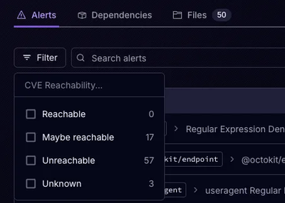
Socket’s precomputed reachability slashes false positives by flagging up to 80% of vulnerabilities as irrelevant, with no setup and instant results.

Product
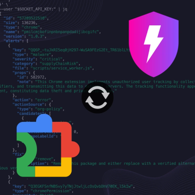
Socket is launching experimental protection for Chrome extensions, scanning for malware and risky permissions to prevent silent supply chain attacks.