@rc-component/progress
Progress Bar.


Example
https://progress.react-component.vercel.app/
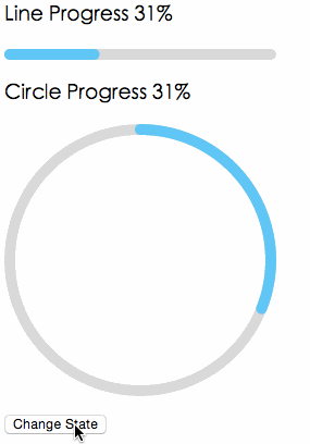
Screenshots
Browsers
- support IE9+, Chrome, Firefox, Safari
Install

Usage
import { Line, Circle } from '@rc-component/progress';
export default () => (
<>
<Line percent={10} strokeWidth={4} strokeColor="#D3D3D3" />
<Circle percent={10} strokeWidth={4} strokeColor="#D3D3D3" />
</>
);
Compatibility
| IE11, Edge | last 2 versions | last 2 versions | last 2 versions | last 2 versions |
API
props
| strokeWidth | Number | 1 | Width of the stroke. Unit is percentage of SVG canvas size. |
| strokeColor | String | #2db7f5 | Stroke color. |
| railWidth | Number | 1 | Width of the rail stroke. Unit is percentage of SVG canvas size. Rail is always centered relative to actual progress path. If railWidth is not defined, it is the same as strokeWidth. |
| railColor | String | #D9D9D9 | Color for lighter rail stroke underneath the actual progress path. |
| strokeLinecap | String | 'round' | The shape to be used at the end of the progress bar: can be `butt`, `square` or `round`. |
| prefixCls | String | rc-progress | prefix className for component |
| className | String | | customized className |
| style | Object | | style object will be added to svg element |
| percent | Number | Number[] | 0 | the percent of the progress |
| gapDegree | Number | 0 | the gap degree of half circle, 0 - 360 |
| gapPosition | String | top | the gap position: can be `top`, `bottom`, `left`, or `right`. |
| loading | Boolean | false | If it is true the indeterminate progress will be enabled. |
Installation
npm install --save @rc-component/progress
Development
npm install
npm start
License
@rc-component/progress is released under the MIT license.


