
Security News
Maven Central Adds Sigstore Signature Validation
Maven Central now validates Sigstore signatures, making it easier for developers to verify the provenance of Java packages.
By Sarah Gooding - Feb 06, 2025
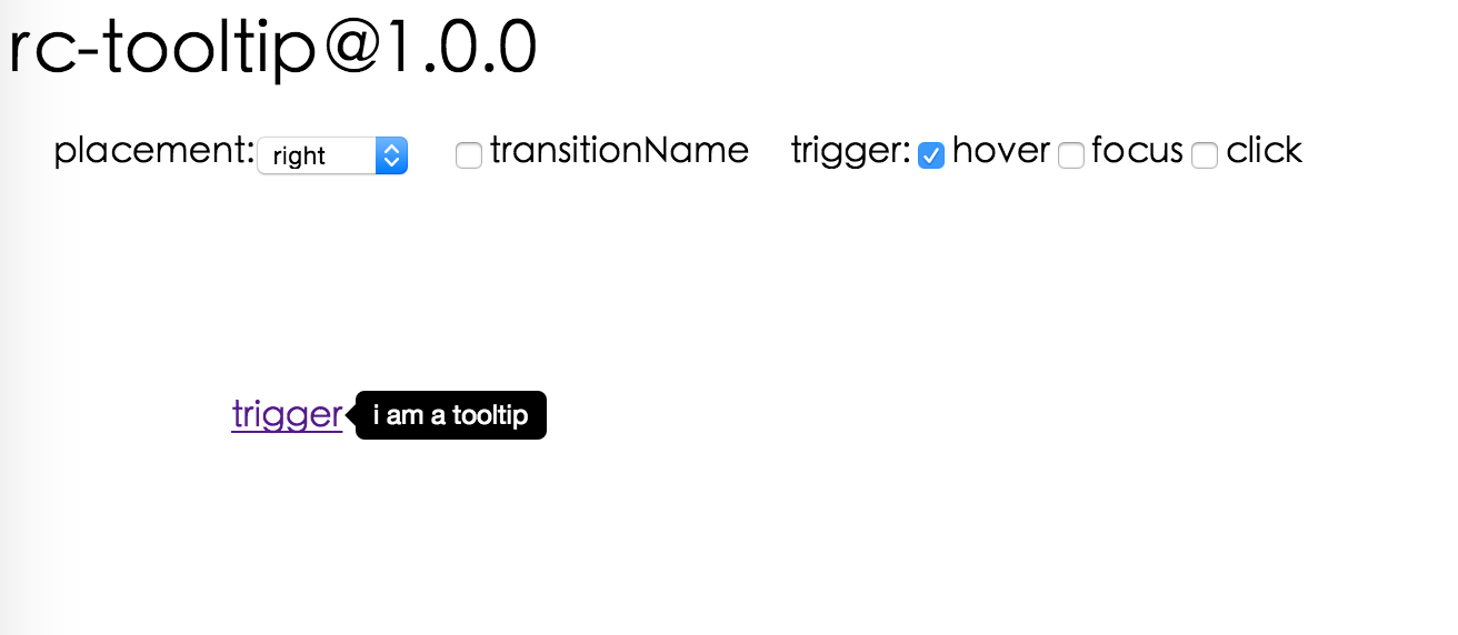
@rc-component/tooltip
Advanced tools
React Tooltip


 IE / Edge |  Firefox |  Chrome |  Safari |  Opera |
|---|---|---|---|---|
| IE 8 + ✔ | Firefox 31.0+ ✔ | Chrome 31.0+ ✔ | Safari 7.0+ ✔ | Opera 30.0+ ✔ |

var Tooltip = require('rc-tooltip');
var React = require('react');
var ReactDOM = require('react-dom');
// By default, the tooltip has no style.
// Consider importing the stylesheet it comes with:
// 'rc-tooltip/assets/bootstrap_white.css'
ReactDOM.render(
<Tooltip placement="left" trigger={['click']} overlay={<span>tooltip</span>}>
<a href="#">hover</a>
</Tooltip>,
container,
);
npm start and then go to
http://localhost:8000/demo
Online demo: https://react-component.github.io/tooltip/demo
| name | type | default | description |
|---|---|---|---|
| trigger | string | string[] | 'hover' | which actions cause tooltip shown. enum of 'hover','click','focus' |
| visible | boolean | false | whether tooltip is visible |
| defaultVisible | boolean | false | whether tooltip is visible by default |
| placement | string | 'right' | tooltip placement. enum of 'top','left','right','bottom', 'topLeft', 'topRight', 'bottomLeft', 'bottomRight', 'leftTop', 'leftBottom', 'rightTop', 'rightBottom' |
| motion | object | Config popup motion. Please ref demo for example | |
| onVisibleChange | (visible: boolean) => void; | Callback when visible change | |
| afterVisibleChange | (visible: boolean) => void; | Callback after visible change | |
| overlay | ReactNode | () => ReactNode | tooltip overlay content | |
| overlayStyle | object | deprecated, Please use styles={{ root: {} }} | |
| overlayClassName | string | deprecated, Please use classNames={{ root: {} }} | |
| prefixCls | string | 'rc-tooltip' | prefix class name of tooltip |
| mouseEnterDelay | number | 0 | delay time (in second) before tooltip shows when mouse enter |
| mouseLeaveDelay | number | 0.1 | delay time (in second) before tooltip hides when mouse leave |
| getTooltipContainer | (triggerNode: HTMLElement) => HTMLElement | () => document.body | get container of tooltip, default to body |
| destroyTooltipOnHide | boolean | false | destroy tooltip when it is hidden |
| align | object | align config of tooltip. Please ref demo for usage example | |
| showArrow | boolean | object | false | whether to show arrow of tooltip |
| zIndex | number | config popup tooltip zIndex | |
| classNames | classNames?: { root?: string; body?: string;}; | Semantic DOM class | |
| styles | styles?: {root?: React.CSSProperties;body?: React.CSSProperties;}; | Semantic DOM styles |
Tooltip requires a child node that accepts an onMouseEnter, onMouseLeave, onFocus, onClick event. This means the child node must be a built-in component like div or span, or a custom component that passes its props to its built-in component child.
For accessibility purpose you can use the id prop to link your tooltip with another element. For example attaching it to an input element:
<Tooltip
    ...
    id={this.props.name}>
    <input type="text"
           ...
           aria-describedby={this.props.name}/>
</Tooltip>
If you do it like this, a screenreader would read the content of your tooltip if you focus the input element.
NOTE: role="tooltip" is also added to expose the purpose of the tooltip element to a screenreader.
npm install
npm start
npm test
npm run chrome-test
npm run coverage
rc-tooltip is released under the MIT license.
FAQs
React Tooltip
We found that @rc-component/tooltip demonstrated a healthy version release cadence and project activity because the last version was released less than a year ago. It has 0 open source maintainers collaborating on the project.
Did you know?

Socket for GitHub automatically highlights issues in each pull request and monitors the health of all your open source dependencies. Discover the contents of your packages and block harmful activity before you install or update your dependencies.
Security News
Maven Central now validates Sigstore signatures, making it easier for developers to verify the provenance of Java packages.

Security News
CISOs are racing to adopt AI for cybersecurity, but hurdles in budgets and governance may leave some falling behind in the fight against cyber threats.

Research
Security News
Socket researchers uncovered a backdoored typosquat of BoltDB in the Go ecosystem, exploiting Go Module Proxy caching to persist undetected for years.