Security News
GitHub Removes Malicious Pull Requests Targeting Open Source Repositories
GitHub removed 27 malicious pull requests attempting to inject harmful code across multiple open source repositories, in another round of low-effort attacks.
@react-native-community/slider
Advanced tools
React Native component used to select a single value from a range of values.
@react-native-community/slider is a React Native component for creating sliders, which are UI elements that allow users to select a value from a range by moving a thumb along a track. This package is useful for scenarios where you need to capture a range of values, such as volume control, brightness adjustment, or any other numeric input.
Basic Slider
This code demonstrates a basic slider with a minimum value of 0 and a maximum value of 1. The slider has custom colors for the minimum and maximum track.
import Slider from '@react-native-community/slider';
import React from 'react';
import { View } from 'react-native';
const BasicSlider = () => {
return (
<View>
<Slider
style={{width: 200, height: 40}}
minimumValue={0}
maximumValue={1}
minimumTrackTintColor="#FFFFFF"
maximumTrackTintColor="#000000"
/>
</View>
);
};
export default BasicSlider;Slider with Custom Thumb
This code demonstrates a slider with a custom thumb image. The thumbImage prop is used to set a custom image for the slider's thumb.
import Slider from '@react-native-community/slider';
import React from 'react';
import { View, Image } from 'react-native';

const CustomThumbSlider = () => {
  return (
    <View>
      <Slider
        style={{width: 200, height: 40}}
        minimumValue={0}
        maximumValue={100}
        thumbImage={require('./path/to/thumbImage.png')}
      />
    </View>
  );
};

export default CustomThumbSlider;
Slider with Step Value
This code demonstrates a slider with a step value of 1. The step prop ensures that the slider's thumb moves in increments of 1.
import Slider from '@react-native-community/slider';
import React from 'react';
import { View } from 'react-native';

const StepSlider = () => {
  return (
    <View>
      <Slider
        style={{width: 200, height: 40}}
        minimumValue={0}
        maximumValue={10}
        step={1}
      />
    </View>
  );
};

export default StepSlider;react-native-slider is another popular package for creating sliders in React Native. It offers similar functionality to @react-native-community/slider, including support for custom thumb images, track colors, and step values. However, @react-native-community/slider is more actively maintained and is part of the React Native Community, which may offer better support and integration with other community packages.
react-native-multi-slider is a package that allows for the creation of multi-point sliders, where users can select multiple values along a range. This package is useful for more complex scenarios where a single slider is not sufficient. It offers more advanced features compared to @react-native-community/slider, but may be overkill for simpler use cases.
@react-native-community/sliderReact Native component used to select a single value from a range of values.


yarn add @react-native-community/slider
or
npm install @react-native-community/slider --save
react-native link @react-native-community/slider
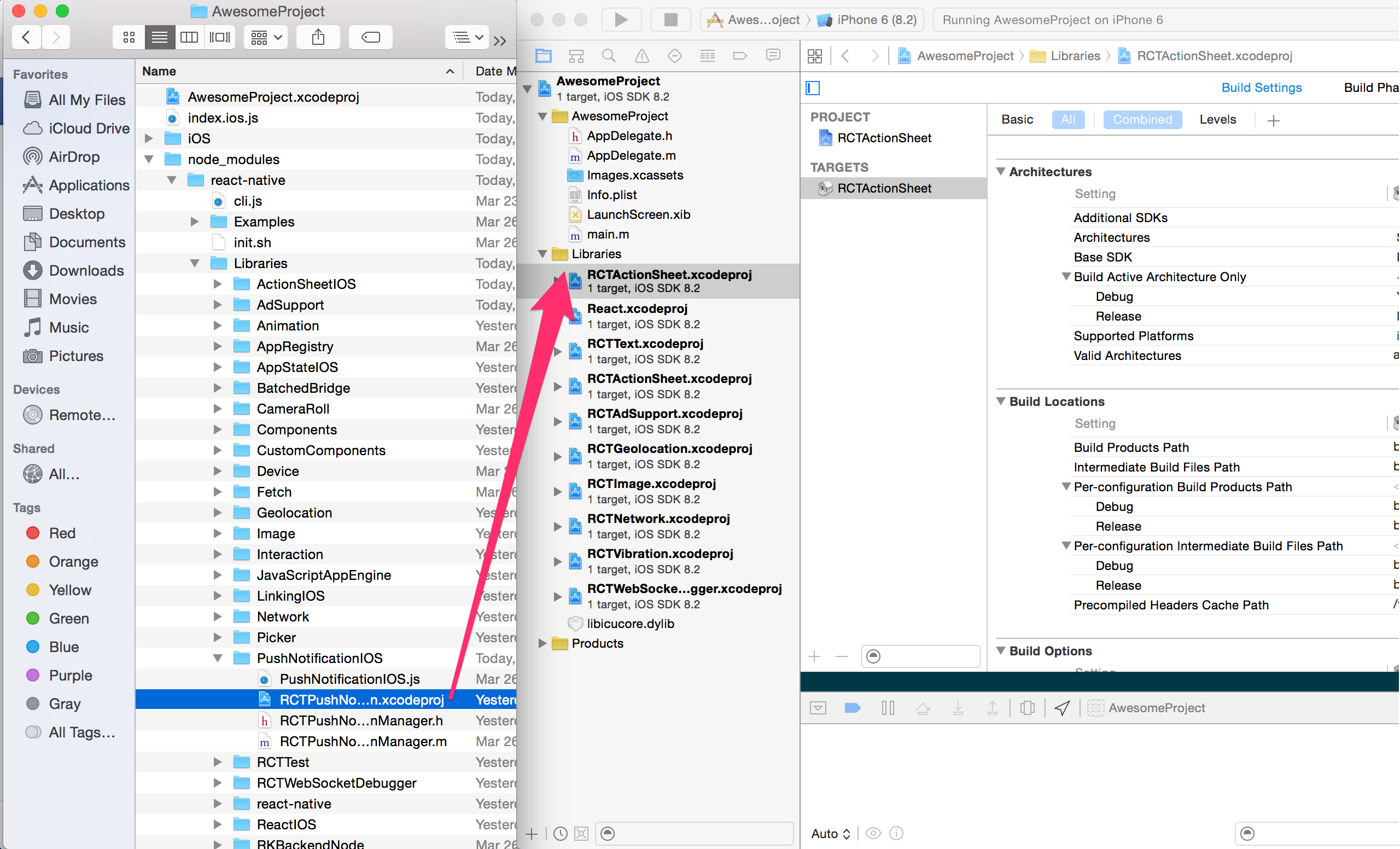
Open project.xcodeproj in XcodeDrag RNCSlider.xcodeproj to your project on Xcode (usually under the Libraries group on Xcode):

libRNCSlider.a binary with librariesClick on your main project file (the one that represents the .xcodeproj) select Build Phases and drag the static library from the Products folder inside the Library you are importing to Link Binary With Libraries (or use the + sign and choose library from the list):

android/settings.gradleinclude ':react-native-community-slider'
project(':react-native-community-slider').projectDir = new File(rootProject.projectDir, '../node_modules/@react-native-community/slider/android')
android/app/build.gradledependencies {
...
implementation project(':react-native-community-slider')
}
android/app/src/main/.../MainApplication.javaOn top, where imports are:
import com.reactnativecommunity.slider.ReactSliderPackage;
Add the ReactSliderPackage class to your list of exported packages.
@Override
protected List<ReactPackage> getPackages() {
    return Arrays.asList(
            new MainReactPackage(),
            new ReactSliderPackage()
    );
}
react-native moduleThis module was created when the Slider was split out from the core of React Native. To migrate to this module you need to follow the installation instructions above and then change you imports from:
import { Slider } from 'react-native';
to:
import Slider from '@react-native-community/slider';
import Slider from '@react-native-community/slider';
  <Slider
    style={{width: 200, height: 40}}
    minimumValue={0}
    maximumValue={1}
    minimumTrackTintColor="#FFFFFF"
    maximumTrackTintColor="#000000"
  />
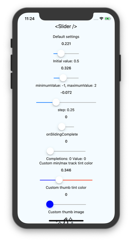
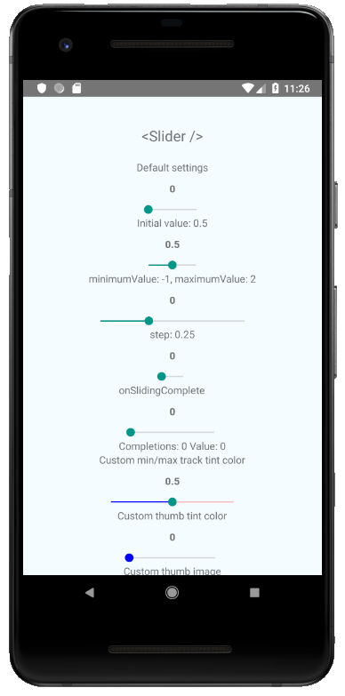
Check out the example project for more examples.
styledisabledmaximumValueminimumTrackTintColorminimumValueonSlidingStartonSlidingCompleteonValueChangestepmaximumTrackTintColortestIDvaluethumbTintColormaximumTrackImageminimumTrackImagethumbImagetrackImagestyleUsed to style and layout the Slider. See StyleSheet.js and ViewStylePropTypes.js for more info.
| Type | Required |
|---|---|
| View.style | No |
disabledIf true the user won't be able to move the slider. Default value is false.
| Type | Required |
|---|---|
| bool | No |
maximumValueInitial maximum value of the slider. Default value is 1.
| Type | Required |
|---|---|
| number | No |
minimumTrackTintColorThe color used for the track to the left of the button. Overrides the default blue gradient image on iOS.
| Type | Required |
|---|---|
| color | No |
minimumValueInitial minimum value of the slider. Default value is 0.
| Type | Required |
|---|---|
| number | No |
onSlidingStartCallback that is called when the user picks up the slider. The initial value is passed as an argument to the callback handler.
| Type | Required |
|---|---|
| function | No |
onSlidingCompleteCallback that is called when the user releases the slider, regardless if the value has changed. The current value is passed as an argument to the callback handler.
| Type | Required |
|---|---|
| function | No |
onValueChangeCallback continuously called while the user is dragging the slider.
| Type | Required |
|---|---|
| function | No |
stepStep value of the slider. The value should be between 0 and (maximumValue - minimumValue). Default value is 0.
| Type | Required |
|---|---|
| number | No |
maximumTrackTintColorThe color used for the track to the right of the button. Overrides the default gray gradient image on iOS.
| Type | Required |
|---|---|
| color | No |
testIDUsed to locate this view in UI automation tests.
| Type | Required |
|---|---|
| string | No |
valueInitial value of the slider. The value should be between minimumValue and maximumValue, which default to 0 and 1 respectively. Default value is 0.
This is not a controlled component, you don't need to update the value during dragging.
| Type | Required |
|---|---|
| number | No |
thumbTintColorColor of the foreground switch grip.
| Type | Required | Platform |
|---|---|---|
| color | No | Android |
maximumTrackImageAssigns a maximum track image. Only static images are supported. The leftmost pixel of the image will be stretched to fill the track.
| Type | Required | Platform |
|---|---|---|
| Image.propTypes.source | No | iOS |
minimumTrackImageAssigns a minimum track image. Only static images are supported. The rightmost pixel of the image will be stretched to fill the track.
| Type | Required | Platform |
|---|---|---|
| Image.propTypes.source | No | iOS |
thumbImageSets an image for the thumb. Only static images are supported.
| Type | Required | Platform |
|---|---|---|
| Image.propTypes.source | No | iOS |
trackImageAssigns a single image for the track. Only static images are supported. The center pixel of the image will be stretched to fill the track.
| Type | Required | Platform |
|---|---|---|
| Image.propTypes.source | No | iOS |
This module was extracted from react-native core. Please reffer to https://github.com/react-native-community/react-native-slider/graphs/contributors for the complete list of contributors.
The library is released under the MIT licence. For more information see LICENSE.
FAQs
React Native component used to select a single value from a range of values.
We found that @react-native-community/slider demonstrated a healthy version release cadence and project activity because the last version was released less than a year ago. It has 2 open source maintainers collaborating on the project.
Did you know?

Socket for GitHub automatically highlights issues in each pull request and monitors the health of all your open source dependencies. Discover the contents of your packages and block harmful activity before you install or update your dependencies.

Security News
GitHub removed 27 malicious pull requests attempting to inject harmful code across multiple open source repositories, in another round of low-effort attacks.

Security News
RubyGems.org has added a new "maintainer" role that allows for publishing new versions of gems. This new permission type is aimed at improving security for gem owners and the service overall.

Security News
Node.js will be enforcing stricter semver-major PR policies a month before major releases to enhance stability and ensure reliable release candidates.