Product
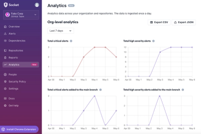
Introducing Dashboard Analytics
We're introducing a new Analytics feature in the Socket dashboard so you can view changes in your organization's and repositories' alerts over time.
By Charlie Gerard - Sep 05, 2024
@rmwc/button
Advanced tools
Buttons communicate the action that will occur when the user touches them.
<Button label="Button" />
<>
  <Button label="Icon" icon="favorite" />
  <Button label="Trailing" trailingIcon="keyboard_arrow_right" />
  <Button label="Loading" icon={<CircularProgress />} />
</>
<>
  <Button label="Raised" raised />
  <Button label="Unelevated" unelevated />
  <Button label="Outlined" outlined />
  <Button label="Dense" dense />
  <Button label="No Ripple" ripple={false} />
</>
<>
  <Button label="Danger" danger raised />
  <Button label="Danger" danger outlined />
  <Button label="Danger" danger />
</>
<>
  <Button
    label="With Theme"
    raised
    theme={['secondaryBg', 'onSecondary']}
  />
  {/**
    This example uses "accent" to control the color of the Ripple.
    See the documentation on Ripples.
  */}
  <Button label="With Theme" theme="secondary" />
</>
<Button>
  {/** Alternatively pass content as children */}
  As Children
</Button>
<>
  {/** Wrapping a button in TouchTargetWrapper will automatically set its `touch` prop to true. */}
  <TouchTargetWrapper>
    <Button>Touch Accessible</Button>
  </TouchTargetWrapper>
</>
The Button component.
| Name | Type | Description |
|---|---|---|
children | React.ReactNode | Content specified as children. |
danger | undefined | false | true | Used to indicate a dangerous action. |
dense | undefined | false | true | Make the Button dense. |
disabled | undefined | false | true | Make the button disabled |
icon | RMWC.IconPropT | An Icon for the Button |
label | React.ReactNode | any | Content specified as a label prop. |
outlined | undefined | false | true | Make the button outlined. |
raised | undefined | false | true | Make the Button raised. |
touch | undefined | false | true | Makes the button more touch friendly. This will automatically be set true if used inside of TouchTargetWrapper. |
trailingIcon | RMWC.IconPropT | A trailing icon for the Button |
unelevated | undefined | false | true | Make the button unelevated. |
FAQs
Buttons communicate the action that will occur when the user touches them.
The npm package @rmwc/button receives a total of 1,069 weekly downloads. As such, @rmwc/button popularity was classified as popular.
We found that @rmwc/button demonstrated a healthy version release cadence and project activity because the last version was released less than a year ago. It has 0 open source maintainers collaborating on the project.
Did you know?

Socket for GitHub automatically highlights issues in each pull request and monitors the health of all your open source dependencies. Discover the contents of your packages and block harmful activity before you install or update your dependencies.
Product
We're introducing a new Analytics feature in the Socket dashboard so you can view changes in your organization's and repositories' alerts over time.
Security News
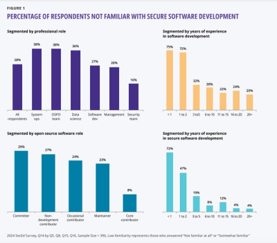
A new OpenSSF report uncovers critical gaps in secure software training, with 75% of new developers unfamiliar with secure practices, highlighting urgent educational needs.
Security News
The 2023 Python Developers Survey reveals key trends in packaging, web frameworks, and developer demographics, highlighting a shift toward innovative tools as the Python community diversifies and grows among less experienced developers.