
Product
Introducing License Enforcement in Socket
Ensure open-source compliance with Socket’s License Enforcement Beta. Set up your License Policy and secure your software!
By Philipp Burckhardt - Oct 17, 2024
@rosen-group/ngx-onboarding
Advanced tools


An onboarding library for Angular applications.
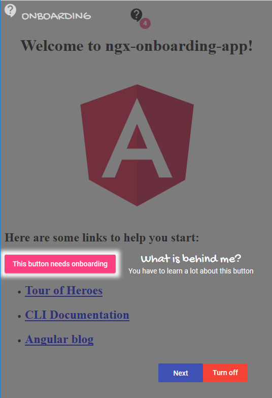
The onboarding library gives you the possibility to add a tutorial directly into your angular application. After that, users learn easily how to use your application and the learning curve is not so steep.
You can specify an onboarding element on every html element you want.
The library is published as a scoped NPM package in the NPMJS Rosen-Group account
npm install --save @rosen-group/ngx-onboarding
For detailed information on how to use the Angular material, please refer to the Angular material getting started page and follow the installations instructions.
Add the rosen-onboarding-component anywhere to your main component, e.g. app.component
<rosen-onboarding></rosen-onboarding>
Add the material icons reference to the index.html
<link href="//fonts.googleapis.com/icon?family=Material+Icons" rel="stylesheet">
The onboarding library contains a button component, which provides a context menu for resetting and turning on/off the onboarding feature. Place this button in the desired position in your application.
<rosen-onboarding-button title="ONBOARDING"></rosen-onboarding-button>
Add the OnboardingModule and it's dependencies to your module, e.g.
    imports: [
        BrowserModule,
        BrowserAnimationsModule,
        HttpClientModule,
        MatIconModule,
        MatButtonModule,
        OnboardingModule
    ]
Add some styles, e.g. to your app.component.css ()
@import "~@angular/material/prebuilt-themes/indigo-pink.css";
And don't forget to bundle it to your output, e.g. in your angular.json
"styles": [
 "src/styles.css",
 "node_modules/@angular/material/prebuilt-themes/indigo-pink.css"
]
The messages will be configured in JSON files.
Place the JSON file(s) where you are able to load them during application runtime. For example, if you are using angular-cli, copy them in an assets subfolder and add the folder to your assets array in the angular.json config file.
[
    {
        "selector": "#logo-img",
        "group": "example0",
        "position": "top",
        "headline": "Angular Logo",
        "details": "This is the angular logo",
        "descriptions": [
            {
                "language": "de",
                "headline": "html tag headline de",
                "details": "htmp tag details de"
            }
        ]
    },
    {
        "selector": "#button-that-needs-onboarding",
        "group": "example1",
        "position": "right",
        "textAlign": "left",
        "headline": "What is behind me?",
        "details": "You have to learn a lot about this button",
        "descriptions": [
            {
                "language": "de",
                "headline": "html tag headline de",
                "details": "htmp tag details de"
            }
        ]
    }
]
(Use a selector that exists in your application, e.g. h2 in a plain Angular-CLI application)
| Property | Type | Default value | Description |
|---|---|---|---|
| selector | string | null | The CSS selector, which identifies the html element you want to describe |
| group | string | null | Groups in the same view will be displayed together |
| position | top / bottom / right / left | bottom | Positioning of the headline and details |
| textAlign | left / right / center | center | Alignment of the headline and details |
| headline | string | null | Headline text for a single onboarding item |
| details | string | null | Details text for a single onboarding item |
| descriptions | Array | null | Collection of additional translations for headline and detail text |
| -- language | string | null | Language key, e.g. en or de, related to your translation definition |
| -- headline | string | null | Translated headline text for a single onboarding item |
| -- details | string | null | Translated details text for a single onboarding item |
Inject the OnboardingService into your component and load the configuration JSON file.
export class AppComponent implements OnInit, OnDestroy {
     private unregisterOnboarding: Function;

     constructor(private onboardingService: OnboardingService,
                 private httpClient: HttpClient) {
     }

     public ngOnInit() {
         this.httpClient.get('assets/onboarding/example.json').subscribe((onboardingItems: Array<OnboardingItem>) => {
             this.unregisterOnboarding = this.onboardingService.register(onboardingItems);
         }, (error) => {
             // do your error handling
         });
     }

     public ngOnDestroy() {
         if (this.unregisterOnboarding) {
             this.unregisterOnboarding();
         }
     }
 }
See CONTRIBUTING
FAQs
Onboarding module for Angular applications
The npm package @rosen-group/ngx-onboarding receives a total of 177 weekly downloads. As such, @rosen-group/ngx-onboarding popularity was classified as not popular.
We found that @rosen-group/ngx-onboarding demonstrated a healthy version release cadence and project activity because the last version was released less than a year ago. It has 2 open source maintainers collaborating on the project.
Did you know?

Socket for GitHub automatically highlights issues in each pull request and monitors the health of all your open source dependencies. Discover the contents of your packages and block harmful activity before you install or update your dependencies.
Product
Ensure open-source compliance with Socket’s License Enforcement Beta. Set up your License Policy and secure your software!

Product
We're launching a new set of license analysis and compliance features for analyzing, managing, and complying with licenses across a range of supported languages and ecosystems.

Product
We're excited to introduce Socket Optimize, a powerful CLI command to secure open source dependencies with tested, optimized package overrides.