
Security News
Maven Central Adds Sigstore Signature Validation
Maven Central now validates Sigstore signatures, making it easier for developers to verify the provenance of Java packages.
By Sarah Gooding - Feb 06, 2025
@sedeh/icon-select
Advanced tools
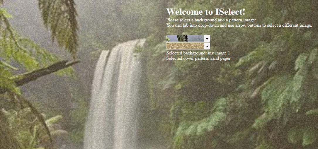
Have you ever wanted to have an easy to use component that looks exactly (almost) like a select tag with the added benefit of showing images, videos, webGL, or live streaming contents instead of words? Have you wanted to transform a select tag into a more
Have you ever wanted to have an easy to use component that looks exactly (almost) like a select tag with the added benefit of showing images, videos, webGL, or live streaming contents instead of words? Have you wanted to transform a select tag into a more meaningful drop-down when it comes to have a list of images, videos, webGLs, live streaming items to pick from? Have you thought of adding animation on images or having slide operation on user favorite items? If so, then welcome to Icon Select!
Live Demo | NPM | Comments/Requests
MODULE:
ISelectModule
EXPORTS
ISelect,
IconInfo,
IRenderer,
CSSImagePipe,
ISelectDirective
your data set should follow the following pattern. You do not need to worry about the id and ownerId as they will be set by the component at initialization time.
export interface IconInfo {
    id?: number, // auto generated
    ownerId?: string, // auto generated
    name: string, // item display name
    value: string, // item source URL
    poster?: string, // if not image, URL to image representing video, stream, or webGL
    type?: string, // if undefined defaults to image. types are image, video, stream, webGL
    animation?: string, // animation type to be performed on item
    opacity?: number, // item transparency
    selected?: boolean, // if item is selected
    disabled?: boolean, // if item is disabled
    repeat?: boolean, // if image type, should it be repeat position
    molded?: boolean, // if image, should it be displayed as pattern
    favorite?: boolean // if is user favorite for animation
}
Run npm install @sedeh/icon-select in your application. and do either of the following:
Sample usage through using i-select component or i-select directive.
    <i-select
        id="backgroundPicker"
        name="selectedBackground"
        [size]="6"
        [template]="temp1"
        [applyOpacity]="false"
        [entries]="pickData"
        [applyLayoutType]="true"
        [applyPattern]="true"
        [applyAnimation]="true"
        [slideShowEnabled]="true"
        [applySlideShow]="true"
        [searchEnabled]="true"
        [controlls]="myfonts"
        (ontoggle)="toggleSelection($event)"
        (onchange)="updateSelection($event)">
    </i-select>

    <select
        i-select
        id="overlayPicker1"
        size="6"
        name="selectedOverlay"
        [searchEnabled]="false"
        [applyOpacity]="true"
        [applyLayoutType]="false"
        [applyPattern]="false"
        [applyAnimation]="true"
        [applySlideShow]="true"
        [slideShowEnabled]="true"
        [controlls]="myfonts"
        (ontoggle)="toggleOverlay($event)"
        (change)="updateOverlay($event)" >
        <option *ngFor="let x of overlayData"
            [attr.opacity]="x.opacity"
            [attr.repeat]="x.repeat"
            [attr.animation]="x.animation"
            [attr.favorite]="x.favorite"
            [attr.pattern]="x.pattern"
            [selected]="x.selected ? 'true' : null"
            [value]="x.value"
            [textContent]="x.name"></option>
    </select>
    <ng-template #temp1>show something here...</ng-template>

<i-renderer *ngIf="selectedImage != null"
    refrenceId="backgroundPicker"
    [absolute]="true"
    [poster]="selectedImage.poster"
    [repeat]="selectedImage.repeat"
    [value]="selectedImage.value"
    [molded]="selectedImage.molded"
    [animation]="selectedImage.animation"
    [type]="selectedImage.type">

  <i-renderer *ngIf="selectedPattern != null"
    refrenceId="overlayPicker1"
    [value]="selectedPattern.value"
    [opacity]="selectedPattern.opacity >= 0 ? selectedPattern.opacity : null"
    [animation]="selectedPattern.animation"></i-renderer>
</i-renderer>
It is that simple..!! setting up a template is optional if you want to add a message or a control on the dropdown.
Now, with the above sample, you can build a background display setup with endless possibilities!
PLEASE NOTE: for i-renderer tag, since type will toggle actual display from video to image or webGL, i recommend to call it last in the tag. i noticed it makes a great difference at startup when default selected item is a video.
| Attribute | Description |
|---|---|
| searchEnabled | Display search field to find / filter images in the list. |
| size | Display size. number of images in the popup. |
| showIconName | Display name of the selected icon at the bottom of the image. |
| template | Area in which you can display additional content or input fields. |
| applyOpacity | Display a opacity input range section on the popup. |
| applyLayoutType | Display a check option to decide if image should repeat or fit. |
| applyPattern | Display a check option to enable / disable pettern generation on a selected image. This option makes it necessary to use i-renderer since it implements animations. |
| applySlideShow | Display Start a slide show from users favorite image. |
| slideShowEnabled | Indicates if user has enabled slide show. |
| applyAnimation | Display dropdown options to choose animation for selected image. |
| Available animation types are: grayout, sepia, fade, zoom, shake | |
| entries | List of all images to be displayed. |
| controlls | set of classes for display of pagination controlls if want to use glyph icons or font awesome instead of default control characters. |
| Attribute | Description |
|---|---|
| refrenceId | ID that corelates with the I-SELECt id. It should be exactly the same id as what is assigned to i-select. |
| absolute | If the view should have position absolute. |
| repeat | If the image sgould be styled to repeat. |
| molded | If the image sgould be styled to pattern. |
| animation | The name of animation to be applied on the view. |
| favorite | If the image is in user's favorite list. |
| value | The image URL or image data to be displayed. |
| Event | Description |
|---|---|
| onchange | Event that fires when an image is selected mainly to store selection. |
| ontoggle | Event that fires when an image is selected, highlighted, or toggled in slide show mainly to display the selected, highlighted, or slided item. |
| enabledShow | Fired when used enables/disables slide show. |
Removed dependency to font-awesome. However, you can still use font awesome or any other fonts to display icons. Forexample, to use font awesome, simply call
    <i-select [controlls] = "myFonts">

where myfonts = {
    firstPage: 'fa fa-angle-double-left',
    previousPage: 'fa fa-angle-left',
    nextPage: 'fa fa-angle-right',
    lastPage: 'fa fa-angle-double-right'
}
| Version | Description |
|---|---|
| 3.0.0 | Updated to angular 15. |
| 2.0.5 | minor updates to look and feel. |
| 2.0.4 | added total item display on pop panel. |
| 2.0.3 | null pointer exception fix on delayed loadabvle options. |
| 2.0.2 | Background image postioning on image selewct pop up is fixed. |
| 2.0.1 | fixed null pointer issue on stackblitz demo site. |
| 2.0.0 | Updated to Angular 8. |
| 1.6.3 | Removed "crossorigin" attribute from video and iframe tag to see if stackblitz would allow display of items with Mozilla browser. |
| 1.6.2 | Fixed autoplay of video at strartup. the key is to set the type last on i-renderer. |
| 1.6.1 | Fixed live stream issues on Safari and mozilla. IE is not supporting mjpg and will not resolve it for the time being. |
| 1.6.0 | Added ability to have live straming on the selector. |
| 1.5.3 | Fixed unicode error resulted from using controlls character when transpiling with aot option. |
| 1.5.2 | removed font-awesome dependency. however, you can still use font awesome if you please. |
| 1.5.1 | fixed a logical issue with preloading images when item type is not image. |
| 1.5.0 | Added ability to have video or webGL items in a select list. |
| 1.4.1 | Made the slideShowEnabled attribute accessible to the calling component. |
| 1.4.0 | Added option to have slide show of the favorite items in a list. |
| 1.3.0 | Added option to animate the image. |
| 1.2.6 | Added option to create pattern out of an image before displaying it. |
| 1.2.5 | Added section to allow image repeat or image fit. |
| 1.2.4 | Fixed situation when there is a default selected item in the list. |
| 1.2.3 | Added template and applyOpacity attributes. |
| 1.2.2 | Fixed accessibility issues. |
| 1.2.1 | Updated dependencies. |
| 1.2.0 | It was brought to my attention that some users have trouble using my components in their angular 6 environment. Since I had only updated few dependencies when moved to Angular 6, I am thinking dependencies are causing issues. So, for this release, I am updating all dependencies to what Angular 6 applications are expecting to have. Please let me know if this is fixing or not fixing any issues you are facing. |
| 1.1.0 | Updated libraries to become compatible with Angular 6+. |
| 1.0.0 | Compiled with AOT option and resolved issues. |
| 0.0.1 | Initial Release. |
FAQs
Have you ever wanted to have an easy to use component that looks exactly (almost) like a select tag with the added benefit of showing images, videos, webGL, or live streaming contents instead of words? Have you wanted to transform a select tag into a more
The npm package @sedeh/icon-select receives a total of 0 weekly downloads. As such, @sedeh/icon-select popularity was classified as not popular.
We found that @sedeh/icon-select demonstrated a healthy version release cadence and project activity because the last version was released less than a year ago. It has 1 open source maintainer collaborating on the project.
Did you know?

Socket for GitHub automatically highlights issues in each pull request and monitors the health of all your open source dependencies. Discover the contents of your packages and block harmful activity before you install or update your dependencies.
Security News
Maven Central now validates Sigstore signatures, making it easier for developers to verify the provenance of Java packages.

Security News
CISOs are racing to adopt AI for cybersecurity, but hurdles in budgets and governance may leave some falling behind in the fight against cyber threats.

Research
Security News
Socket researchers uncovered a backdoored typosquat of BoltDB in the Go ecosystem, exploiting Go Module Proxy caching to persist undetected for years.