
Security News
Risky Biz Podcast: AI Agents Are Raising the Stakes for Software Supply Chain Security
Open source attacks are accelerating as AI coding agents pull in dependencies faster, with less human review.
By Sarah Gooding - Jun 30, 2026
@sentinel-password/react-components
Advanced tools
Accessible, headless React components for @sentinel-password - password validation UI made simple

Accessible, headless React components for password validation, built on top of @sentinel-password/core.
Documentation | Interactive Playground | API Reference
useId()-linked label. Page-level conformance depends on the consumer's CSS (contrast) and surrounding markup — see Accessibility below.@sentinel-password/core is a regular dependency of this package (not a peer), so installing @sentinel-password/react-components automatically pulls in core. You only need to add core explicitly if you're importing from it directly elsewhere in your app.
npm install @sentinel-password/react-components
# or
pnpm add @sentinel-password/react-components
# or
yarn add @sentinel-password/react-components
Peer dependencies: React 18 or 19 and React DOM 18 or 19 — bring your own.
import { PasswordInput } from '@sentinel-password/react-components'

function MyForm() {
  return (
    <form>
      <PasswordInput
        label="Password"
        onValidationChange={(result) => {
          console.log('Valid:', result.valid)
          console.log('Strength:', result.strength)
        }}
      />
    </form>
  )
}
A headless password input component with built-in validation.
<PasswordInput
  label="Password"
  description="Enter a strong password"
  onValidationChange={(result) => console.log(result)}
  onChange={(value) => console.log(value)}
  showPassword={false}
  onShowPasswordChange={(show) => console.log(show)}
  validateOnMount={false}
  debounceMs={300}
/>
| Prop | Type | Default | Description |
|---|---|---|---|
label | string | required | Accessible label rendered as <label> |
description | string | — | Helper text linked via aria-describedby |
value | string | — | Controlled value. Any defined value flips the component to controlled mode — see the Controlled vs Uncontrolled rules. |
defaultValue | string | — | Uncontrolled initial value. Silently ignored if value is defined. |
onChange | (value: string) => void | — | Fired with the new string value (not the event) |
onValidationChange | (result: ValidationResult) => void | — | Fired whenever validation completes |
onShowPasswordChange | (show: boolean) => void | — | Fired when the show/hide toggle changes state |
showPassword | boolean | uncontrolled | Controlled show/hide state — omit for uncontrolled toggle |
validateOnMount | boolean | false | Validate the initial value once on mount — only if value/defaultValue is non-empty. Uses the debounced path; set debounceMs: 0 for synchronous mount validation. |
validateOnChange | boolean | true | Validate on every change (debounced). Set to false to disable change-driven validation. |
debounceMs | number | 300 | Debounce delay in milliseconds. 0 validates synchronously. |
showValidationMessages | boolean | true | Render the validation messages <div role="alert">. Set to false to suppress the messages and render your own. |
showToggleButton | boolean | true | Render the show/hide password button. Set to false to suppress (e.g., for a localized custom toggle). |
containerClassName | string | '' | Class on the outer <div> wrapper |
labelClassName | string | '' | Class on <label> |
descriptionClassName | string | '' | Class on the description <div> |
inputWrapperClassName | string | '' | Class on the <input> + toggle wrapper |
toggleButtonClassName | string | '' | Class on the show/hide <button> |
validationClassName | string | '' | Class on the validation messages <div> |
className (and other standard input attrs) | — | — | Forwarded to the underlying <input> (className, name, placeholder, autoFocus, etc.). See the "reserved" list below for the exceptions. |
Most standard HTML input attributes are forwarded to the underlying <input> — for example name, placeholder, className, style, autoFocus, required, minLength, maxLength, pattern, inputMode, onFocus, onBlur, and data-*.
A handful are reserved by the component for its a11y and controlled-state internals — passing them is harmless but has no effect at runtime:
id — generated via useId() so the <label> can be associated correctlyaria-describedby / aria-invalid — managed for validation feedbackautoComplete — hardcoded to "new-password"ref — not forwarded (the component is not wrapped in React.forwardRef)type — toggled internally between "password" and "text"; omitted from the props typeonChange — replaced with the (value: string) => void signature documented aboveonKeyDown is wrapped (the component handles Escape to clear the input, then calls your handler for all keys) rather than overridden.
See the API reference for the full table and the controlled-vs-uncontrolled rules.
The component is designed to meet WCAG 2.1 AAA criteria when integrated correctly. It provides:
<label htmlFor> linked to the input via useId())aria-invalid (true/omitted), aria-describedby, aria-pressed on the toggle buttonrole="alert" aria-live="polite" aria-atomic="true") that mounts only when there's feedback to announceTab between input and toggle, Escape to clear the input, Space/Enter on the toggle buttonThe consumer is responsible for:
aria-label ("Show password"/"Hide password") on the visibility toggle are not configurable today. For non-English locales, swap showToggleButton={false} and render your own localized toggle, or stay tuned for toggleShowText/toggleHideText props in a future release.@sentinel-password/core - Core validation engine (zero dependencies)@sentinel-password/react - React hook for password validationMIT © Aleksei Kankov
FAQs
Accessible, headless React components for @sentinel-password - password validation UI made simple
The npm package @sentinel-password/react-components receives a total of 3,231 weekly downloads. As such, @sentinel-password/react-components popularity was classified as popular.
We found that @sentinel-password/react-components demonstrated a healthy version release cadence and project activity because the last version was released less than a year ago. It has 1 open source maintainer collaborating on the project.
Did you know?

Socket for GitHub automatically highlights issues in each pull request and monitors the health of all your open source dependencies. Discover the contents of your packages and block harmful activity before you install or update your dependencies.
Security News
Open source attacks are accelerating as AI coding agents pull in dependencies faster, with less human review.

Research
/Security News
Malicious Chrome and Firefox extensions posed as free VPNs while stealing clipboard data through later extension updates.
Research
/Security News
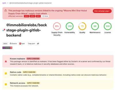
Miasma Mini Shai-Hulud hits @immobiliarelabs Backstage plugins, targeting GitLab and LDAP auth packages on npm.