New Case Study:See how Anthropic automated 95% of dependency reviews with Socket.Learn More
Socket
Sign inDemoInstall
Socket

@snakedin/react-data-list

Package Overview
Dependencies
Maintainers
1
Versions
3
Alerts
File Explorer

Advanced tools

Socket logo

Install Socket

Detect and block malicious and high-risk dependencies

Install

@snakedin/react-data-list

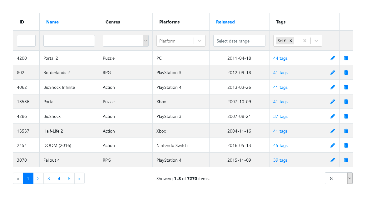
React DataList is a lightweight, fast and fully customized component for creating data tables with sorting, filtering and paging support. An excellent choice for the admin centers or the control panels.

  • 1.0.2
  • latest
  • Source
  • npm
  • Socket score

Version published
Weekly downloads
52
decreased by-25.71%
Maintainers
1
Weekly downloads
 
Created
Source

React DataList

React DataList is a lightweight, fast and fully customized component for creating data tables with sorting, filtering and paging support. An excellent choice for the admin centers or the control panels.

Installing

npm install @snakedin/react-data-list
Usage without Bootstrap

By default, DataList uses Bootstrap styles to show tables. If you want to use DataList without Bootstrap, you need to import an additional file with styles:

import '@snakedin/react-data-list/dist/themes/without-bootstrap.css';

Demo examples

API Reference

DataList
Prop nameTypeDescriptionDefault value
classNameHeadStringTable head (<thead>) class name"thead-light"
classNamePagerStringPage list (<ul>) class name"pagination mb-0 justify-content-center justify-content-lg-start"
classNameRowStringTable content rows (<tr>) class name""
classNameTableStringTable (<table>) class name"table table-striped table-hover table-bordered"
defaultFilterObjectInitial filter values (name: value){}
defaultPagerObjectInitial pager and sort by values{ page: 1, pageSize: 10, sortBy: ''}
enableSortingBooleanTo disable sorting for all columns, set this param to falsetrue
extractIdFunctionThis function can be used to extract each row unique key.

By default component will use the id key.
(item) => item.id
localeObjectObject with localized interface elements.{}
onErrorFunctionThis function can be used to override the default errors handler.
onParamsChangedFunctionThis function can be used to override the default params changing behaviour.
pageShowMaxNumberSpecifies the maximum number of pages to be displayed in the page bar.10
pageSizesArray of numbersAn array of allowed page sizes. Also it will be used in switch page sizes dropdown list.[10, 20, 30]
providerFunction, ArrayRequired. The data provider for the view. It can be an array of objects, an async function, or an instance of the special FetchProvider helper class.
renderErrorFunctionThis function can be used to override the default error message.
renderLoadingFunctionThis function can be used to override the default loading indicator.
renderPageBarFunctionThis function can be used to change page bar render.
renderPageSummaryFunctionThis function can be used to change page summary text.
renderTemplateFunctionA function that receives table and pageBar arguments and is used to determine the order of displaying component's parts.

For example, you can show page bar above the table or show two page bars above and below the table.
showFilterBooleanWhether the filter row should be shown.true
showPageBarBooleanWhether the page bar should be shown.true
showPageNextBooleanWhether the "Next page" button should be shown.true
showPagePreviousBooleanWhether the "Previous page" button should be shown.true
Column
Prop nameTypeDescriptionDefault value
contentAttributesObjectThe HTML attributes for the content cell td.
headerAttributesObjectThe HTML attributes for the head cell td.
idStringRequired. The unique ID for the column.
filterObject, Function, BooleanIf true is passed, text input will be used for filtering.
If false is passed, filtering will be disabled for this column.
If object is passed, this object should contain type field (text, select, react-select or date).
You can use your own filters by passing a function in this property.
true
labelStringLabel to be displayed in the header cell. If this property is not set, id of the column will be used.
sortString, BooleanIf true is passed, column's id will be used for sorting.
If string is passed, this string will be used for sorting.
If false is passed, sorting will be disabled for this column.
true
valueFunctionBy default, item[Column's ID] will be used to display in the cell.

This function can be used to change the rendered value in the cell.

Development

If you want to experiment with examples in your local environment:

$ git clone https://github.com/snakedin/react-data-list.git .
$ npm install 
$ npm start

Keywords

FAQs

Package last updated on 14 Aug 2020

Did you know?

Socket

Socket for GitHub automatically highlights issues in each pull request and monitors the health of all your open source dependencies. Discover the contents of your packages and block harmful activity before you install or update your dependencies.

Install

Related posts

SocketSocket SOC 2 Logo

Product

  • Package Alerts
  • Integrations
  • Docs
  • Pricing
  • FAQ
  • Roadmap
  • Changelog

Packages

npm

Stay in touch

Get open source security insights delivered straight into your inbox.


  • Terms
  • Privacy
  • Security

Made with ⚡️ by Socket Inc