Research
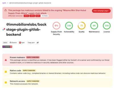
/Security News
Miasma Mini Shai-Hulud Hits ImmobiliareLabs npm Packages
Miasma Mini Shai-Hulud hits @immobiliarelabs Backstage plugins, targeting GitLab and LDAP auth packages on npm.
By Socket Research Team - Jun 26, 2026
@spark-web/text-link
Advanced tools
--- title: Text Link storybookPath: navigation-textlink--default isExperimentalPackage: true ---
NOTE: These components must be nested within a Text or Heading component.
Text links take users to another place in the application, and usually appear within or directly following a sentence. Styled to resemble a hyperlink.
<Text>
This is some text containing a <TextLink href="#">text link</TextLink>
</Text>
The font-size is inherited from the parent Text component.
<Text size="small">
  A <TextLink href="#">text link</TextLink> inheriting the parent's “small”
  font-size
</Text>
This component renders a native anchor element by default, which can be
customised via the linkComponent prop on the SparkProvider component.
The TextLink component also extends native HTML a anchor props and are not
listed here.
Even though it looks like a text link, this is actually a semantic button.
<Text>
  <TextLinkButton>Visually a link, with button semantics</TextLinkButton>
</Text>
The TextLinkButton component also extends native HTML span props and are not
listed here.
FAQs
--- title: Text Link storybookPath: navigation-textlink--default isExperimentalPackage: true ---
The npm package @spark-web/text-link receives a total of 941 weekly downloads. As such, @spark-web/text-link popularity was classified as not popular.
We found that @spark-web/text-link demonstrated a healthy version release cadence and project activity because the last version was released less than a year ago. It has 2 open source maintainers collaborating on the project.
Did you know?

Socket for GitHub automatically highlights issues in each pull request and monitors the health of all your open source dependencies. Discover the contents of your packages and block harmful activity before you install or update your dependencies.
Research
/Security News
Miasma Mini Shai-Hulud hits @immobiliarelabs Backstage plugins, targeting GitLab and LDAP auth packages on npm.

Security News
Rolldown paused Rust React Compiler integration after a 5MB binary size increase raised concerns about shipping React-specific code to all Vite users.

Security News
/Research
Mini Shai-Hulud expands into the Go ecosystem after hitting LeoPlatform npm packages and targeting GitHub Actions workflows.