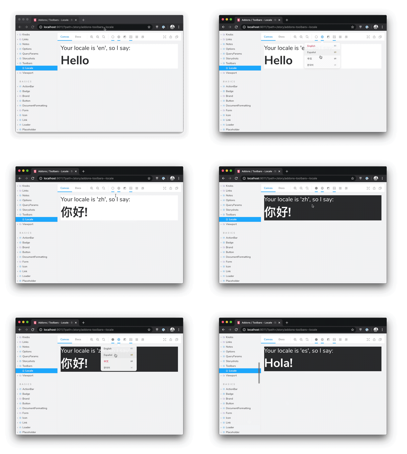
What is @storybook/addon-toolbars?
The @storybook/addon-toolbars package allows developers to add custom toolbars to their Storybook UI. These toolbars can be used to control various aspects of the stories being displayed, such as themes, locales, or any other context that might need to be adjusted dynamically. It enhances the development experience by providing a more interactive and customizable environment for testing UI components.
What are @storybook/addon-toolbars's main functionalities?
Global Toolbars
This feature allows you to add global toolbars that affect all stories. In the code sample, a global 'Theme' toolbar is defined with 'light', 'dark', and 'custom' options.
export const globalTypes = {
theme: {
name: 'Theme',
description: 'Global theme for components',
defaultValue: 'light',
toolbar: {
icon: 'circlehollow',
items: ['light', 'dark', 'custom'],
showName: true,
},
},
};
Story-Specific Toolbars
This feature allows you to use toolbars to control story-specific parameters. The code sample shows a decorator that wraps the story in a ThemeProvider, which uses the global 'theme' parameter set by the toolbar.
export const decorators = [
  (Story, context) => (
    <ThemeProvider theme={context.globals.theme}>
      <Story />
    </ThemeProvider>
  ),
];
Other packages similar to @storybook/addon-toolbars
@storybook/addon-knobs
The @storybook/addon-knobs package allows developers to add UI controls to tweak the component props in real-time. It is similar to @storybook/addon-toolbars in that it provides a way to dynamically adjust the presentation of components, but it focuses more on component props rather than global contexts.
@storybook/addon-controls
The @storybook/addon-controls package is a successor to @storybook/addon-knobs. It automatically generates controls based on component properties and provides a more integrated and less manual approach compared to @storybook/addon-toolbars, which is more about setting global contexts.
@storybook/addon-contexts
The @storybook/addon-contexts package allows you to provide contextual data to your stories, such as themes or internationalization. It is similar to @storybook/addon-toolbars in that it can be used to switch contexts, but it does so through a different UI approach, using a panel rather than a toolbar.
Storybook Toolbars Addon
The Toolbars addon controls global story rendering options from Storybook's toolbar UI. It's a general purpose addon that can be used to:
- set a theme for your components
- set your components' internationalization (i18n) locale
- configure just about anything in Storybook that makes use of a global variable
Framework Support

Installation
Toolbars is part of essentials and so is installed in all new Storybooks by default. If you need to add it to your Storybook, you can run:
npm i -D @storybook/addon-toolbars
Then, add following content to .storybook/main.js:
export default {
  addons: ['@storybook/addon-toolbars'],
};
Usage
The usage is documented in the documentation.
FAQs
How does this compare to addon-contexts?
Addon-toolbars is the successor to addon-contexts, which provided convenient global toolbars in Storybook's toolbar.
The primary difference between the two packages is that addon-toolbars makes use of Storybook's new Story Args feature, which has the following advantages:
-
Standardization. Args are built into Storybook in 6.x. Since addon-toolbars is based on args, you don't need to learn any addon-specific APIs to use it.
-
Ergonomics. Global args are easy to consume in stories, in Storybook Docs, or even in other addons.
- Framework compatibility. Args are completely framework-independent, so
addon-toolbars is compatible with React, Vue 3, Angular, etc. out of the box with no framework logic needed in the addon.


