Product
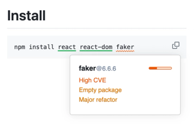
New Socket Web Extension, Take Socket with You
Can you spot malicious malicious packages on the web at a glance? Socket can. Check out our updated Web Extension!
By Vincent Grastic - Aug 14, 2024
@storybook/docs-tools
Advanced tools
Shared utility functions for frameworks to implement docs
Package description
The @storybook/docs-tools package is a part of the Storybook ecosystem, designed to enhance the documentation capabilities within Storybook. It provides tools and utilities to help developers create better documentation for their UI components, integrating seamlessly with Storybook's UI component development environment.
MDX Support
Enables writing documentation using MDX (Markdown for JSX), which allows for rich and interactive documentation. This feature lets you embed live examples and props tables directly in your markdown files.
import { Meta, Story, ArgsTable, Primary } from '@storybook/addon-docs/blocks';
<Meta title='Your Component Title' />
<Story name='Default View' height='400px'>
<YourComponent />
</Story>
<ArgsTable of={YourComponent} />Component Props Table
Automatically generates and displays a table of properties (props) for your components. This is useful for documenting the different props that can be used with a component, including types, default values, and descriptions.
import { ArgsTable } from '@storybook/addon-docs/blocks';
<ArgsTable of={YourComponent} />
Custom Doc Blocks
Allows the creation of custom documentation blocks within MDX files, enabling more structured and styled documentation. This feature supports various blocks like Title, Subtitle, Description, and more.
import { Title, Subtitle, Description, Primary } from '@storybook/addon-docs/blocks';
<Title>My Custom Component</Title>
<Subtitle>Component Subtitle</Subtitle>
<Description>{`This is a detailed description of the custom component.`}</Description>
<Primary>/* Render your component here */</Primary>React Docgen automatically parses React component files to extract prop types and descriptions. It's similar to @storybook/docs-tools in that it helps generate documentation for components, but it does not integrate directly with Storybook or support MDX.
Docusaurus is a static site generator that can be used for creating project documentation. Unlike @storybook/docs-tools, which is specifically tailored for Storybook and UI components, Docusaurus provides a more general approach to documentation across different frameworks and libraries.
Changelog
7.0.0-alpha.54 (November 25, 2022)
lib/addons into manager & preview part, move code to manager-api #19952api to manager-api #19944preview-api package #19749Readme
Shared utility functions for frameworks to implement docs:
This library is used by most framework packages so it and its dependencies should be minimized
FAQs
Shared utility functions for frameworks to implement docs
The npm package @storybook/docs-tools receives a total of 3,634,063 weekly downloads. As such, @storybook/docs-tools popularity was classified as popular.
We found that @storybook/docs-tools demonstrated a healthy version release cadence and project activity because the last version was released less than a year ago. It has 11 open source maintainers collaborating on the project.
Did you know?

Socket for GitHub automatically highlights issues in each pull request and monitors the health of all your open source dependencies. Discover the contents of your packages and block harmful activity before you install or update your dependencies.
Product
Can you spot malicious malicious packages on the web at a glance? Socket can. Check out our updated Web Extension!
Product
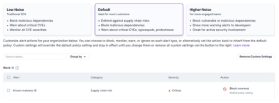
Socket introduces three new customizable default security policies for users to choose from: Low Noise (traditional SCA), Default, and Higher Noise.

Security News
MITRE has just minted its 400th CNA, as the NVD struggles to tame its backlog of CVEs awaiting analysis, which has increased by 30% since June.