
Product
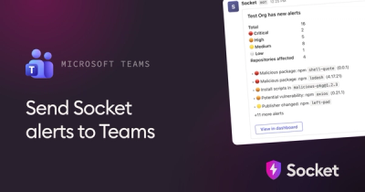
Microsoft Teams Notifications Are Now Available in Socket
Socket can now send alerts and supply chain attack notifications to Microsoft Teams, with filters that route the right updates to each channel.
By Jeppe Hasseriis - Sep 01, 2026
@synap-core/ui-system
Advanced tools
Synap's comprehensive design system built with Tamagui 1.141.5.
A universal UI system for web and native featuring shadow-based depth, dual theme identity (Amber/Cyan), glassmorphism, and tactile interactions.
This is a private workspace package. Import from within the monorepo:
import {
Button,
Card,
YStack,
XStack,
Text,
useTheme,
useThemeMode,
} from '@synap/ui-system';
import { Button, Card, YStack, Text } from '@synap/ui-system';

export function MyComponent() {
  return (
    <Card elevation="md" padding="$6">
      <YStack gap="$4">
        <Text fontSize="$6" fontWeight="600">
          Welcome to Synap
        </Text>
        <Button variant="primary" size="md">
          Get Started
        </Button>
      </YStack>
    </Card>
  );
}
import { YStack, Text, useTheme } from '@synap/ui-system';

export function ThemedComponent() {
  const theme = useTheme();

  return (
    <YStack backgroundColor="$background" padding="$4">
      <Text color="$color">This text adapts to theme</Text>
      <Text color="$primary">Primary color (Amber in light, Cyan in dark)</Text>
    </YStack>
  );
}
<YStack
  padding="$4"
  $gtMd={{ padding: '$8' }}
  $gtLg={{ padding: '$12' }}
>
  Responsive padding
</YStack>
// Semantic colors (theme-aware)
$primary        // Amber (light) / Cyan (dark)
$secondary      // Cyan (light) / Amber (dark)
$ai             // Emerald (constant across modes)
$success        // Emerald
$error          // Red
$warning        // Amber
$info           // Cyan

// UI colors
$color          // Text color
$background     // Background color
$muted          // Secondary text
$borderColor    // Border color
$1: 4px    $2: 8px    $3: 12px   $4: 16px
$5: 20px   $6: 24px   $8: 32px   $12: 48px
// Font sizes
$4: 14px   $5: 16px   $6: 18px   $7: 20px

// Fonts
$heading   // Fraunces (serif)
$body      // DM Sans (sans-serif)
import { TamaguiProvider, Theme } from '@synap/ui-system';
import config from '@synap/ui-system/config';

<TamaguiProvider config={config}>
  <Theme name="light"> {/* or "dark" */}
    <App />
  </Theme>
</TamaguiProvider>
import { useThemeMode } from '@synap/ui-system';

const isDark = useThemeMode();
const iconColor = isDark ? '#22D3EE' : '#D97706';
For overlays, modals, command palette:
<YStack
  backgroundColor="$glassBackground"
  borderWidth={1}
  borderColor="$glassBorder"
  borderRadius="$4"
  style={{
    backdropFilter: 'blur(20px)',
    WebkitBackdropFilter: 'blur(20px)',
  }}
>
  Glass content
</YStack>
DO:
$primary, $4) instead of hard-coded valuesDON'T:
packages/core/ui-system/
├── src/
│   ├── components/          # Component implementations
│   │   ├── Button.tsx
│   │   ├── Card.tsx
│   │   ├── Input.tsx
│   │   ├── ModernInput.tsx
│   │   ├── SearchBar.tsx
│   │   ├── AIInsightCard.tsx
│   │   ├── Badge.tsx
│   │   ├── Checkbox.tsx
│   │   ├── Radio.tsx
│   │   ├── Switch.tsx
│   │   └── ...
│   ├── layout/              # Layout components
│   │   ├── Panel.tsx
│   │   ├── Resizable.tsx
│   │   └── Stack.tsx
│   ├── hooks/               # Custom hooks
│   │   └── useThemeMode.ts
│   ├── tamagui.config.ts    # Tamagui configuration
│   ├── themes.ts            # Theme definitions
│   └── index.ts             # Main exports
├── package.json
└── README.md
This is a source package (no build step). TypeScript source is exported directly and transpiled by Next.js.
{
  "exports": {
    ".": "./src/index.ts"
  }
}
cd packages/core/ui-system
pnpm type-check
Private - Synap Monorepo
For questions or issues:
src/components/FAQs
Synap design system built with Tamagui
The npm package @synap-core/ui-system receives a total of 6 weekly downloads. As such, @synap-core/ui-system popularity was classified as not popular.
We found that @synap-core/ui-system demonstrated a healthy version release cadence and project activity because the last version was released less than a year ago. It has 1 open source maintainer collaborating on the project.
Product
Socket can now send alerts and supply chain attack notifications to Microsoft Teams, with filters that route the right updates to each channel.
Security News
pnpm 12 rewrites the package manager in Rust, cutting install times by up to 90% while preserving pnpm 11 workflows and lockfiles.
Security News
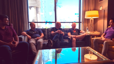
Socket CTO Ahmad Nassri joins AppSec leaders at Black Hat to discuss active malware, package manager risks, and software supply chain defense.