
Security News
PyPI’s New Archival Feature Closes a Major Security Gap
PyPI now allows maintainers to archive projects, improving security and helping users make informed decisions about their dependencies.
By Sarah Gooding - Jan 30, 2025
@syncfusion/ej2-ng-inputs
Advanced tools
A package of Essential JS 2 Input textbox components. It comes with a collection of form components which is useful to get different input values from the users such as text, numbers, patterns, color and file inputs.

Input is part of Syncfusion Essential JS 2 commercial program. License is available in two models Community and Paid. Please refer the license file for more information. License can be obtained by registering at https://www.syncfusion.com/downloads/essential-js2
To install Input and its dependent packages, use the following command
npm install @syncfusion/ej2-ng-inputs
Following list of components are available in the package.
ColorPicker - Color picker is a user interface that is used to select and adjust color values.
TextBox - The text box component is an extended version of the HTML input control which is used to edit or display text input on a form.
MaskedTextBox - MaskedTextBox allows the user to enter the valid input only based on the provided mask.
NumericTextBox - NumericTextBox is used to get the number inputs from the user. The input values can be incremented or decremented by a predefined step value.
Slider - The slider component allows you to select a value or range of values between the min and max range.
Uploader - The uploader component is an extended version of the HTML5 upload control which is used to upload images, documents, and other files to a server.
Input component is also offered in following list of frameworks.
Red Green Blue, Hue Saturation Value and Hex codes.Picker and Palette mode.opacity of the selected color.Product support is available for through following mediums.
syncfusion, ej2.Check the license detail here.
Check the changelog here
FAQs
Essential JS 2 Input Components for Angular
We found that @syncfusion/ej2-ng-inputs demonstrated a not healthy version release cadence and project activity because the last version was released a year ago. It has 2 open source maintainers collaborating on the project.
Did you know?

Socket for GitHub automatically highlights issues in each pull request and monitors the health of all your open source dependencies. Discover the contents of your packages and block harmful activity before you install or update your dependencies.
Security News
PyPI now allows maintainers to archive projects, improving security and helping users make informed decisions about their dependencies.

Research
Security News
Malicious npm package postcss-optimizer delivers BeaverTail malware, targeting developer systems; similarities to past campaigns suggest a North Korean connection.
Security News
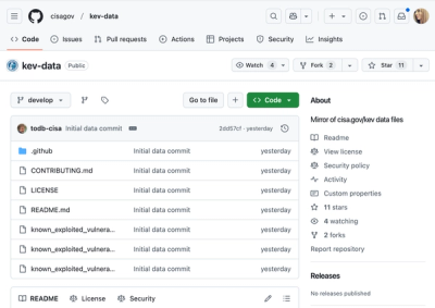
CISA's KEV data is now on GitHub, offering easier access, API integration, commit history tracking, and automated updates for security teams and researchers.