Research
Security News
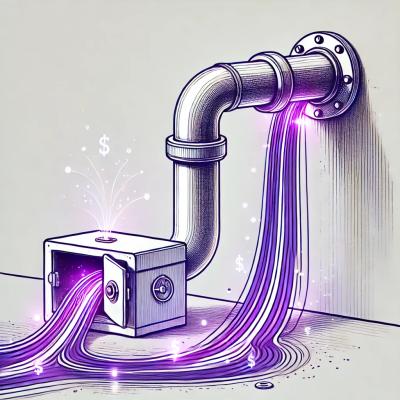
Malicious npm Package Targets Solana Developers and Hijacks Funds
A malicious npm package targets Solana developers, rerouting funds in 2% of transactions to a hardcoded address.
By Socket Research Team - Dec 02, 2024
@syncfusion/ej2-react-layouts
Advanced tools
A package of Essential JS 2 layout pure CSS components such as card and avatar. The card is used as small container to show content in specific structure, whereas the avatars are icons, initials or figures representing particular person. for React
The layout package contains cards, avatars, splitter, timeline and Dashboard Layout components.
The card is a small container in which user can show defined content in specific structure.
The avatars are icons, initials or figures representing a particular person, used in popular media formats like images, SVG, font icons, and letters.
The splitter is container component which used to construct different layouts using multiple and nested panes.
The timeline is a tool for displaying chronological information effortlessly within your application. It offers a visually compelling and user-friendly experience for showcasing user activities, tracking progress, or narrating historical timelines.
The DashboardLayout is a grid structured layout component that helps to create a dashboard with panels. Panels hold the UI components and allow resize, reorder, drag-n-drop, remove and add options. This allows users to easily place the components at the desired position within the grid layout.

This is a commercial product and requires a paid license for possession or use. Syncfusion’s licensed software, including this component, is subject to the terms and conditions of Syncfusion's EULA. To acquire a license, you can purchase or start a free 30-day trial here.
A free community license is also available for companies and individuals whose organizations have less than $1 million USD in annual gross revenue and five or fewer developers.
To install Layout components and its dependent packages, use the following command.
npm install @syncfusion/ej2-react-layouts
Following list of components are available in the package
React Card - Container used to display content in specific structure.
React Avatar - Used to add images or initials or icons in different shapes and sizes to your application.
React Splitter - Used to construct a different layout using its multiple and nested panes with resizable.
React Timeline - Used to build timelines to showcases user activities, tracking progress, narrating historical timelines, and more.
React Dashboard Layout - Used to build dashboards with panels that holds the UI components and allow resize, reorder, drag-n-drop, remove and add options.
These components are available in following list of:
Card
Header - Header supports to include title, subtitle along with image.
Images and Title - Support to include images with customizable caption positions in it.
Action Buttons - Supports to add buttons within the card either in vertical or horizontal alignment.
Horizontal Card - Allows to align card elements horizontally and also allows to stack the content vertically within horizontal alignment.
Avatar
Splitter
Multiple Panes - Provided an option to configure more than two panes.
Resizable Panes - Supports resizable to adjust its pane size dynamically.
Orientation - The panes can orient either horizontally or vertically.
Integration - Other React UI components can be integrated within panes.
Nested Panes - Another splitter can be integrated within panes to create a complex layout.
Timeline
Orientation - Display items in a horizontal or vertical orientation.
Opposite content - Display additional information opposite to the item content.
Items alignment - Items content and opposite content can be aligned - before, after, alternate, or alternate reverse.
Reverse timeline - Shows the timeline items in the reverse order.
Templates - Customize the default appearance, including styling the dot item, templated content, and more.
Dashboard Layout
Drag and Drop - Allows drag and drop of panels at the desired location within the dashboard.
Floating - Floats the panels upward when the dragging option is enabled.
Resizing - Support to resize the panels in any direction as per the requirement.
MediaQuery - Allows the panels to be stacked when the specified resolution is met.
Product support is available for through following mediums.
syncfusion and ej2.Check the license detail here.
Check the changelog here
© Copyright 2024 Syncfusion, Inc. All Rights Reserved. The Syncfusion Essential Studio license and copyright applies to this distribution.
FAQs
A package of Essential JS 2 layout pure CSS components such as card and avatar. The card is used as small container to show content in specific structure, whereas the avatars are icons, initials or figures representing particular person. for React
We found that @syncfusion/ej2-react-layouts demonstrated a healthy version release cadence and project activity because the last version was released less than a year ago. It has 0 open source maintainers collaborating on the project.
Did you know?

Socket for GitHub automatically highlights issues in each pull request and monitors the health of all your open source dependencies. Discover the contents of your packages and block harmful activity before you install or update your dependencies.
Research
Security News
A malicious npm package targets Solana developers, rerouting funds in 2% of transactions to a hardcoded address.

Security News
Research
Socket researchers have discovered malicious npm packages targeting crypto developers, stealing credentials and wallet data using spyware delivered through typosquats of popular cryptographic libraries.
Security News
Socket's package search now displays weekly downloads for npm packages, helping developers quickly assess popularity and make more informed decisions.