
Security News
GitHub Removes Malicious Pull Requests Targeting Open Source Repositories
GitHub removed 27 malicious pull requests attempting to inject harmful code across multiple open source repositories, in another round of low-effort attacks.
@syncfusion/ej2-vue-calendars
Advanced tools
A complete package of date or time components with built-in features such as date formatting, inline editing, multiple (range) selection, range restriction, month and year selection, strict mode, and globalization. for Vue
The Vue Calendars package contains date and time components such as calendar, date picker, date range picker, date time picker, and time picker. These components come with options to disable dates, restrict selection, and show custom events.
The Vue Calendars package includes the following list of components.
The Vue Calendar component is a graphical user interface component that displays a Gregorian or Islamic Calendar and allows selection of a date.
Getting Started . Online demos . Learn more
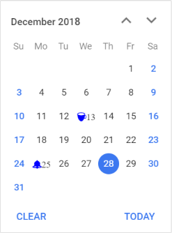
min and max properties.month, year, and decade views that provide flexibility to select dates.The Vue DatePicker component is a lightweight and mobile-friendly component that allows end users to enter or select a date value. It has month, year, and decade view options to quickly navigate to the desired date. It supports minimum dates, maximum dates, and disabled dates to restrict the date selection.
Getting Started . Online demos . Learn more
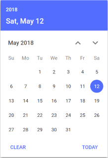
The Vue TimePicker component is a simple and intuitive interface component that allows selection of a time value from the popup list or setting a desired time value.
Getting Started . Online demos . Learn more
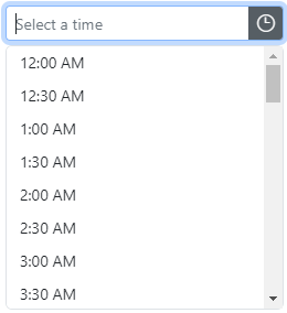
min and max properties.The Vue DateTimePicker component is a graphical user interface component that allows an end user to enter or select a date and time values from a pop-up calendar and time list pop-up.
Getting Started . Online demos . Learn more
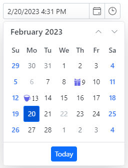
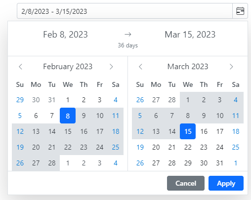
min and max properties.The Vue DateRangePicker component is a graphical user interface control that allows an end user to select start and end date values as a range from a calendar pop-up or by entering the value directly in the input element.
Getting Started . Online demos . Learn more
Trusted by the world's leading companies

To install calendars and its dependent packages, use the following command.
npm install @syncfusion/ej2-vue-calendars
Calendar components are also offered in the following list of frameworks.
 JavaScript |  React |  Angular |  ASP.NET Core |  ASP.NET MVC |
|---|
Product support is available through following mediums.
Check the changelog here. Get minor improvements and bug fixes every week to stay up to date with frequent updates.
This is a commercial product and requires a paid license for possession or use. Syncfusion’s licensed software, including this component, is subject to the terms and conditions of Syncfusion's EULA. To acquire a license for 80+ Vue UI components, you can purchase or start a free 30-day trial.
A free community license is also available for companies and individuals whose organizations have less than $1 million USD in annual gross revenue and five or fewer developers.
See LICENSE FILE for more info.
© Copyright 2023 Syncfusion, Inc. All Rights Reserved. The Syncfusion Essential Studio license and copyright applies to this distribution.
FAQs
A complete package of date or time components with built-in features such as date formatting, inline editing, multiple (range) selection, range restriction, month and year selection, strict mode, and globalization. for Vue
The npm package @syncfusion/ej2-vue-calendars receives a total of 0 weekly downloads. As such, @syncfusion/ej2-vue-calendars popularity was classified as not popular.
We found that @syncfusion/ej2-vue-calendars demonstrated a healthy version release cadence and project activity because the last version was released less than a year ago. It has 0 open source maintainers collaborating on the project.
Did you know?

Socket for GitHub automatically highlights issues in each pull request and monitors the health of all your open source dependencies. Discover the contents of your packages and block harmful activity before you install or update your dependencies.

Security News
GitHub removed 27 malicious pull requests attempting to inject harmful code across multiple open source repositories, in another round of low-effort attacks.

Security News
RubyGems.org has added a new "maintainer" role that allows for publishing new versions of gems. This new permission type is aimed at improving security for gem owners and the service overall.

Security News
Node.js will be enforcing stricter semver-major PR policies a month before major releases to enhance stability and ensure reliable release candidates.