Security News
Deno 2.2 Improves Dependency Management and Expands Node.js Compatibility
Deno 2.2 enhances Node.js compatibility, improves dependency management, adds OpenTelemetry support, and expands linting and task automation for developers.
@syncfusion/ej2-vue-diagrams
Advanced tools
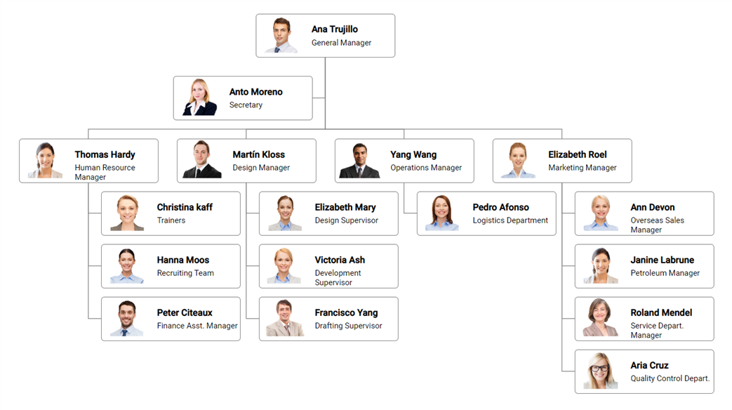
Feature-rich diagram control to create diagrams like flow charts, organizational charts, mind maps, and BPMN diagrams. Its rich feature set includes built-in shapes, editing, serializing, exporting, printing, overview, data binding, and automatic layouts.
The Vue Diagram component is used for visualizing, creating, and editing interactive diagrams. It supports creating flowcharts, organizational charts, mind maps, floor plans, UML diagrams, and BPMN charts either through code or a visual interface.
Getting started . Online demos . Learn more

Trusted by the world's leading companies

You can use Vue CLI to setup your Vue 2 applications.To install Vue CLI use the following commands.
npm install -g @vue/cli
vue create quickstart
cd quickstart
npm run serve
Initiating a new project prompts us to choose the type of project to be used for the current application. Select the option Default ([Vue 2] babel, eslint) from the menu.
All Syncfusion Vue packages are published in npmjs.com registry. To install Vue diagram package, use the following command.
npm install @syncfusion/ej2-vue-diagrams --save
You can register the Diagram component in your application by using the Vue.use(). Refer to the code example given below.
import { DiagramPlugin } from '@syncfusion/ej2-vue-diagrams';

Vue.use(DiagramPlugin);
Registering DiagramPlugin in vue, will register the diagram component along with its required child directives globally.
Add CSS references needed for Diagram in style section of the App.vue file from ../node_modules/@syncfusion package folder.
<style>
@import "../node_modules/@syncfusion/ej2-diagrams/styles/material.css";
@import "../node_modules/@syncfusion/ej2-vue-diagrams/styles/material.css";
@import "../node_modules/@syncfusion/ej2-base/styles/material.css";
@import "../node_modules/@syncfusion/ej2-popups/styles/material.css";
@import "../node_modules/@syncfusion/ej2-splitbuttons/styles/material.css";
@import "../node_modules/@syncfusion/ej2-navigations/styles/material.css";
</style>
Add the Vue Diagram by using ejs-diagram selector in template section of the App.vue file.
<template>
    <div id="app">
        <ejs-diagram id="diagram"  :width='width' :height='height' :nodes='nodes' :connectors='connectors'></ejs-diagram>
    </div>
</template>
<script>
import Vue from "vue";
import { DiagramPlugin } from "@syncfusion/ej2-vue-diagrams";

Vue.use(DiagramPlugin);

//Initializes the nodes for the diagram
let nodes: NodeModel[] = [
  {
    id: "begin",
    height: 60,
    offsetX: 300,
    offsetY: 80,
    shape: { type: "Flow", shape: "Terminator" },
    annotations: [
      {
        content: "Begin"
      }
    ]
  },
  {
    id: "process",
    height: 60,
    offsetX: 300,
    offsetY: 160,
    shape: { type: "Flow", shape: "Decision" },
    annotations: [
      {
        content: "Process"
      }
    ]
  },
  {
    id: "end",
    height: 60,
    offsetX: 300,
    offsetY: 240,
    shape: { type: "Flow", shape: "Process" },
    annotations: [
      {
        content: "End"
      }
    ]
  },
];
//Initializes the connector for the diagram
let connectors: ConnectorModel[] = [
  { id: "connector1", sourceID: "begin", targetID: "process" },
  { id: "connector2", sourceID: "process", targetID: "end" },
];

export default {
  data() {
    return {
       width: "100%",
       height: "350px",
       nodes: nodes,
       connectors: connectors
    };
  },
}
</script>
<style>
@import "../node_modules/@syncfusion/ej2-diagrams/styles/material.css";
@import "../node_modules/@syncfusion/ej2-vue-diagrams/styles/material.css";
@import "../node_modules/@syncfusion/ej2-base/styles/material.css";
@import "../node_modules/@syncfusion/ej2-popups/styles/material.css";
@import "../node_modules/@syncfusion/ej2-splitbuttons/styles/material.css";
@import "../node_modules/@syncfusion/ej2-navigations/styles/material.css";
</style>
Refer the Getting Started with Vue3 for using Syncfusion Vue components in Vue 3 applications.
Diagram component is also offered in following list of frameworks.
 JavaScript |  Angular |  Vue |  ASP.NET Core |  ASP.NET MVC |
|---|
Product support is available through the following mediums.
Check the changelog here. Get minor improvements and bug fixes every week to stay up to date with frequent updates.
This is a commercial product and requires a paid license for possession or use. Syncfusion® licensed software, including this component, is subject to the terms and conditions of Syncfusion® EULA. To acquire a license for 80+ Vue UI components, you can purchase or start a free 30-day trial.
A free community license is also available for companies and individuals whose organizations have less than $1 million USD in annual gross revenue and five or fewer developers.
See LICENSE FILE for more info.
© Copyright 2025 Syncfusion® Inc. All Rights Reserved. The Syncfusion® Essential Studio® license and copyright applies to this distribution.
FAQs
Feature-rich diagram control to create diagrams like flow charts, organizational charts, mind maps, and BPMN diagrams. Its rich feature set includes built-in shapes, editing, serializing, exporting, printing, overview, data binding, and automatic layouts.
The npm package @syncfusion/ej2-vue-diagrams receives a total of 465 weekly downloads. As such, @syncfusion/ej2-vue-diagrams popularity was classified as not popular.
We found that @syncfusion/ej2-vue-diagrams demonstrated a healthy version release cadence and project activity because the last version was released less than a year ago. It has 3 open source maintainers collaborating on the project.
Did you know?

Socket for GitHub automatically highlights issues in each pull request and monitors the health of all your open source dependencies. Discover the contents of your packages and block harmful activity before you install or update your dependencies.

Security News
Deno 2.2 enhances Node.js compatibility, improves dependency management, adds OpenTelemetry support, and expands linting and task automation for developers.

Security News
React's CRA deprecation announcement sparked community criticism over framework recommendations, leading to quick updates acknowledging build tools like Vite as valid alternatives.

Security News
Ransomware payment rates hit an all-time low in 2024 as law enforcement crackdowns, stronger defenses, and shifting policies make attacks riskier and less profitable.