


Product
PHP and Composer Support Is Now in Beta
Socket’s PHP and Composer support is now in Beta for all customers, with PHP reachability analysis generally available.
By Trevor Norris, Benjamin Barslev - Aug 21, 2026
@tadamus/wpui
Advanced tools
A collection of React components that we use to build interfaces for our plugins.
A collection of React components that we use to build interfaces for the plugins from Tadamus.
The set of elements included in the library.
A button based on an input element.
The dynamic variables that can be passed to the component.
Class names that will be added to the wrap div.
Class names that will be added to the button.
The text that will be added on the button.
A checkbox input element.
The dynamic variables that can be passed to the component.
The function that will run on the onChange event listener along with the default function that ticks the box.
Class names that will be added to the wrap div.
The text that will be added next to the checkbox.
The name attribute of the HTML input element
The id attribute of the HTML input element
A wrapping element for all the groups in a form block.
The dynamic variables that can be passed to the component.
Class names that will be added to the div.
A small text that can be added below a form element to explain what it does.
The dynamic variables that can be passed to the component.
Class names that will be added to the wrap div.
Class names that will be added to the paragraph element.
The contents of the helper text.
Label element that can be added to a form input
The dynamic variables that can be passed to the component.
Class names that will be added to the wrap div.
The for attribute.
Class names that will be added to the label element.
The text that will be added to the label.
A input field for passwords
The dynamic variables that can be passed to the component.
Class names that will be added to the wrap div.
Class names that will be added to the input element.
The name attribute of the HTML input element
The id attribute of the HTML input element
The function that will run on the onChange event listener along with the default function.
The value of the element.
A input field for passwords
The dynamic variables that can be passed to the component.
Class names that will be added to the wrap div.
Class names that will be added to the input element.
The name attribute of the HTML input element
The id attribute of the HTML input element
The function that will run on the onChange event listener along with the default function.
The value of the element.
The header element that we add at the top of any administrator page.
The dynamic variables that can be passed to the component.
The image that will be added to the logo image element. Default: https://account.tadamus.com/wp-content/uploads/2023/11/Tadamus-logo-300-60-px.png
The link that will be added to the logo. Default: https://tadamus.com
The title that will be added to the main heading
A regular link but stylized as a button
The dynamic variables that can be passed to the component.
Class names that will be added to the wrap div.
Class names that will be added to the link element.
The text that will be added to the button.
The function that will run on the click event.
A heading element representing a H2 element.
The dynamic variables that can be passed to the component.
Class names that will be added to the wrap div.
Class names that will be added to the heading element.
The text that will be added to the element.
A table element
The dynamic variables that can be passed to the component.
Class names that will be added to the table element.
Must be a boolean and represents weather the columns should have contentEditable turned on or not.
The function that will run on the onBlur event of the editable columns.
The names of the header cells.
The array of objects that will be added as rows.
FAQs
A collection of React components that we use to build interfaces for our plugins.
The npm package @tadamus/wpui receives a total of 7 weekly downloads. As such, @tadamus/wpui popularity was classified as not popular.
We found that @tadamus/wpui demonstrated a not healthy version release cadence and project activity because the last version was released a year ago. It has 1 open source maintainer collaborating on the project.
Product
Socket’s PHP and Composer support is now in Beta for all customers, with PHP reachability analysis generally available.
Product
Socket is bringing experimental protection to Firefox, scanning 97,000+ extensions in Mozilla's official directory for malware and risky updates.
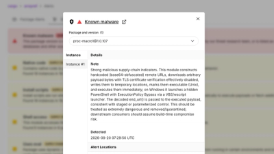
Research
/Security News
Three compromised Rust crates pulled in a malicious dependency that downloaded and executed cross-platform malware during Cargo builds.