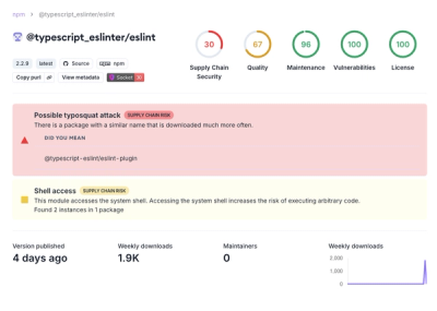
What is @types/react-responsive?
@types/react-responsive provides TypeScript definitions for the react-responsive library, which allows developers to create responsive components that adapt to different screen sizes and media queries.
What are @types/react-responsive's main functionalities?
Media Query Component
The useMediaQuery hook allows you to create responsive components by defining media queries. The component will render different content based on the screen size and orientation.
import { useMediaQuery } from 'react-responsive';
const ExampleComponent = () => {
const isDesktopOrLaptop = useMediaQuery({ minDeviceWidth: 1224 });
const isBigScreen = useMediaQuery({ minDeviceWidth: 1824 });
const isTabletOrMobile = useMediaQuery({ maxWidth: 1224 });
const isPortrait = useMediaQuery({ orientation: 'portrait' });
const isRetina = useMediaQuery({ minResolution: '2dppx' });
return (
<div>
{isDesktopOrLaptop && <p>You are a desktop or laptop</p>}
{isBigScreen && <p>You have a huge screen</p>}
{isTabletOrMobile && <p>You are a tablet or mobile phone</p>}
{isPortrait && <p>You are in portrait orientation</p>}
{isRetina && <p>You are retina</p>}
</div>
);
};
Media Query Component with Children
The MediaQuery component allows you to wrap content that should only be displayed if the media query matches. This is useful for conditionally rendering parts of your UI based on screen size and other media features.
import { MediaQuery } from 'react-responsive';

const ExampleComponent = () => (
  <div>
    <MediaQuery minDeviceWidth={1224}>
      <p>You are a desktop or laptop</p>
    </MediaQuery>
    <MediaQuery minDeviceWidth={1824}>
      <p>You have a huge screen</p>
    </MediaQuery>
    <MediaQuery maxWidth={1224}>
      <p>You are a tablet or mobile phone</p>
    </MediaQuery>
    <MediaQuery orientation="portrait">
      <p>You are in portrait orientation</p>
    </MediaQuery>
    <MediaQuery minResolution="2dppx">
      <p>You are retina</p>
    </MediaQuery>
  </div>
);
Other packages similar to @types/react-responsive
react-media
react-media is a similar library that provides a declarative way to use media queries in React. It offers a similar API but focuses more on the declarative approach using the Media component. Compared to @types/react-responsive, react-media is more straightforward for simple use cases but may lack some of the advanced features.
react-responsive-mixin
react-responsive-mixin is another library that provides mixins for responsive design in React. It is less popular and less maintained compared to react-responsive. It uses mixins, which are not recommended in modern React development, making it less favorable for new projects.
react-socks
react-socks is a library for responsive design in React that uses context and hooks to provide a modern API for handling media queries. It is similar to react-responsive but offers a more modern approach with hooks and context, making it a good alternative for developers looking for a more contemporary solution.


