


Product
PHP and Composer Support Is Now in Beta
Socket’s PHP and Composer support is now in Beta for all customers, with PHP reachability analysis generally available.
By Trevor Norris, Benjamin Barslev - Aug 21, 2026
@uploadkitdev/react
Advanced tools
Premium React components for UploadKit — UploadButton, UploadDropzone, FileList with CSS variable theming and dark mode out of the box.




Premium React upload components for UploadKit.
--uk-* custom propertiesaria attributes throughout# npm
npm install @uploadkitdev/react
# pnpm
pnpm add @uploadkitdev/react
# yarn
yarn add @uploadkitdev/react
Peer dependencies: react >= 18, react-dom >= 18
Import the stylesheet in your app's root:
import '@uploadkitdev/react/styles.css';
import { UploadKitProvider, UploadButton } from '@uploadkitdev/react';
import '@uploadkitdev/react/styles.css';

export function App() {
  return (
    <UploadKitProvider apiKey="uk_live_..." endpoint="/api/upload">
      <UploadButton
        route="imageUploader"
        onUploadComplete={(result) => {
          console.log('Uploaded:', result.url);
        }}
        onUploadError={(error) => {
          console.error(error.message);
        }}
      />
    </UploadKitProvider>
  );
}
| Component | Description |
|---|---|
UploadKitProvider | Context provider — wrap your app or upload section once |
UploadButton | Button that opens the file picker and uploads on selection |
UploadDropzone | Drag-and-drop area; click to browse files |
UploadModal | Full-screen modal with file queue, per-file progress, retry |
FileList | Paginated file browser with search and delete |
FilePreview | Thumbnail for images, icon for other file types |
| Hook | Description |
|---|---|
useUploadKit() | Access the UploadKitClient instance from context |
useDragState() | Track drag enter/leave without flicker on child elements |
useThumbnail(file) | Generate an object URL thumbnail for a File |
useAutoDismiss(ms) | Auto-dismiss state after a delay (for success/error messages) |
All visual tokens are CSS custom properties. Override them in your stylesheet:
:root {
  --uk-primary: #6366f1;         /* accent / primary button color */
  --uk-primary-hover: #818cf8;   /* hover state */
  --uk-radius: 8px;              /* border radius for buttons and dropzone */
  --uk-font-family: inherit;     /* inherits your app font by default */
  --uk-surface: #ffffff;         /* component background */
  --uk-surface-hover: #f5f5f5;  /* hover background */
  --uk-text: #111111;            /* primary text */
  --uk-text-muted: #6b6b6b;     /* secondary / muted text */
  --uk-border: rgba(0,0,0,0.08); /* border color */
  --uk-error: #dc2626;           /* error state (WCAG AA on white) */
}
Dark mode example:
[data-theme="dark"] {
  --uk-surface: #1a1a1a;
  --uk-surface-hover: #2a2a2a;
  --uk-text: #fafafa;
  --uk-text-muted: #a1a1aa;
  --uk-border: rgba(255,255,255,0.08);
}
MIT
FAQs
Premium React components for UploadKit — UploadButton, UploadDropzone, FileList with CSS variable theming and dark mode out of the box.
The npm package @uploadkitdev/react receives a total of 1 weekly downloads. As such, @uploadkitdev/react popularity was classified as not popular.
We found that @uploadkitdev/react demonstrated a healthy version release cadence and project activity because the last version was released less than a year ago. It has 1 open source maintainer collaborating on the project.
Product
Socket’s PHP and Composer support is now in Beta for all customers, with PHP reachability analysis generally available.
Product
Socket is bringing experimental protection to Firefox, scanning 97,000+ extensions in Mozilla's official directory for malware and risky updates.
Research
/Security News
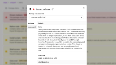
Three compromised Rust crates pulled in a malicious dependency that downloaded and executed cross-platform malware during Cargo builds.