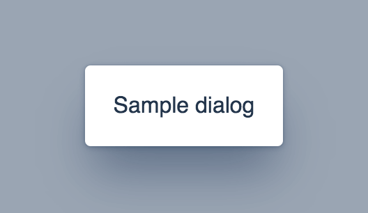


<vaadin-dialog>
Live Demo ↗
|
API documentation ↗
<vaadin-dialog> is a Polymer 2 element for customized modal dialogs, part of the Vaadin components.
<vaadin-dialog opened>
<template>
Sample dialog
</template>
</vaadin-dialog>

Getting Started
Vaadin components use the Lumo theme by default.
The file structure for Vaadin components
-
src/vaadin-dialog.html
Unstyled component.
-
theme/lumo/vaadin-dialog.html
Component with Lumo theme.
-
vaadin-dialog.html
Alias for theme/lumo/vaadin-dialog.html
Running demos and tests in browser
-
Fork the vaadin-dialog repository and clone it locally.
-
Make sure you have npm installed.
-
When in the vaadin-dialog directory, run npm install and then bower install to install dependencies.
-
Run polymer serve --open, browser will automatically open the component API documentation.
-
You can also open demo or in-browser tests by adding demo or test to the URL, for example:
Running tests from the command line
- When in the
vaadin-dialog directory, run polymer test
Following the coding style
We are using ESLint for linting JavaScript code. You can check if your code is following our standards by running gulp lint, which will automatically lint all .js files as well as JavaScript snippets inside .html files.
Contributing
- Make sure your code is compliant with our code linters:
gulp lint - Check that tests are passing:
polymer test - Submit a pull request with detailed title and description
- Wait for response from one of Vaadin components team members
License
Apache License 2.0
Vaadin collects development time usage statistics to improve this product. For details and to opt-out, see https://github.com/vaadin/vaadin-usage-statistics.


