Research
/Security News
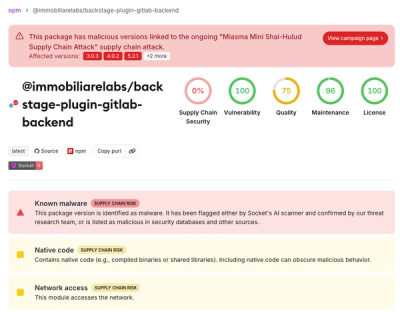
Miasma Mini Shai-Hulud Hits ImmobiliareLabs npm Packages
Miasma Mini Shai-Hulud hits @immobiliarelabs Backstage plugins, targeting GitLab and LDAP auth packages on npm.
By Socket Research Team - Jun 26, 2026
@vxe-ui/plugin-render-element
Advanced tools
Vxe UI plug-in for compatibility with the element-plus component.
Vxe UI plug-in for compatibility with the element-plus component.
It corresponds to vxe-table v4 or vxe-pc-ui v4
npm install @vxe-ui/plugin-render-element
// ...
// Use vxe-pc-ui
import { VxeUI } from 'vxe-pc-ui'
// Use vxe-table
// import { VxeUI } from 'vxe-table'
import VxeUIPluginRenderElement from '@vxe-ui/plugin-render-element'
import '@vxe-ui/plugin-render-element/dist/style.css'
// ...

VxeUI.use(VxeUIPluginRenderElement)
// VxeUI.use(VxeUIPluginRenderElement, {
//   ElementPlus
// })
// ...
// Use vxe-pc-ui
import { VxeUI } from 'vxe-pc-ui'
// Use vxe-table
// import { VxeUI } from 'vxe-table'
import VxeUIPluginRenderElement from '@vxe-ui/plugin-render-element'
import '@vxe-ui/plugin-render-element/dist/style.css'
// ...

// If it is not a global installation, then a single import is required.
import { ElInput, ElInputNumber, ElSelect } from 'element-plus'
// ...
VxeUIPluginRenderElement.component(ElInput)
VxeUIPluginRenderElement.component(ElInputNumber)
VxeUIPluginRenderElement.component(ElSelect)
// ...

VxeUI.use(VxeUIPluginRenderElement)
| 属性 | 描述 | 类型 | 可选值 | 默认值 |
|---|---|---|---|---|
| name | 支持的渲染组件 | String | ElInput, ElAutocomplete, ElInputNumber, ElSwitch, ElRate, ElSlider, ElButton, ElButtons | — |
| attrs | 渲染组件附加属性,参数请查看被渲染的 Component attrs | Object | — | {} |
| props | 渲染组件附加属性,参数请查看被渲染的 Component props | Object | — | {} |
| options | 只对 name=ElSelect 有效,下拉组件选项列表 | Array | — | [] |
| optionProps | 只对 name=ElSelect 有效,下拉组件选项属性参数配置 | Object | — | { value: 'value', label: 'label' } |
| optionGroups | 只对 name=ElSelect 有效,下拉组件分组选项列表 | Array | — | [] |
| optionGroupProps | 只对 name=ElSelect 有效,下拉组件分组选项属性参数配置 | Object | — | { options: 'options', label: 'label' } |
| events | 渲染组件附加事件,参数为 ( {row,rowIndex,column,columnIndex}, ...Component arguments ) | Object | — | — |
| 属性 | 描述 | 类型 | 可选值 | 默认值 |
|---|---|---|---|---|
| name | 支持的渲染组件 | String | ElInput, ElAutocomplete, ElInputNumber, ElSelect, ElCascader, ElTimeSelect, ElTimePicker, ElDatePicker, ElSwitch, ElRate, ElSlider, ElButton, ElButtons | — |
| attrs | 渲染组件附加属性,参数请查看被渲染的 Component attrs | Object | — | {} |
| props | 渲染组件附加属性,参数请查看被渲染的 Component props | Object | — | {} |
| options | 只对 name=ElSelect 有效,下拉组件选项列表 | Array | — | [] |
| optionProps | 只对 name=ElSelect 有效,下拉组件选项属性参数配置 | Object | — | { value: 'value', label: 'label' } |
| optionGroups | 只对 name=ElSelect 有效,下拉组件分组选项列表 | Array | — | [] |
| optionGroupProps | 只对 name=ElSelect 有效,下拉组件分组选项属性参数配置 | Object | — | { options: 'options', label: 'label' } |
| events | 渲染组件附加事件,参数为 ( {row,rowIndex,column,columnIndex}, ...Component arguments ) | Object | — | — |
| 属性 | 描述 | 类型 | 可选值 | 默认值 |
|---|---|---|---|---|
| name | 支持的渲染组件 | String | ElInput, ElInputNumber, ElAutocomplete, ElSelect, ElDatePicker, ElSwitch, ElRate, ElSlider | — |
| attrs | 渲染组件附加属性,参数请查看被渲染的 Component attrs | Object | — | {} |
| props | 渲染组件附加属性,参数请查看被渲染的 Component props | Object | — | {} |
| options | 只对 name=ElSelect 有效,下拉组件选项列表 | Array | — | [] |
| optionProps | 只对 name=ElSelect 有效,下拉组件选项属性参数配置 | Object | — | { value: 'value', label: 'label' } |
| optionGroups | 只对 name=ElSelect 有效,下拉组件分组选项列表 | Array | — | [] |
| optionGroupProps | 只对 name=ElSelect 有效,下拉组件分组选项属性参数配置 | Object | — | { options: 'options', label: 'label' } |
| events | 渲染组件附加事件,参数为 ( {}, ...Component arguments ) | Object | — | — |
| 属性 | 描述 | 类型 | 可选值 | 默认值 |
|---|---|---|---|---|
| name | 支持的渲染组件 | String | ElInput, ElInputNumber, ElAutocomplete, ElSelect, ElDatePicker, ElSwitch, ElRate, ElSlider, ElRadio, ElCheckbox, ElButton, ElButtons | — |
| attrs | 渲染组件附加属性,参数请查看被渲染的 Component attrs | Object | — | {} |
| props | 渲染组件附加属性,参数请查看被渲染的 Component props | Object | — | {} |
| options | 只对 name=ElSelect 有效,下拉组件选项列表 | Array | — | [] |
| optionProps | 只对 name=ElSelect 有效,下拉组件选项属性参数配置 | Object | — | { value: 'value', label: 'label' } |
| optionGroups | 只对 name=ElSelect 有效,下拉组件分组选项列表 | Array | — | [] |
| optionGroupProps | 只对 name=ElSelect 有效,下拉组件分组选项属性参数配置 | Object | — | { options: 'options', label: 'label' } |
| events | 渲染组件附加事件,参数为 ( {}, ...Component arguments ) | Object | — | — |
| 描述 |
|---|
| 'ElInputWidget', 'ElTextareaWidget', 'ElNumberInputWidget', 'ElDatePickerWidget', 'ElSelectWidget', 'ElRadioWidget', 'ElCheckboxWidget', 'ElSwitchWidget' |
<template>
  <vxe-table
    height="600"
    :data="tableData"
    :edit-config="{trigger: 'click', mode: 'cell'}">
    <vxe-column field="name" title="Name" :edit-render="{name: 'ElInput'}"></vxe-column>
    <vxe-column field="age" title="Age" :edit-render="{name: 'ElInputNumber'}"></vxe-column>
    <vxe-column field="date" title="Date" width="200" :edit-render="{name: 'ElDatePicker'}"></vxe-column>
  </vxe-table>
</template>

<script>
export default {
  data () {
    return {
      tableData: [
        { id: 100, name: 'test0', age: 28, sex: '1', date: '' },
        { id: 101, name: 'test1', age: 32, sex: '0', date: '' },
        { id: 102, name: 'test2', age: 36, sex: '1', date: '' }
      ]
    }
  }
}
</script>
<template>
  <vxe-table
    height="600"
    :data="tableData">
    <vxe-column field="name" title="Name":filters="nameOptions" :filter-render="{name: 'ElInput'}"></vxe-column>
    <vxe-column field="age" title="Age"></vxe-column>
    <vxe-column field="date" title="Date" ></vxe-column>
  </vxe-table>
</template>

<script>
export default {
  data () {
    return {
      nameOptions: [
        { data: '' }
      ],
      tableData: [
        { id: 100, name: 'test0', age: 28, date: null },
        { id: 101, name: 'test1', age: 32, date: null },
        { id: 102, name: 'test2', age: 36, date: null }
      ]
    }
  }
}
</script>
Thank you to everyone who contributed to this project.
MIT © 2019-present, Xu Liangzhan
FAQs
Vxe UI plug-in for compatibility with the element-plus component.
The npm package @vxe-ui/plugin-render-element receives a total of 1,278 weekly downloads. As such, @vxe-ui/plugin-render-element popularity was classified as popular.
We found that @vxe-ui/plugin-render-element demonstrated a healthy version release cadence and project activity because the last version was released less than a year ago. It has 1 open source maintainer collaborating on the project.
Did you know?

Socket for GitHub automatically highlights issues in each pull request and monitors the health of all your open source dependencies. Discover the contents of your packages and block harmful activity before you install or update your dependencies.
Research
/Security News
Miasma Mini Shai-Hulud hits @immobiliarelabs Backstage plugins, targeting GitLab and LDAP auth packages on npm.

Security News
Rolldown paused Rust React Compiler integration after a 5MB binary size increase raised concerns about shipping React-specific code to all Vite users.

Security News
/Research
Mini Shai-Hulud expands into the Go ecosystem after hitting LeoPlatform npm packages and targeting GitHub Actions workflows.