Security News
JSR Working Group Kicks Off with Ambitious Roadmap and Plans for Open Governance
At its inaugural meeting, the JSR Working Group outlined plans for an open governance model and a roadmap to enhance JavaScript package management.
@washingtonpost/motion-tokens
Advanced tools
Motion design should derive from our core design principles. Inspiration for motion design is rooted in the design of the printing press — the machine that brings our paper to life.
The printing press has a sequence of motions that build upon each other to deliver the final product to the reader. Likewise, motion in our products should serve a purpose. Motion builds on the user experience through intelligent feedback and brings our products to life. Motion helps guide our users through their experience.
The various parts of the printing press — gears, knobs, and levers — each have distinct direction and weight. They move along a fixed axis and connect to the overall machine which produces the paper. When designing for motion, think of the UI elements as physical objects, each with its own force applied to it.
The printing press's parts vary widely in size and shape. Some are small and move fast, while others are big and require great force to drive them. Some parts have a massive influence despite being quite small— these include elements like levers and switches. Parts are weighted by their importance and as a result act similar to heavier objects.
When adding timing to your animations, always use multiples of 100ms. The shortest duration should be 200ms. To increase duration, multiply 100ms by a "modifier". A modifier is a whole number — also known as an "integer." Read on to learn more about timing.
Timing in animation comes down to feel. Sometimes a short amount of time is desirable because it increases the visual speed. Sometimes a bit more time is better because it provides a more subtle transition. Whenever choosing the duration of timing and delays, always consider the following:
Delta means "change." Ask yourself: How big is the change? How significantly is your object rotating, scaling, or moving from its original state? The larger the delta, the more time is likely needed to avoid a rough transition.
How many elements are going to be moving at the same time? How many different directions will they be traveling in? If you have lots of elements moving at the same time, consider a longer duration. This helps to avoid visual overload and confusion.
If an element is a part of a sequence of motions, carefully consider whether more or less time is needed. Objects should move in a logical order and not move at a pace that overwhelms the user.
FAQs
WaPo Motion Tokens
The npm package @washingtonpost/motion-tokens receives a total of 1,268 weekly downloads. As such, @washingtonpost/motion-tokens popularity was classified as popular.
We found that @washingtonpost/motion-tokens demonstrated a not healthy version release cadence and project activity because the last version was released a year ago. It has 181 open source maintainers collaborating on the project.
Did you know?

Socket for GitHub automatically highlights issues in each pull request and monitors the health of all your open source dependencies. Discover the contents of your packages and block harmful activity before you install or update your dependencies.

Security News
At its inaugural meeting, the JSR Working Group outlined plans for an open governance model and a roadmap to enhance JavaScript package management.

Security News
Research
An advanced npm supply chain attack is leveraging Ethereum smart contracts for decentralized, persistent malware control, evading traditional defenses.

Security News
Research
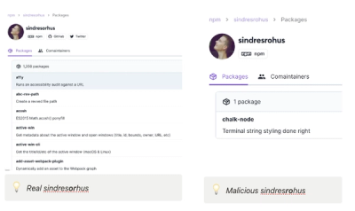
Attackers are impersonating Sindre Sorhus on npm with a fake 'chalk-node' package containing a malicious backdoor to compromise developers' projects.