@web-portfolio/icons
A React icon component backed by 633 bundled SVG icons — programming
languages, frameworks, dev tools, social platforms, and everyday UI icons —
all through one <Icon /> component instead of a separate import per icon.
It started as the icon set for a personal portfolio site, and grew into
something worth publishing on its own: no icon font, no CDN requests at
runtime, nothing to load asynchronously. Everything ships inside the
package and renders instantly.
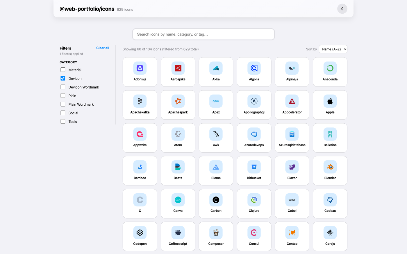
Browse the full icon set → — search by
name or category, try the color/stroke/size controls on any icon, and copy
the exact <Icon /> snippet or the raw SVG straight from the page.


Recent changes
Security & supply chain
- Bumped
vitest to 3.2.7 and drizzle-orm to 0.45.2 across the monorepo,
and pinned several transitive dependencies (esbuild, sharp, postcss,
glob, js-yaml, uuid, prismjs, adm-zip, es-define-property) to
patched versions via pnpm overrides.
- Install scripts now run only for an explicit allow-list (
esbuild,
sharp) instead of the whole dependency tree by default.
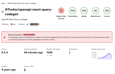
- Current Socket.dev
score: 100 Vulnerability, 100 Quality, 100 License, 91
Maintenance, 81 Supply Chain Security. This package ships zero runtime
dependencies — everything is bundled or a peer — so the two scores under
100 reflect Socket's scan of the declared
react peer and this package's
adoption signals (age, download volume), not anything this repo controls.
Smaller bundle
- The registry now stores only what
<Icon> actually reads (viewBox /
innerHTML). Search-only fields (label, tags, category) moved to a
separate file that only @web-portfolio/icons-sanity's picker needs, and
the build output is now minified.
Why this exists
Building a portfolio or dashboard usually means one of two things: pulling
in an icon font for a handful of glyphs, or scattering <img src="...">
tags across the codebase pointing at some CDN that may or may not be up
when it matters. Neither felt right for something as small as "show the
React logo next to the word React." This package is the alternative —
<Icon name="react" />, done, and the same component works whether you
need a tech-stack badge, a social link icon, or a plain arrow for a
carousel button.
A few things it does deliberately:
- One component, not 633 imports.
registry[name] does a lookup at
render time, so you never end up with import { ReactIcon, DockerIcon, PostgresIcon } from '...' cluttering the top of a file.
- Nothing fetched at runtime. The whole registry is bundled at build
time and optimized with SVGO, so there's no loading state, no layout
shift while an image loads, and it works offline.
- Themeable where it makes sense.
color, stroke, and strokeWidth
props recolor monochrome icons to match your palette; brand marks that
are supposed to stay a specific color (the React logo's blue, for
instance) are left alone on purpose.
- Typed out of the box. No separate
@types/ package to remember to
install.
Installation
npm install @web-portfolio/icons
pnpm add @web-portfolio/icons
yarn add @web-portfolio/icons
Requires React 18 or later.
Quick start
import { Icon } from '@web-portfolio/icons'

function TechStack() {
  return (
    <div style={{ display: 'flex', gap: 12 }}>
      <Icon name="react" size={32} />
      <Icon name="typescript" size={32} />
      <Icon name="nodejs" size={32} />
      <Icon name="postgresql" size={32} />
      <Icon name="docker" size={32} />
    </div>
  )
}
That's more or less the whole API. Every icon in the set works the same
way — swap the name and you're done.
import { Icon } from '@web-portfolio/icons'

function SocialLinks() {
  return (
    <nav aria-label="Social links">
      <a href="https://github.com/you" aria-label="GitHub">
        <Icon name="github" title="GitHub" />
      </a>
      <a href="https://linkedin.com/in/you" aria-label="LinkedIn">
        <Icon name="linkedin" title="LinkedIn" />
      </a>
      <a href="mailto:you@example.com" aria-label="Email">
        <Icon name="mail" title="Email" />
      </a>
    </nav>
  )
}
Recoloring with color, stroke, and strokeWidth
<Icon name="mail" color="#6366f1" size={20} />
<Icon name="arrow_forward" stroke="#0ea5e9" strokeWidth={1.5} size={24} />
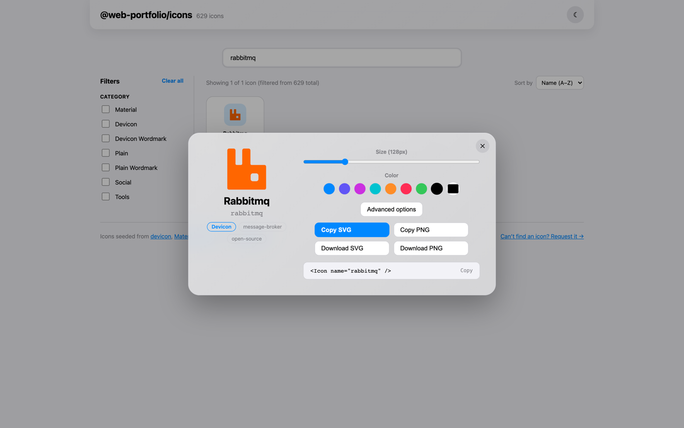
If you'd rather dial in a color visually than guess a hex value, the
gallery has a live color/stroke/size picker
on every icon's page — pick a look, then copy the <Icon /> snippet with
your chosen props already filled in.
API
<Icon
name="react"
size={24}
color="currentColor"
stroke={undefined}
strokeWidth={undefined}
title={undefined}
className="my-icon"
/>
name | string | — | Required. Unknown names render nothing and log a dev-only warning instead of throwing. |
size | number | string | 24 | Sets both width and height. |
color | string | currentColor | Only affects monochrome icons — multi-color brand marks keep their original colors. |
stroke | string | — | Overrides any stroke the icon's markup declares, and sets it on the root <svg>. |
strokeWidth | number | string | — | Applied the same way as stroke. |
title | string | — | Adds an accessible <title> and role="img". Omit for a purely decorative icon (aria-hidden). |
Any other prop (className, onClick, style, ...) passes straight through
to the underlying <svg> element.
What's in the icon set
633 icons pulled from three sources and normalized to a consistent style —
you shouldn't be able to tell which source any given icon came from just by
looking at it:
- devicon (578 icons, MIT) — the
bulk of the set: programming languages, frameworks, databases, cloud
platforms, and dev tools.
react, typescript, nodejs, docker,
postgresql, figma, amazonwebservices, kubernetes, and hundreds
more.
- Material Symbols (38
icons, Apache-2.0) — the everyday UI icons devicon doesn't cover:
mail,
call, arrow_forward, menu, close, connected_tv, bolt,
translate, checklist, gift, and more.
- Simple Icons (17 icons, CC0-1.0) — social
platforms and dev-tool brands devicon is missing:
instagram, youtube,
whatsapp, mcp, langchain, ollama, and more (devicon already
covers GitHub, LinkedIn, Twitter/X, GitLab, and Slack, so those aren't
duplicated here).
The fastest way to find the exact name you need is the
gallery — search, filter by category, and
copy the name (or the whole snippet) straight off the page.
TypeScript
The package ships its own type declarations — no @types/ package needed.
IconProps is exported if you want to type a wrapper component:
import { Icon, type IconProps } from '@web-portfolio/icons'
Managing your own icons in the CMS
Building with Sanity? Pair this with
@web-portfolio/icons-sanity
to let editors pick icons from a searchable picker in Studio, backed by the
same 633-icon registry — no more pasting raw SVG markup into every field.
License
MIT — see LICENSE.
Bundled icon sets keep their original licenses (devicon: MIT, Material
Symbols: Apache-2.0, Simple Icons: CC0-1.0) — see the
repo README for full
attribution.