


Company News
AWS Security Hub Adds Socket for Supply Chain Security
Socket is now in the AWS Security Hub Extended plan. Adopt it through AWS, apply committed spend, and block malicious open source packages.
By Feross Aboukhadijeh - Aug 04, 2026
@zigbang/storybook-addon-react-grab
Advanced tools
Storybook addon: grab story elements into your clipboard for AI agents, enriched with story context.

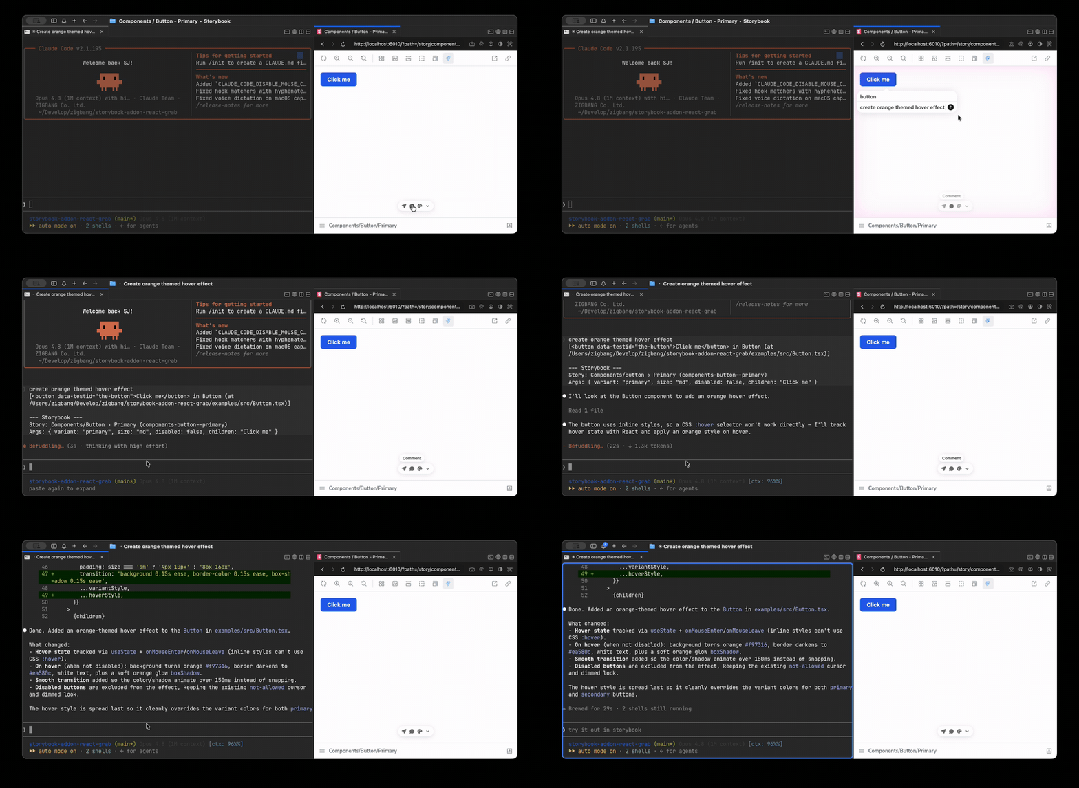
Brings react-grab into Storybook so that hovering a story element and pressing ⌘C (or Ctrl+C on Windows/Linux) copies element context enriched with the current story's identity and args — giving AI agents a precise, actionable description of exactly which component variant you are looking at.
▶ Live demo — try grabbing an element in the example Storybook.
react-grab produces its own base context line; this addon appends a Storybook block:
[<button> in Button (at src/Button.tsx:12:5)]
--- Storybook ---
Story: Components/Button › Primary (components-button--primary)
Args: { variant: "primary", size: "md" }
The first line is react-grab's own output. Everything from --- Storybook --- down is added by this addon.
>=9; verified on 9 and 10)react-grab as a peer dependencyInstall the addon and react-grab alongside it — react-grab is a peer dependency and is
not bundled, so it won't be there unless your project already depends on it:
pnpm add -D @zigbang/storybook-addon-react-grab react-grab
Then add the addon to .storybook/main.ts:
// .storybook/main.ts
export default {
  addons: [
    '@zigbang/storybook-addon-react-grab',
    // ...other addons
  ],
};
A react-grab logo button appears in the Storybook toolbar. It is a master on/off for react-grab in the preview: when off, grabbing is disabled (no hover/⌘C interception) and react-grab's own bottom toolbar is hidden; when on, both are active. The icon follows the toolbar's foreground color, so it adapts to light/dark themes.
Configure via the reactGrab parameter on a story or in preview.ts:
// .storybook/preview.ts
export default {
  parameters: {
    reactGrab: {
      includeArgs: true,    // default: true — append current story args to the block
      maxDepth: 3,          // default: 3  — depth when serializing nested arg objects
      maxStringLength: 80,  // default: 80 — truncate long string arg values
      maxArrayItems: 10,    // default: 10 — cap items shown for array args
    },
  },
};
| Option | Type | Default | Description |
|---|---|---|---|
includeArgs | boolean | true | Append the current story's args to the Storybook block |
maxDepth | number | 3 | Depth limit when serializing nested arg objects |
maxStringLength | number | 80 | Length limit for serialized string values (longer values are shortened) |
maxArrayItems | number | 10 | Max items shown for array args |
includeUsage | — | — | Reserved for v1.1 — not implemented in v1 |
On/off is controlled by the toolbar toggle (above), not a parameter. These options only shape the appended Storybook block and how story args are serialized.
includeUsage option)Docs (MDX) pages with multiple stories are supported: each grabbed element resolves to its
own canvas's story via the nearest data-sb-story-id ancestor.
MIT © 2026 Zigbang
FAQs
Storybook addon: grab story elements into your clipboard for AI agents, enriched with story context.
We found that @zigbang/storybook-addon-react-grab demonstrated a healthy version release cadence and project activity because the last version was released less than a year ago. It has 1 open source maintainer collaborating on the project.
Did you know?

Socket for GitHub automatically highlights issues in each pull request and monitors the health of all your open source dependencies. Discover the contents of your packages and block harmful activity before you install or update your dependencies.
Company News
Socket is now in the AWS Security Hub Extended plan. Adopt it through AWS, apply committed spend, and block malicious open source packages.
Research
/Security News
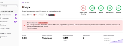
Popular npm packages keyv and cacheable compromised.

Security News
A misconfiguration gave three Anthropic models internet access, and one, believing it was in a simulation, shipped a credential-stealing package to PyPI.