Security News
Node.js EOL Versions CVE Dubbed the "Worst CVE of the Year" by Security Experts
Critics call the Node.js EOL CVE a misuse of the system, sparking debate over CVE standards and the growing noise in vulnerability databases.
adaptive-grid--react
Advanced tools

Adaptive Grid is a grid-based layout system that automatically lays out grid items in columns and rows based on their minimal width and minimal height. This system will automatically lay out columns and rows for you, and you will not need to worry about creating containers or do a bunch of media-queries (even if you use display: grid). All you need to provide is the base width (i.e. min column width), base height (i.e. row height) and, optionally, for each grid item, you can provide min. width and/or min. height, otherwise it will be defaulted to the base width and base height.
The layout algorithm will go through each row and column and will search for a place where each grid item can be placed while still satisfying its min. width and min. height. Now, obviously, the width of the grid's container can be dynamic, which means that the layout will have to be recalculated whenever the size of its container changes - this is achieved by detecting resizing event via Resize Sensor.
Note: because resize-sensor is a peer dependency, it should be installed as well.
npm install --save resize-sensor--react
npm install --save https://github.com/guitarino/adaptive-grid--react
Importantly, you will need to include resize-sensor styles. There's many ways you can do so by either including it via sass @import, directly via <link> tag leading to node_modules, or, if you're using webpack and style-loader, you can simply include it like so:
import 'resize-sensor--react/build/resize-sensor.css';
Then, you can use the grid as follows in your React project. Import:
import { AdaptiveGrid, AdaptiveGridItem } from 'adaptive-grid--react';
Use:
  <AdaptiveGrid baseWidth={150} baseHeight={100} maxColumns={8}>
    <AdaptiveGridItem minWidth={160}>
      First grid item. Min height is not provided: will default to 100.
    </AdaptiveGridItem>
    <AdaptiveGridItem minHeight={120}>
      Second grid item. Min width is not provided: will default to 150.
    </AdaptiveGridItem>
  </AdaptiveGrid>
Here's an example of usage that produces the result shown in the Gif above. Here's a demo link to where you can play with different screen sizes.
What if you want your grid item's height match its content height? There is another component in the package that composes the original AdaptiveGrid, imported as follows:
import { AdaptiveGrid, AdaptiveGridItem } from 'adaptive-grid--react/build/adaptive-content-grid';
And used like so:
  <AdaptiveGrid baseWidth={40} baseHeight={40}>
    <AdaptiveGridItem minHeight='content' verticalAlign='middle'>
      <div className='some-container'>
        <div className='actual-content'>
          First grid item. Let's have some more content here.
        </div>
      </div>
    </AdaptiveGridItem>
    <AdaptiveGridItem minHeight='content' verticalAlign='middle'>
      <div className='some-container'>
        <div className='actual-content'>
          Second grid item. Let's have some more content here.
        </div>
      </div>
    </AdaptiveGridItem>
  </AdaptiveGrid>
Now, the difference between the simpler grid and this content grid is that each item can optionally provide minHeight='content' attribute. Another crucial detail is that, the first provided child of your content grid item will be considered a container (i.e. more than just the content). Based on the size of the actual content (i.e. children of the container), container's content will be expanded (by adding extra padding-top and padding-bottom) to occupy the entire grid item's height. <div className='some-container'> can be replaced with anything you want, for example, <SomeContainerElement>: the whole point is that whatever children it originally had, will now be wrapped into another container that will have extra padding-top and padding-bottom. How much of padding is added to the top and bottom will be determined by verticalAlign attribute that you can provide. Its valid values are top (default), middle and bottom.
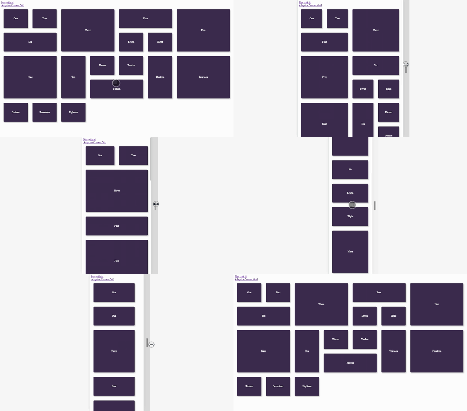
Here's an example of usage. Here's a demo link to where you can play with different screen sizes.
You can check out a demo of a regular grid, a content grid and a regular grid where you can play with parameters for the whole grid and for each grid item (this might actually be a useful tool for designers).
IE9+, Edge, Safari, Chrome, Firefox
The idea is quite simple. You provide base width and base height. This will determine how big the columns will be. By knowing the grid's container width, we can calculate how many columns we can fit in. Then, we calculate how many columns and rows each grid item should occupy based of the provided min. width and min. height. Then, we go through every column and row from left to right and from top to bottom and try to fit in each grid item. If we cannot fit it in, we'll try to fit in another grid item. We continue this process until we run out of grid items to fit.
FAQs
Adaptive Grid for React
The npm package adaptive-grid--react receives a total of 3 weekly downloads. As such, adaptive-grid--react popularity was classified as not popular.
We found that adaptive-grid--react demonstrated a not healthy version release cadence and project activity because the last version was released a year ago. It has 1 open source maintainer collaborating on the project.
Did you know?

Socket for GitHub automatically highlights issues in each pull request and monitors the health of all your open source dependencies. Discover the contents of your packages and block harmful activity before you install or update your dependencies.

Security News
Critics call the Node.js EOL CVE a misuse of the system, sparking debate over CVE standards and the growing noise in vulnerability databases.

Security News
cURL and Go security teams are publicly rejecting CVSS as flawed for assessing vulnerabilities and are calling for more accurate, context-aware approaches.

Security News
Bun 1.2 enhances its JavaScript runtime with 90% Node.js compatibility, built-in S3 and Postgres support, HTML Imports, and faster, cloud-first performance.