
Security News
Oracle Drags Its Feet in the JavaScript Trademark Dispute
Oracle seeks to dismiss fraud claims in the JavaScript trademark dispute, delaying the case and avoiding questions about its right to the name.
By Sarah Gooding - Feb 07, 2025
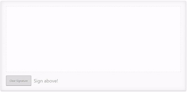
angular-signature-pad
Advanced tools
This project provides components and utils for digital signatures. Use it to draw smooth signatures based on HTML5 canvas and uses variable width Bézier curve interpolation. [SignaturePad](https://github.com/szimek/signature_pad) is used a the vanilla i
This project provides components and utils for digital signatures. Use it to draw smooth signatures based on HTML5 canvas and uses variable width Bézier curve interpolation. SignaturePad is used a the vanilla implementation.
// app.component.html
<signature-pad [config]="{penColor:red}" #sP></signature-pad>
<button (click)="sp.clear()">CLEAR</button>
$ npm install angular-signature-pad --save
// src/app/app.module.ts
...
// IMPORT YOUR LIBRARY
import { AngularSignaturePadModule } from 'angular-signature-pad';

@NgModule({
  imports: [
    ...
    AngularSignaturePadModule.forRoot()
  ]
  ...
})
export class AppModule { }
// src/app/app.component.html
<signature-pad #sigPad></signature-pad>

<b>value:</b>
<pre>
  {{sigPad.value | json}}
</pre>

<button (click)="sigPad.clear()">Clear</button>
To apply the default styles just import the styles.scss file from the node_modules/angular-signature-pad folder.
// src/styles.scss

@import "../node_modules/angular-signature-pad/styles";
The SignaturePadCard and SignaturePadCardGroup component have a default styling set over the [theme] property.
It is applied over the .raised class internally.
To create your own theme create a class i.e. .my-theme and combine
it with the default class of the signature pad. .signature-pad-card.my-theme.
Apply it to the component over the [theme] property binding.
.signature-pad-card.my-theme {
  ...

  .signature-pad {
    ...
  }

  .signature-pad-canvas {
    ...
  }

  .actions {
    ...
    .clear {
     ...
    }
  }

  .feedback {
   ...
  }
}
<signature-pad-card [theme]="'my-theme'" ></signature-pad-card>
FAQs
This project provides components and utils for digital signatures. Use it to draw smooth signatures based on HTML5 canvas and uses variable width Bézier curve interpolation. [SignaturePad](https://github.com/szimek/signature_pad) is used a the vanilla i
The npm package angular-signature-pad receives a total of 294 weekly downloads. As such, angular-signature-pad popularity was classified as not popular.
We found that angular-signature-pad demonstrated a not healthy version release cadence and project activity because the last version was released a year ago. It has 1 open source maintainer collaborating on the project.
Did you know?

Socket for GitHub automatically highlights issues in each pull request and monitors the health of all your open source dependencies. Discover the contents of your packages and block harmful activity before you install or update your dependencies.
Security News
Oracle seeks to dismiss fraud claims in the JavaScript trademark dispute, delaying the case and avoiding questions about its right to the name.

Security News
The Linux Foundation is warning open source developers that compliance with global sanctions is mandatory, highlighting legal risks and restrictions on contributions.

Security News
Maven Central now validates Sigstore signatures, making it easier for developers to verify the provenance of Java packages.