
Security News
The Unpaid Backbone of Open Source: Solo Maintainers Face Increasing Security Demands
Solo open source maintainers face burnout and security challenges, with 60% unpaid and 60% considering quitting.
By Sarah Gooding - Sep 20, 2024
angular-star-rating
Advanced tools
  [](https://www.npmjs.com/package/angular-star-


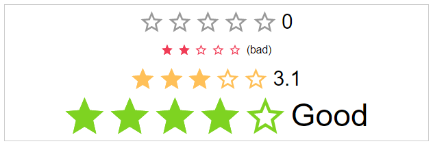
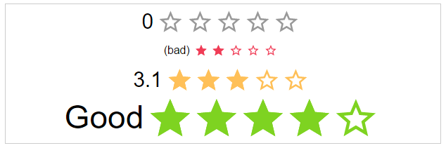
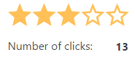
Angular Star Rating is a >2 Angular component written in typescript.
It is based on css-sar-rating, a fully featured and customizable css only star rating component written in scss.
##Related Projects
| Css | Angular1 (>=1.5) | Angular (>=2) |
|---|---|---|
 |  |  |
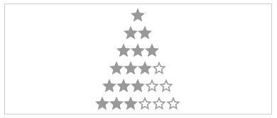
| Css Star Rating | Angular1 Star Rating | Angular Star Rating |
This module implements all Features from CSS-STAR-RATING. It also provides callbacks for all calculation functions used in the component as well as all possible event emitters.
| IE | Firefox | Chrome | Safari | Opera |
|---|---|---|---|---|
| >11 | >50 | >55 | >10 | >41 |
 |  |  |  |  |
Get Angular Star Rating:
$ npm install angular-star-rating from your console$ bower install angular2-star-rating from your consoleLoad library
<script src="[bower or npm folder]/angular-star-rating/dist/index.js"></script>
Register module
...
import { StarRatingModule } from 'path/to/star/rating/star-rating.module';
...
@NgModule({
  ...
  imports: [
    ...
    StarRatingModule
    ...
  ]
  ...
})
export class AppModule { }
Use it
<star-rating-comp
         [size]="'large'"
         [rating]="3"
         [text]="'Rating:'"
         (onRatingChange)="crtl.onRatingChange($event)">
 </star-rating-comp>
id: string (Optional)
The html id attribute of the star rating
Default: undefined
<star-rating-comp [id]="'my-id'"></star-rating-comp>
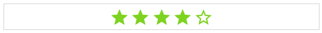
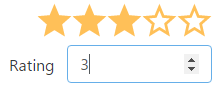
rating: number (Optional)
The actual star rating value
Default: no
<star-rating-comp [rating]="3"></star-rating-comp>
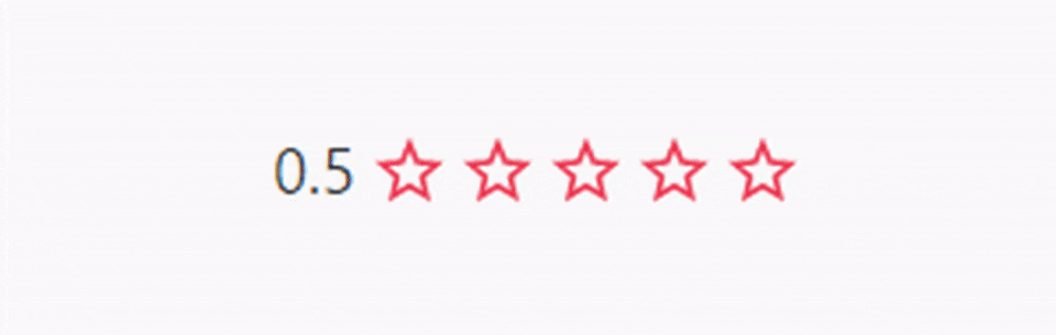
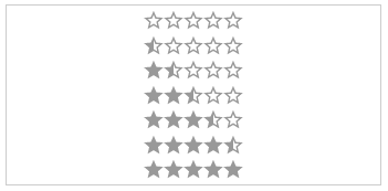
showHalfStars: boolean (Optional)
To show half stars or not
Options: true, false
Default: false
<star-rating-comp [showHalfStars]="true"></star-rating-comp>
numOfStars: number (Optional)
The possible number of stars to choose from
Default: 5
<star-rating-comp [numOfStars]="6"></star-rating-comp>
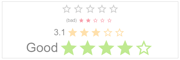
text: string (Optional)
The text next to the stars.
Default: undefined
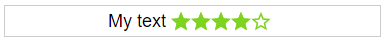
<star-rating-comp [text]="'My text!'"></star-rating-comp>
labelPosition: starRatingPosition (Optional)
The position of the label
Options: top, right, bottom, left
Default: left
<star-rating-comp [labelPosition]="'top'"></star-rating-comp>
spread: boolean (Optional)
If the start use the whole space or not.
Default: false
<star-rating-comp [space]="true"></star-rating-comp>


size: starRatingSizes (Optional)
The height and width of the stars.
Options: small, medium, large
Default: middle
<star-rating-comp [size]="'small'"></star-rating-comp>

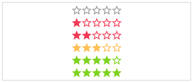
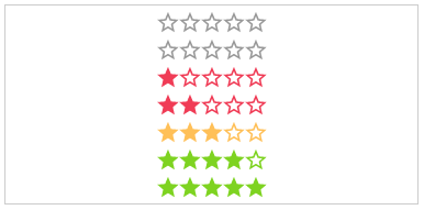
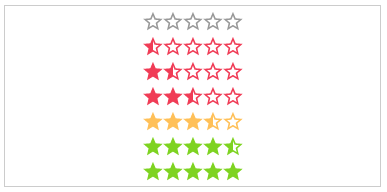
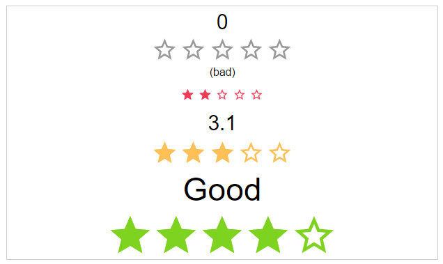
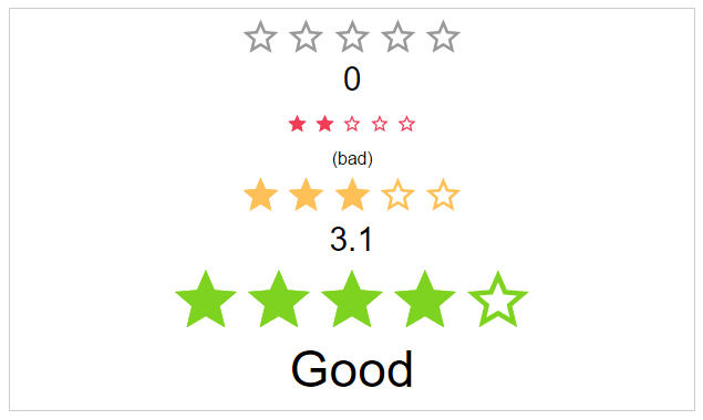
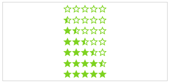
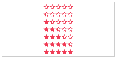
color: starRatingColors (Optional)
Possible color names for the stars.
Options: default, negative, middle, positive
Default: undefined
<star-rating-comp [color]="'positive'"></star-rating-comp>

disabled: boolean (Optional)
The click callback is disabled, colors are transparent
Default: false
<star-rating-comp [disabled]="true"></star-rating-comp>

direction: string (Optional)
The direction of the stars and label.
Options: rtl, ltr
Default: rtl
<star-rating-comp [direction]="'ltr'"></star-rating-comp>

readOnly: boolean (Optional)
The click callback is disabled
Default: false
<star-rating-comp [readOnly]="true"></star-rating-comp>
speed: starRatingSpeed (Optional)
The duration of the animation in ms.
Options: immediately, noticeable, slow
Default: noticeable
<star-rating-comp [speed]="'slow'"></star-rating-comp>


starType: starRatingStarTypes (Optional)
The type of start resource to use.
Options: svg, icon
Default: svg
<star-rating-comp [starType]="'icon'"></star-rating-comp>
getColor: Function (Optional)
Calculation of the color by rating.
Params: rating, number,numOfStars and staticColor
Return: color name
<star-rating-comp [getColor]="ctrl.getColor(rating, numOfStars, staticColor)"></star-rating-comp>
getHalfStarVisible: Function (Optional)
Calculation for adding the "half" class or not, depending on the rating value.
Params: rating
Return: boolean
<star-rating-comp [getHalfStarClass]="ctrl.getHalfStarClass(rating)" rating="3.2"></star-rating-comp>
onClick: Function (Optional)
Callback function for star click event
Params: $event
<star-rating-comp (onClick)="ctrl.onClick($event)"></star-rating-comp>
onRatingChange: Function (Optional)
Callback function for rating change event
Params: $event
<star-rating-comp (onRatingChange)="ctrl.onRatingChange($event)"></star-rating-comp>
2.0.0-beta.1 (2017-01-31)
<a name="2.0.0-beta.0"></a>
FAQs
Angular Star Rating is a fully featured and configurable Angular UI component.
The npm package angular-star-rating receives a total of 3,344 weekly downloads. As such, angular-star-rating popularity was classified as popular.
We found that angular-star-rating demonstrated a healthy version release cadence and project activity because the last version was released less than a year ago. It has 1 open source maintainer collaborating on the project.
Did you know?

Socket for GitHub automatically highlights issues in each pull request and monitors the health of all your open source dependencies. Discover the contents of your packages and block harmful activity before you install or update your dependencies.
Security News
Solo open source maintainers face burnout and security challenges, with 60% unpaid and 60% considering quitting.

Security News
License exceptions modify the terms of open source licenses, impacting how software can be used, modified, and distributed. Developers should be aware of the legal implications of these exceptions.

Security News
A developer is accusing Tencent of violating the GPL by modifying a Python utility and changing its license to BSD, highlighting the importance of copyleft compliance.