
Security News
Oracle Drags Its Feet in the JavaScript Trademark Dispute
Oracle seeks to dismiss fraud claims in the JavaScript trademark dispute, delaying the case and avoiding questions about its right to the name.
By Sarah Gooding - Feb 07, 2025
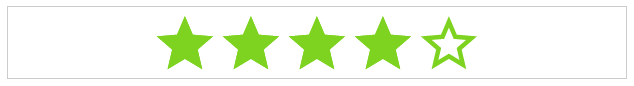
angular1-star-rating
Advanced tools
Angular1 Star Rating is a Angular1.5 component written in typescript, based on css only techniques written in scss


Angular1 Star Rating is a >1.5 Angular component written in typescript.
It is based on css-star-rating, a fully featured and customizable css only star rating component written in scss.
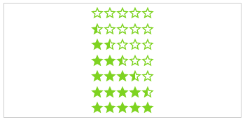
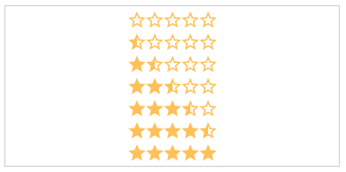
| Css | Angular1 (>=1.5) | Angular (>=2) |
|---|---|---|
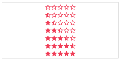
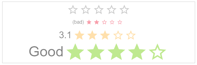
 |  |  |
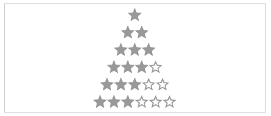
| Css Star Rating | Angular1 Star Rating | Angular Star Rating |
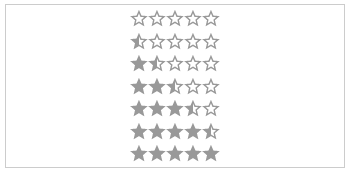
This module implements all Features from CSS-STAR-RATING. It also provides callbacks for all calculation functions used in the component as well as all possible event emitters.
| IE | Firefox | Chrome | Safari | Opera |
|---|---|---|---|---|
| > 11 | > 50 | > 55 | > 10 | > 41 |
 |  |  |  |  |
*Get Angular1 Star Rating:
$ npm install angular1-star-rating from your console$ bower install angular1-star-rating from your console<script src="https://cdn.rawgit.com/BioPhoton/angular1-star-rating/v1.2.4/dist/index.js"></script>
Load library as minified js file
<script src="[bower or npm folder or git-cdn path]/angular1-star-rating/dist/index.js"></script>
Inject it into angular
angular.module('myApp', ['star-rating'])
Use it
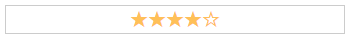
<star-rating-comp rating="'3.0'"></star-rating-comp>
id: string (Optional)
The html id attribute of the star rating
Default: undefined
<star-rating-comp id="'my-id'"></star-rating-comp>
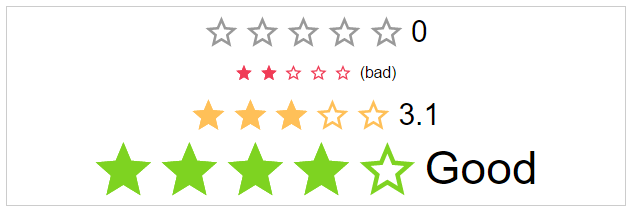
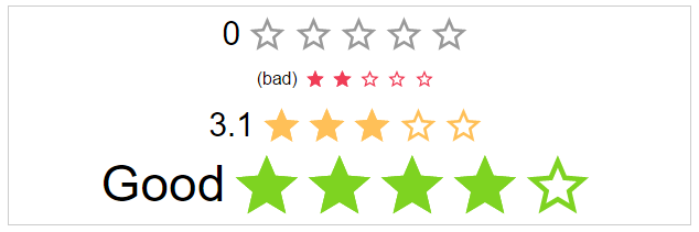
rating: number (Optional)
The actual star rating value
Default: 0
<star-rating-comp rating="3"></star-rating-comp>
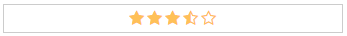
showHalfStars: boolean (Optional)
To show half stars or not
Options: true, false
Default: false
<star-rating-comp show-half-stars="true"></star-rating-comp>
showHoverStars: boolean (Optional)
To show hover state on stars or not
Options: true, false
Default: false
<star-rating-comp show-hover-stars="true"></star-rating-comp>


numOfStars: number (Optional)
The possible number of stars to choose from
Default: 5
<star-rating-comp num-of-stars="6"></star-rating-comp>
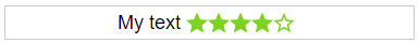
label-text: string (Optional)
The label text next to the stars.
Default: undefined
<star-rating-comp label-text="'My text!'"></star-rating-comp>
labelPosition: starRatingPosition (Optional)
The position of the label
Options: top, right, bottom, left
Default: left
<star-rating-comp label-position="'top'"></star-rating-comp>
space: starRatingStarSpace (Optional)
If the start use the whole space or not.
Options: no, between, around
Default: no
<star-rating-comp space="'around'"></star-rating-comp>


size: starRatingSizes (Optional)
The height and width of the stars.
Options: small, medium, large
Default: ok
<star-rating-comp size="'small'"></star-rating-comp>

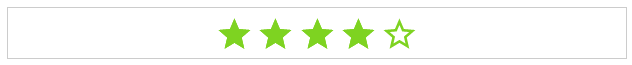
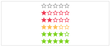
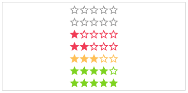
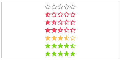
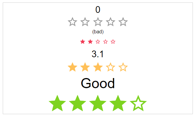
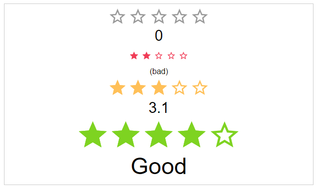
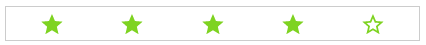
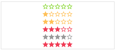
color: starRatingColors (Optional)
Possible color names for the stars.
Options: default, negative, ok, positive
Default: undefined
<star-rating-comp color="'positive'"></star-rating-comp>
disabled: boolean (Optional)
The click callback is disabled, colors are transparent
Default: false
<star-rating-comp disabled="true"></star-rating-comp>

direction: string (Optional)
The direction of the stars and label.
Options: rtl, ltr
Default: rtl
<star-rating-comp direction="'ltr'"></star-rating-comp>

readOnly: boolean (Optional)
The click callback is disabled
Default: false
<star-rating-comp read-only="true"></star-rating-comp>
speed: starRatingSpeed (Optional)
The duration of the animation in ms.
Options: immediately, noticeable, slow
Default: noticeable
<star-rating-comp speed="'slow'"></star-rating-comp>


starType: starRatingStarTypes (Optional)
The type of start resource to use.
Options: svg, icon, custom-icon
Default: svg
<star-rating-comp star-type="'icon'"></star-rating-comp>
getColor: Function (Optional)
Calculation of the color by rating.
Params: rating, numOfStars, staticColor
Return: colorName as string
<star-rating-comp get-color="parentCtrl.getColor(rating, numOfStars, staticColor)"></star-rating-comp>
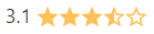
getHalfStarVisible: Function (Optional)
Calculation for adding the "half" class or not, depending on the rating value.
Params: rating
Return: boolean
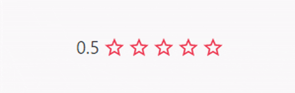
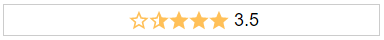
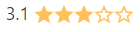
<star-rating-comp get-half-star-visible="parentCtrl.getHalfStarVisible(rating)" rating="3.1"></star-rating-comp>
function getHalfStarVisible(rating) {
    var absDiff = Math.abs(rating % 1);

    if(absDiff == 0.1) {
        return false;
    }

    return absDiff > 0;
}
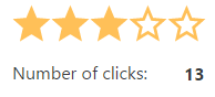
onClick: Function (Optional)
Callback function for star click event
Params: $event
<star-rating-comp on-click="parentCtrl.onClick($event)"></star-rating-comp>
function onClick($event) {
    parent.clickCount = parent.clickCount + 1;
}
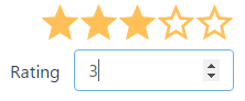
onRatingChange: Function (Optional)
Callback function for rating update event
Params: $event
<star-rating-comp on-rating-change="parentCtrl.onRatingChange($event)"></star-rating-comp>
function onRatingChange($event) {
    parent.rating = $event.rating;
}
1.2.11 (2017-04-08)
<a name="1.2.10"></a>
FAQs
Angular1 Star Rating is a Angular1.5 component written in typescript, based on css only techniques written in scss
The npm package angular1-star-rating receives a total of 266 weekly downloads. As such, angular1-star-rating popularity was classified as not popular.
We found that angular1-star-rating demonstrated a not healthy version release cadence and project activity because the last version was released a year ago. It has 1 open source maintainer collaborating on the project.
Did you know?

Socket for GitHub automatically highlights issues in each pull request and monitors the health of all your open source dependencies. Discover the contents of your packages and block harmful activity before you install or update your dependencies.
Security News
Oracle seeks to dismiss fraud claims in the JavaScript trademark dispute, delaying the case and avoiding questions about its right to the name.

Security News
The Linux Foundation is warning open source developers that compliance with global sanctions is mandatory, highlighting legal risks and restrictions on contributions.

Security News
Maven Central now validates Sigstore signatures, making it easier for developers to verify the provenance of Java packages.