Security News
MCP Steering Committee Launches Official MCP Registry in Preview
The MCP Steering Committee has launched the official MCP Registry in preview, a central hub for discovering and publishing MCP servers.
antd-prompt
Advanced tools
An ant.design helper that auto create a Modal with an optional message prompting the user to input some text.
An ant.design helper that auto create a Modal with an optional message prompting the user to input some text.
Support antd v4.
npm i antd-prompt
import React, { component } from 'react';
import ReactDOM from 'react-dom';
import prompt from 'antd-prompt';
import { Button, message } from 'antd';

class App extends Component {
    handler = async () => {
        try {
            const name = await prompt({
                title: "Please enter name",
                placeholder: "Your name",
                rules: [
                    // check this link for more help: https://ant.design/components/form/#Validation-Rules
                    {
                        required: true,
                        message: "You must enter name"
                    }
                ],
                modalProps: {
                    width: '80%'
                }
            });
        } catch (e) {
            message.error('Please enter name');
        }
    }
    render() {
        return <div>
            <Button onClick={this.handler}>Set Name</Button>
        </div>
    }
}

ReactDOM.render(<App />, document.getElementById('root'));
import React, { component } from 'react';
import ReactDOM from 'react-dom';
import prompt from 'antd-prompt';
import { Button, message } from 'antd';

class App extends Component {
    handler = async () => {
        await prompt({
            title: "Please enter name",
            value: 'Initial Value',
            modalProps: {
                width: '80%'
            },
            onOk: name => {
                // do something with name
                return false;
                // or return Promise.resolve(false);
            }
        });
    }
    render() {
        return <div>
            <Button onClick={this.handler}>Set Name</Button>
        </div>
    }
}

ReactDOM.render(<App />, document.getElementById('root'));
FAQs
An ant.design helper that auto create a Modal with an optional message prompting the user to input some text.
We found that antd-prompt demonstrated a not healthy version release cadence and project activity because the last version was released a year ago. It has 1 open source maintainer collaborating on the project.
Did you know?

Socket for GitHub automatically highlights issues in each pull request and monitors the health of all your open source dependencies. Discover the contents of your packages and block harmful activity before you install or update your dependencies.

Security News
The MCP Steering Committee has launched the official MCP Registry in preview, a central hub for discovering and publishing MCP servers.

Product
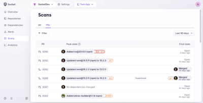
Socket’s new Pull Request Stories give security teams clear visibility into dependency risks and outcomes across scanned pull requests.

Research
/Security News
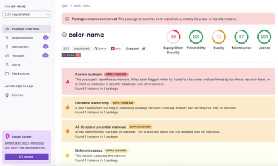
npm author Qix’s account was compromised, with malicious versions of popular packages like chalk-template, color-convert, and strip-ansi published.