
Security News
The Unpaid Backbone of Open Source: Solo Maintainers Face Increasing Security Demands
Solo open source maintainers face burnout and security challenges, with 60% unpaid and 60% considering quitting.
By Sarah Gooding - Sep 20, 2024
The antd npm package is a UI design language and React UI library that provides a lot of out-of-the-box components and tools to help developers build user interfaces efficiently. It is widely used for enterprise-level applications and admin UIs due to its comprehensive set of components and professional look.
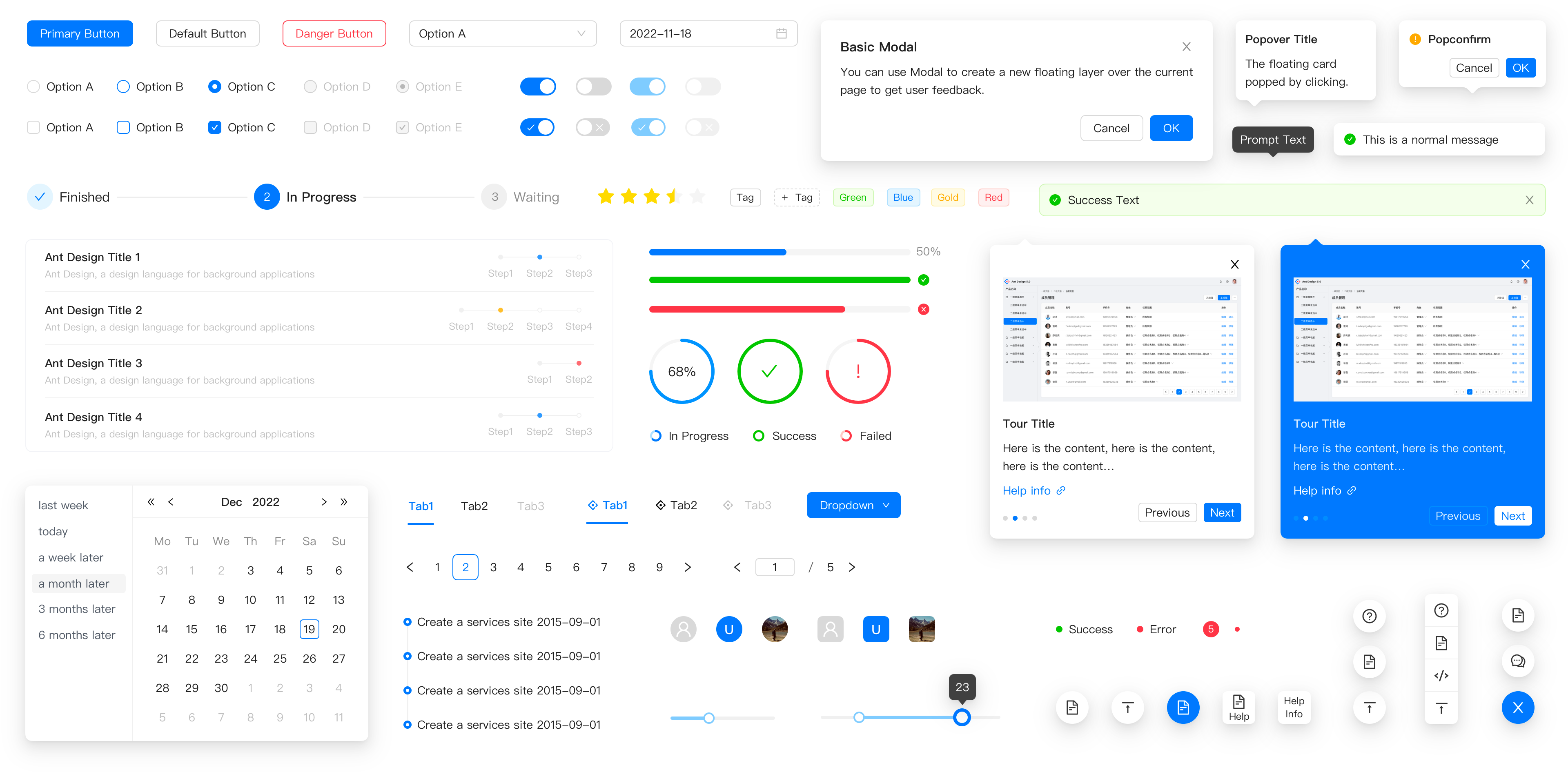
Layout
Provides a set of components to create a layout structure for your application, including headers, footers, sidebars, and content areas.
import { Layout } from 'antd';
const { Header, Footer, Sider, Content } = Layout;
ReactDOM.render(
<Layout>
<Header>Header</Header>
<Layout>
<Sider>Sider</Sider>
<Content>Content</Content>
</Layout>
<Footer>Footer</Footer>
</Layout>,
document.getElementById('container')
);Data Display
Includes components like tables, lists, and cards to display data in a structured format.
import { Table } from 'antd';

const dataSource = [
  { key: '1', name: 'John Doe', age: 32, address: 'Some Street' },
  { key: '2', name: 'Jane Doe', age: 42, address: 'Another Street' }
];

const columns = [
  { title: 'Name', dataIndex: 'name', key: 'name' },
  { title: 'Age', dataIndex: 'age', key: 'age' },
  { title: 'Address', dataIndex: 'address', key: 'address' }
];

ReactDOM.render(<Table dataSource={dataSource} columns={columns} />, document.getElementById('container'));
Form Controls
Provides form components like input fields, checkboxes, radio buttons, and forms with validation.
import { Form, Input, Button } from 'antd';

const FormComponent = () => (
  <Form>
    <Form.Item label='Username' name='username'>
      <Input />
    </Form.Item>
    <Form.Item label='Password' name='password'>
      <Input.Password />
    </Form.Item>
    <Form.Item>
      <Button type='primary' htmlType='submit'>Submit</Button>
    </Form.Item>
  </Form>
);

ReactDOM.render(<FormComponent />, document.getElementById('container'));
Feedback
Offers feedback components such as alerts, modals, notifications, and messages to interact with users.
import { message } from 'antd';

function success() {
  message.success('This is a success message');
}

ReactDOM.render(<button onClick={success}>Show success message</button>, document.getElementById('container'));
Navigation
Includes navigation components like menus, tabs, breadcrumbs, and paginations to guide users through the application.
import { Menu } from 'antd';

const { SubMenu } = Menu;

ReactDOM.render(
  <Menu mode='horizontal'>
    <Menu.Item key='mail'>Navigation One</Menu.Item>
    <SubMenu title='Navigation Two'>
      <Menu.Item key='submenu-item-1'>Option 1</Menu.Item>
      <Menu.Item key='submenu-item-2'>Option 2</Menu.Item>
    </SubMenu>
  </Menu>,
  document.getElementById('container')
);Also known as MUI, it is a popular React UI framework that follows Google's Material Design guidelines. It offers a different design philosophy compared to antd, which is more neutral and less opinionated, making it suitable for a wide range of projects.
It is a React component library that rebuilds the Bootstrap components with React. It provides a familiar Bootstrap-like interface for React applications, but it may not offer as many advanced components as antd does.
This is the official React integration for Semantic UI. It is similar to antd in providing a wide range of components, but it follows the design principles of Semantic UI, which focuses on human-friendly design.
Chakra UI is a simple, modular, and accessible component library that gives you the building blocks to build your React applications. It is known for its simplicity and ease of styling, which can be a contrast to antd's more out-of-the-box, styled components.

An enterprise-class UI design language and React UI library.


Changelog · Report Bug · Request Feature · English · 中文


 Edge |  Firefox |  Chrome |  Safari |  Electron |
|---|---|---|---|---|
| Edge | last 2 versions | last 2 versions | last 2 versions | last 2 versions |
npm install antd
yarn add antd
pnpm add antd
import { Button, DatePicker } from 'antd';

export default () => (
  <>
    <Button type="primary">PRESS ME</Button>
    <DatePicker placeholder="select date" />
  </>
);
Use Gitpod, a free online dev environment for GitHub.

Or clone locally:
$ git clone git@github.com:ant-design/ant-design.git
$ cd ant-design
$ npm install
$ npm start
Open your browser and visit http://127.0.0.1:8001 , see more at Development.

Let's build a better antd together.
We welcome all contributions. Please read our Contributing Guide first. You can submit any ideas as Pull Requests or as GitHub Issues. If you'd like to improve code, check out the Development Instructions and have a good time! :)
If you are a collaborator, please follow our Pull Request Principle to create a Pull Request with our Pull Request Template.


FAQs
An enterprise-class UI design language and React components implementation
The npm package antd receives a total of 920,133 weekly downloads. As such, antd popularity was classified as popular.
We found that antd demonstrated a healthy version release cadence and project activity because the last version was released less than a year ago. It has 7 open source maintainers collaborating on the project.
Did you know?

Socket for GitHub automatically highlights issues in each pull request and monitors the health of all your open source dependencies. Discover the contents of your packages and block harmful activity before you install or update your dependencies.
Security News
Solo open source maintainers face burnout and security challenges, with 60% unpaid and 60% considering quitting.

Security News
License exceptions modify the terms of open source licenses, impacting how software can be used, modified, and distributed. Developers should be aware of the legal implications of these exceptions.

Security News
A developer is accusing Tencent of violating the GPL by modifying a Python utility and changing its license to BSD, highlighting the importance of copyleft compliance.