What is antd?
The antd npm package is a UI design language and React UI library that provides a lot of out-of-the-box components and tools to help developers build user interfaces efficiently. It is widely used for enterprise-level applications and admin UIs due to its comprehensive set of components and professional look.
What are antd's main functionalities?
Layout
Provides a set of components to create a layout structure for your application, including headers, footers, sidebars, and content areas.
import { Layout } from 'antd';
const { Header, Footer, Sider, Content } = Layout;
ReactDOM.render(
<Layout>
<Header>Header</Header>
<Layout>
<Sider>Sider</Sider>
<Content>Content</Content>
</Layout>
<Footer>Footer</Footer>
</Layout>,
document.getElementById('container')
);
Data Display
Includes components like tables, lists, and cards to display data in a structured format.
import { Table } from 'antd';

const dataSource = [
  { key: '1', name: 'John Doe', age: 32, address: 'Some Street' },
  { key: '2', name: 'Jane Doe', age: 42, address: 'Another Street' }
];

const columns = [
  { title: 'Name', dataIndex: 'name', key: 'name' },
  { title: 'Age', dataIndex: 'age', key: 'age' },
  { title: 'Address', dataIndex: 'address', key: 'address' }
];

ReactDOM.render(<Table dataSource={dataSource} columns={columns} />, document.getElementById('container'));
Form Controls
Provides form components like input fields, checkboxes, radio buttons, and forms with validation.
import { Form, Input, Button } from 'antd';

const FormComponent = () => (
  <Form>
    <Form.Item label='Username' name='username'>
      <Input />
    </Form.Item>
    <Form.Item label='Password' name='password'>
      <Input.Password />
    </Form.Item>
    <Form.Item>
      <Button type='primary' htmlType='submit'>Submit</Button>
    </Form.Item>
  </Form>
);

ReactDOM.render(<FormComponent />, document.getElementById('container'));
Feedback
Offers feedback components such as alerts, modals, notifications, and messages to interact with users.
import { message } from 'antd';

function success() {
  message.success('This is a success message');
}

ReactDOM.render(<button onClick={success}>Show success message</button>, document.getElementById('container'));
Navigation
Includes navigation components like menus, tabs, breadcrumbs, and paginations to guide users through the application.
import { Menu } from 'antd';

const { SubMenu } = Menu;

ReactDOM.render(
  <Menu mode='horizontal'>
    <Menu.Item key='mail'>Navigation One</Menu.Item>
    <SubMenu title='Navigation Two'>
      <Menu.Item key='submenu-item-1'>Option 1</Menu.Item>
      <Menu.Item key='submenu-item-2'>Option 2</Menu.Item>
    </SubMenu>
  </Menu>,
  document.getElementById('container')
);
Other packages similar to antd
material-ui
Also known as MUI, it is a popular React UI framework that follows Google's Material Design guidelines. It offers a different design philosophy compared to antd, which is more neutral and less opinionated, making it suitable for a wide range of projects.
react-bootstrap
It is a React component library that rebuilds the Bootstrap components with React. It provides a familiar Bootstrap-like interface for React applications, but it may not offer as many advanced components as antd does.
semantic-ui-react
This is the official React integration for Semantic UI. It is similar to antd in providing a wide range of components, but it follows the design principles of Semantic UI, which focuses on human-friendly design.
chakra-ui
Chakra UI is a simple, modular, and accessible component library that gives you the building blocks to build your React applications. It is known for its simplicity and ease of styling, which can be a contrast to antd's more out-of-the-box, styled components.
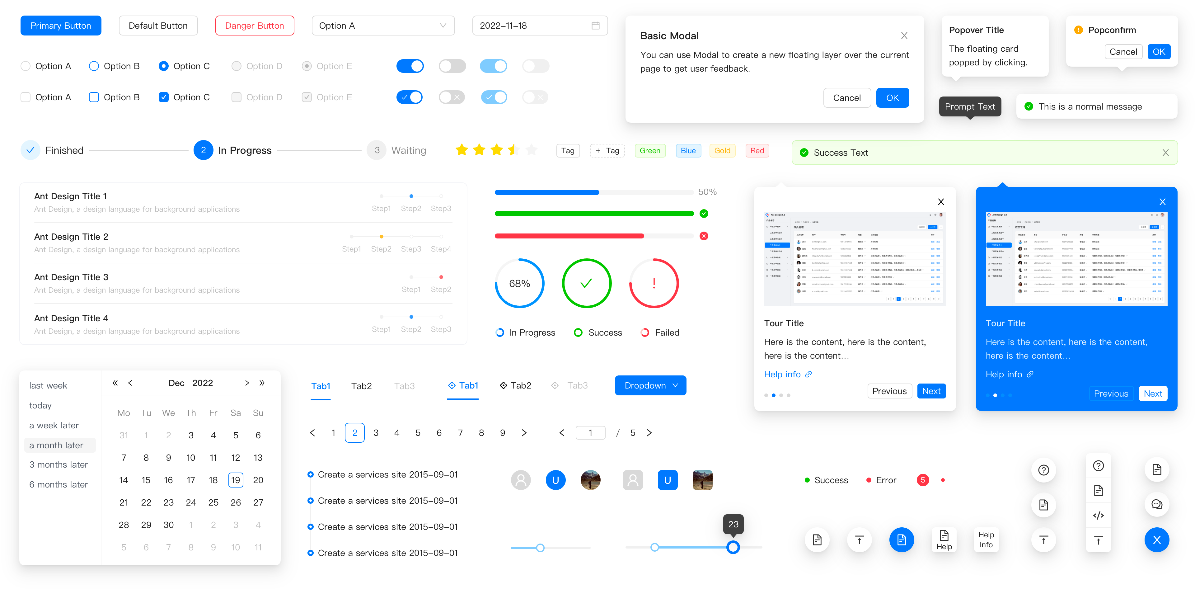
✨ Features
- 🌈 Enterprise-class UI designed for web applications.
- 📦 A set of high-quality React components out of the box.
- 🛡 Written in TypeScript with predictable static types.
- ⚙️ Whole package of design resources and development tools.
- 🌍 Internationalization support for dozens of languages.
- 🎨 Powerful theme customization based on CSS-in-JS.
🖥 Environment Support
- Modern browsers
- Server-side Rendering
- Electron

Edge | 
Firefox | 
Chrome | 
Safari | 
Electron |
|---|
| Edge | last 2 versions | last 2 versions | last 2 versions | last 2 versions |
📦 Install
npm install antd
yarn add antd
pnpm add antd
🔨 Usage
import { Button, DatePicker } from 'antd';

export default () => (
  <>
    <Button type="primary">PRESS ME</Button>
    <DatePicker placeholder="select date" />
  </>
);
🔗 Links
⌨️ Development
Use Gitpod, a free online dev environment for GitHub.

Or use opensumi.run, a free online pure front-end dev environemt.

Or clone locally:
$ git clone git@github.com:ant-design/ant-design.git
$ cd ant-design
$ npm install
$ npm start
Open your browser and visit http://127.0.0.1:8001 , see more at Development.
🤝 Contributing 
Let's build a better antd together.
We warmly invite contributions from everyone. Before you get started, please take a moment to review our Contributing Guide. Feel free to share your ideas through Pull Requests or GitHub Issues. If you're interested in enhancing our codebase, explore the Development Instructions and enjoy your coding journey! :)
For collaborators, adhere to our Pull Request Principle and utilize our Pull Request Template when creating a Pull Request.

❤️ Sponsors and Backers 


