
Security News
Oracle Drags Its Feet in the JavaScript Trademark Dispute
Oracle seeks to dismiss fraud claims in the JavaScript trademark dispute, delaying the case and avoiding questions about its right to the name.
By Sarah Gooding - Feb 07, 2025
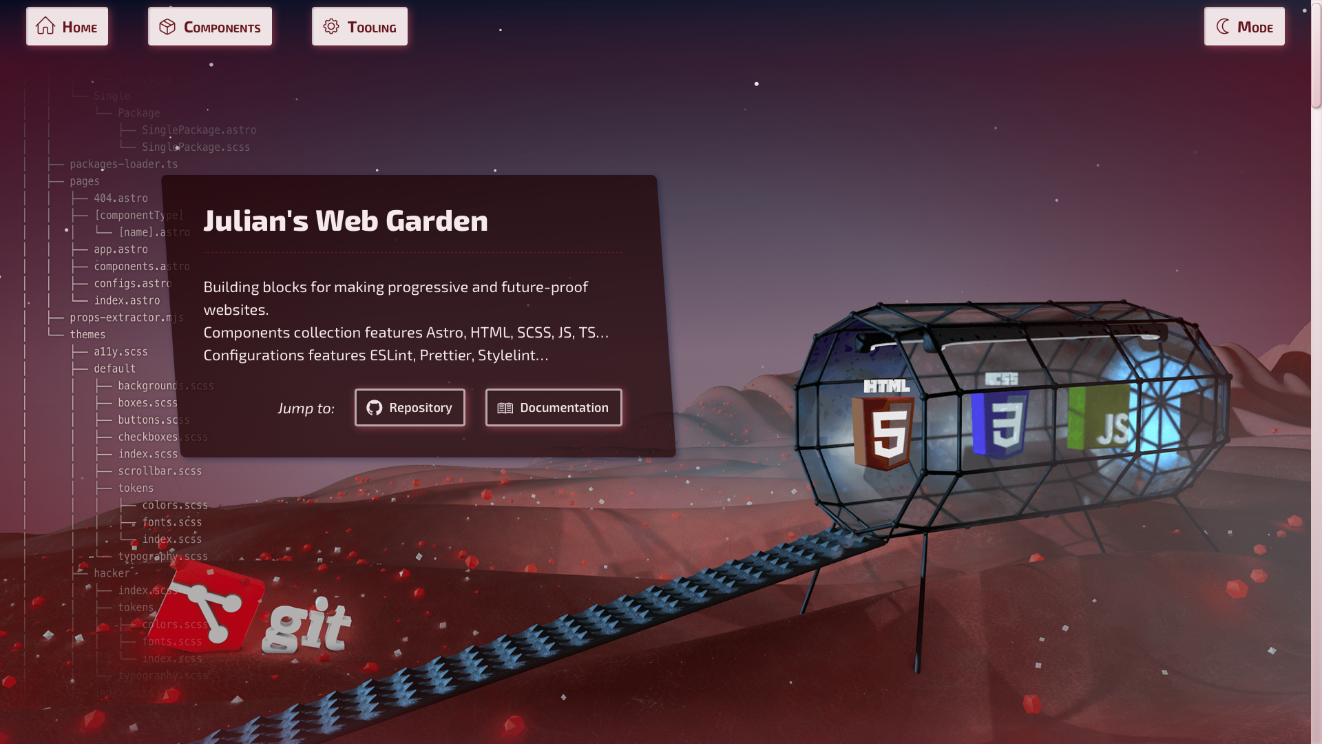
astro-color-mode
Advanced tools
Provides system or user-defined color scheme preference, with a toggle mechanism. Settings are persisted, component is progressively enhanced and flash of unstyled content avoided. Also, it will provide an easier way to target theme with CSS / SCSS / JS.


Provides system or user-defined color scheme preference, with a toggle mechanism.
Settings are persisted, component is progressively enhanced and flash of mis-styled content avoided.
Also, this provides an easier way to target theme with CSS selector / SCSS mixins / JS DOM selector.
data-color-mode="dark|light" attribute on root documentpnpm i astro-color-mode
---
import { ColorMode } from 'astro-color-mode';
// ...
---
<!-- ... -->
<head>
  <!-- Place component inside `HEAD` tag -->

  <ColorMode />

  <!-- ... -->
</head>
Use data-color-mode-switch where you want to toggle theme setting,
on an any element, somewhere inside BODY tag:
<!-- ... -->
<body>
  <!-- ... -->

  <button data-color-mode-switch>Toggle COLOR MODE 💡</button>

  <!-- ... -->
</body>
<html data-color-mode="light|dark">
  <!-- ... -->
</html>
SCSS mixins registration in astro.config.mjs:
export default defineConfig({
  // ...
  vite: {
    css: {
      preprocessorOptions: {
        scss: {
          additionalData: `
            @use "astro-color-mode/use-color-mode.scss" as *;
          `,
        },
      },
    },
  },
});
Then, use it like this in your stylesheets:
.my-layout {
  :is(.my-link, body) {
    @include color-mode(light) {
      color: black;
      background-color: white;
      // ...
    }
    @include color-mode(dark) {
      color: white;
      background-color: black;
      // ...
    }
  }
}

.some-class {
  @include color-mode(light) {
    color: blue;
    background-color: yellow;
    // ...
  }
  @include color-mode(dark) {
    color: yellow;
    background-color: blue;
    // ...
  }
}
@media query support for SCSS mixinsFAQs
Provides system or user-defined color scheme preference, with a toggle mechanism. Settings are persisted, component is progressively enhanced and flash of unstyled content avoided. Also, it will provide an easier way to target theme with CSS / SCSS / JS.
The npm package astro-color-mode receives a total of 2 weekly downloads. As such, astro-color-mode popularity was classified as not popular.
We found that astro-color-mode demonstrated a not healthy version release cadence and project activity because the last version was released a year ago. It has 1 open source maintainer collaborating on the project.
Did you know?

Socket for GitHub automatically highlights issues in each pull request and monitors the health of all your open source dependencies. Discover the contents of your packages and block harmful activity before you install or update your dependencies.
Security News
Oracle seeks to dismiss fraud claims in the JavaScript trademark dispute, delaying the case and avoiding questions about its right to the name.

Security News
The Linux Foundation is warning open source developers that compliance with global sanctions is mandatory, highlighting legal risks and restrictions on contributions.

Security News
Maven Central now validates Sigstore signatures, making it easier for developers to verify the provenance of Java packages.