Huge News!Announcing our $40M Series B led by Abstract Ventures.Learn More →
astro-color-mode
Advanced tools
astro-color-mode - npm Package Compare versions
Comparing version 0.5.0 to 0.5.1
| { | ||
| "name": "astro-color-mode", | ||
| "version": "0.5.0", | ||
| "version": "0.5.1", | ||
| "description": "Provides system or user-defined color scheme preference, with a toggle mechanism. Settings are persisted, component is progressively enhanced and flash of unstyled content avoided. Also, it will provide an easier way to target theme with CSS / SCSS / JS.", | ||
@@ -5,0 +5,0 @@ "main": "index.js", |
132
README.md
@@ -1,27 +0,133 @@ | ||
| # ~~🚀 Astro — Color mode, with user override~~ | ||
| # 🚀 Astro — Color mode, with user override | ||
| # 🛑 THIS PACKAGE HAS BEEN _MOVED_! 🛑 | ||
| [](https://www.npmjs.com/package/@julian_cataldo/astro-color-mode) | ||
|  | ||
| [](https://github.com/JulianCataldo/web-garden/blob/develop/LICENSE) | ||
| [](https://makeapullrequest.com) | ||
| [](https://astro.build) | ||
| [](http://www.typescriptlang.org/) | ||
| [](https://prettier.io) | ||
| [](https://editorconfig.org) | ||
| [](https://eslint.org) | ||
| **New package location ➽ <https://www.npmjs.com/package/astro-color-mode>** | ||
| Provides system or user-defined color scheme preference, with a toggle mechanism. | ||
| Settings are persisted, component is progressively enhanced and flash of mis-styled content avoided. | ||
| Also, this provides an easier way to target theme with CSS selector / SCSS mixins / JS DOM selector. | ||
| # Features | ||
| - Detects user current color mode | ||
| - Apply a `data-color-mode="dark|light"` attribute on root document | ||
| - Provides a toggle mechanism for overriding system preference | ||
| - Persists user preference in browser local storage | ||
| - Inject saved setting **critically**, avoiding a blinding flash of mis-styled content. | ||
| - Provides SCSS mixins for easy theme targeting | ||
| - Supports JS / No-JS, with a fallback to user system preference | ||
| ## 📦 Installation | ||
| ```sh | ||
| pnpm i @julian_cataldo/astro-color-mode | ||
| ``` | ||
| ## 🛠 Usage | ||
| ```astro | ||
| --- | ||
| import ColorMode from '@julian_cataldo/astro-color-mode/ColorMode.astro'; | ||
| // ... | ||
| --- | ||
| ``` | ||
| - **OLD**: `@julian_cataldo/astro-color-mode` | ||
| - **NEW**: `astro-color-mode` | ||
| ```astro | ||
| <!-- ... --> | ||
| <head> | ||
| <!-- Place component inside `HEAD` tag --> | ||
| ## [LIVE DEMO 🎭 DOCUMENTATION WEBSITE ⎋](https://code.juliancataldo.com/) | ||
| <ColorMode /> | ||
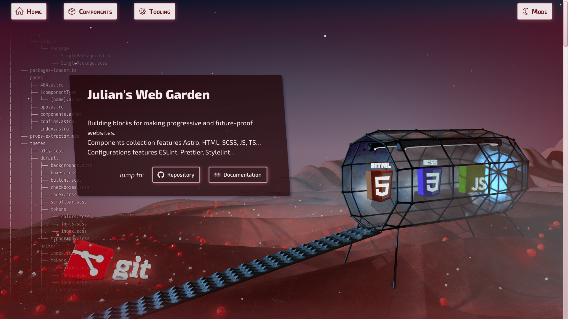
| [](https://code.juliancataldo.com) | ||
| <!-- ... --> | ||
| </head> | ||
| ``` | ||
| **_[`code.juliancataldo.com`](https://code.juliancataldo.com/)_** | ||
| Use `data-color-mode-switch` where you want to toggle theme setting, | ||
| on an any element, somewhere inside `BODY` tag: | ||
| ```astro | ||
| <!-- ... --> | ||
| <body> | ||
| <!-- ... --> | ||
| <button data-color-mode-switch>Toggle COLOR MODE 💡</button> | ||
| <!-- ... --> | ||
| </body> | ||
| ``` | ||
| #### 🎉 Result | ||
| ```html | ||
| <html data-color-mode="light|dark"> | ||
| <!-- ... --> | ||
| </html> | ||
| ``` | ||
| ### With SCSS | ||
| SCSS mixins registration in `astro.config.mjs`: | ||
| ```js | ||
| export default defineConfig({ | ||
| // ... | ||
| vite: { | ||
| css: { | ||
| preprocessorOptions: { | ||
| scss: { | ||
| additionalData: ` | ||
| @use "@julian_cataldo/astro-color-mode/use-color-mode.scss" as *; | ||
| `, | ||
| }, | ||
| }, | ||
| }, | ||
| }, | ||
| }); | ||
| ``` | ||
| Then, use it like this in your stylesheets: | ||
| ```scss | ||
| span { | ||
| @include color-mode(light) { | ||
| color: black; | ||
| background-color: white; | ||
| // ... | ||
| } | ||
| @include color-mode(dark) { | ||
| color: white; | ||
| background-color: black; | ||
| // ... | ||
| } | ||
| } | ||
| ``` | ||
| ## To do | ||
| - [ ] Fix no JS support (SCSS mixin…) | ||
| - [ ] Full JS independant `@media` query support for SCSS mixins | ||
| - [ ] SCSS mixins demo usage | ||
| - [ ] Thorough demo video for all user scenarios | ||
| - [ ] With JS, system pref. | ||
| - [ ] With JS, persisted user pref. | ||
| - [ ] No JS, system pref. | ||
| <div class="git-footer"> | ||
| --- | ||
| Other projects: | ||
| ## [LIVE DEMO 🎭 DOCUMENTATION WEBSITE ⎋](https://code.juliancataldo.com/) | ||
| - [astro-content](https://github.com/JulianCataldo/astro-content): A text based, structured content manager, for edition and consumption. | ||
| - [remark-lint-frontmatter-schema](https://github.com/JulianCataldo/remark-lint-frontmatter-schema): Validate your Markdown **frontmatter** data against a **JSON schema**. | ||
| - [retext-case-police](https://github.com/JulianCataldo/retext-case-police): Check popular names casing. Example: ⚠️ `github` → ✅ `GitHub`. | ||
| - [remark-embed](https://github.com/JulianCataldo/remark-embed): A `remark` plugin for embedding remote / local Markdown or code snippets. | ||
| [](https://code.juliancataldo.com) | ||
| **_[`code.juliancataldo.com`](https://code.juliancataldo.com/)_** | ||
| --- | ||
@@ -28,0 +134,0 @@ |
No alert changes
Improved metrics
- Total package byte prevSize
- increased by33.31%
9782
- Number of lines in readme file
- increased by331.25%
138
No dependency changes