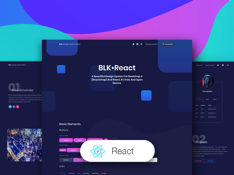
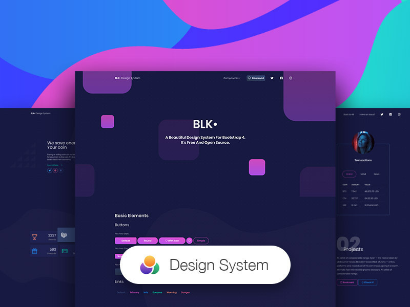
Blk• Design System React is a responsive Bootstrap 4 kit, developed using React, Reactstrap and create-react-app, and it is provided for free by Creative Tim. It is a beautiful cross-platform UI kit featuring over 70 elements and 3 templates.
Blk• Design System React will help you create a clean and simple website that is a perfect fit for today's black design. It is built using the 12 column grid system, with components designed to fit together perfectly. It makes use of bold colours, beautiful typography, clear photography and spacious arrangements.
Complex Documentation
Each element is well presented in a very complex documentation. You can read more about the idea behind this design system here. You can check the components here and the foundation here.
Bootstrap 4 Support
Blk• Design System React is built on top of the much awaited Bootstrap 4 (Reactstrap). This makes starting a new project very simple. It also provides benefits if you are already working on a Bootstrap 4 or Reactstrap project; you can just import the Blk• Design System React style over it. Most of the elements have been redesigned; but if you are using an element we have not touched, it will fall back to the Bootstrap default.
Table of Contents
Versions


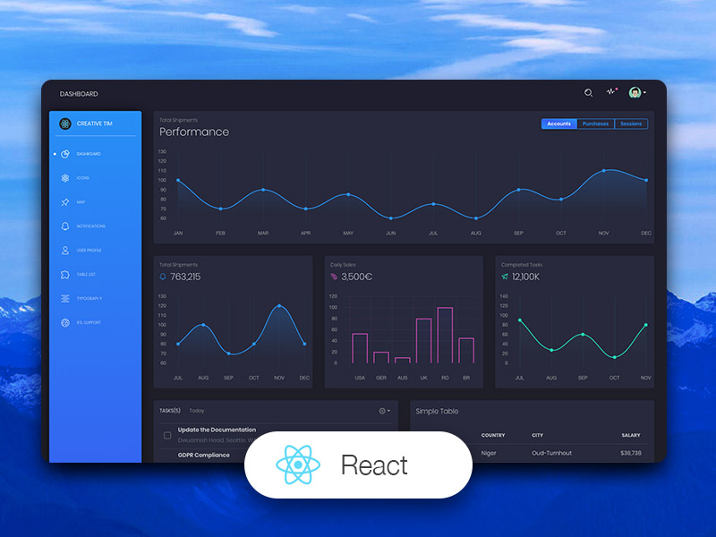
| HTML | React |
|---|
 |  |
Demo
| Login Page | Landing Page | Profile Page |
|---|
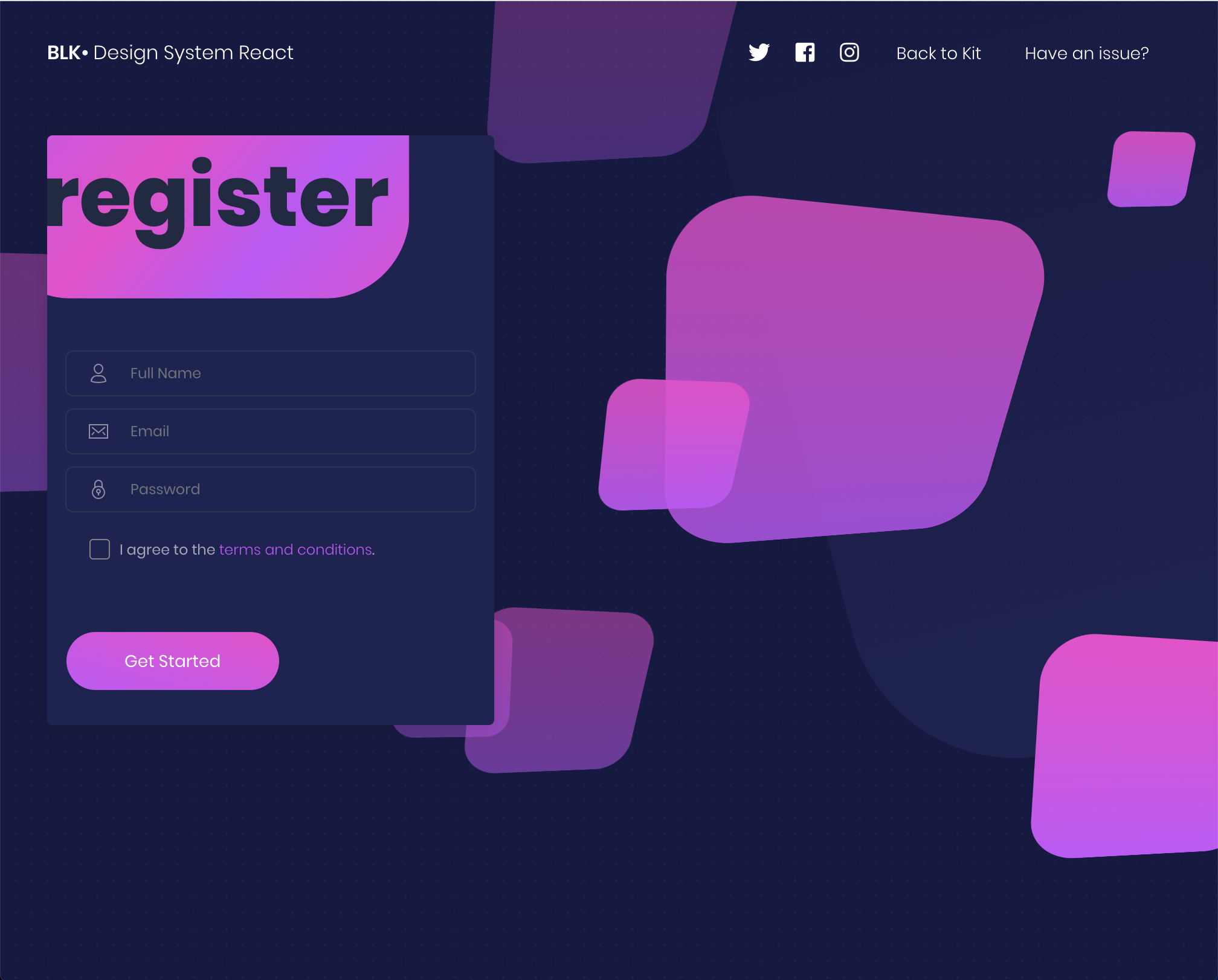 |  |  |
View More
Quick start
Documentation
The documentation for the BLK Design System React is hosted at our website.
File Structure
Within the download you'll find the following directories and files:
Blk• Design System React
.
├── CHANGELOG.md
├── ISSUE_TEMPLATE.md
├── README.md
├── package.json
├── public
│   ├── favicon.ico
│   ├── index.html
│   └── manifest.json
└── src
    ├── index.js
    ├── variables
    │   └── charts.jsx
    ├── assets
    │   ├── css
    │   │   ├── blk-design-system-react.css
    │   │   ├── blk-design-system-react.css.map
    │   │   ├── blk-design-system-react.min.css
    │   │   └── nucleo-icons.css
    │   ├── demo
    │   │   └── demo.css
    │   ├── fonts
    │   │   ├── nucleo.eot
    │   │   ├── nucleo.ttf
    │   │   ├── nucleo.woff
    │   │   └── nucleo.woff2
    │   ├── img
    │   └── scss
    │       ├── blk-design-system-react
    │       │   ├── bootstrap
    │       │   │   ├── mixins
    │       │   │   └── utilities
    │       │   ├── custom
    │       │   │   ├── cards
    │       │   │   ├── mixins
    │       │   │   ├── sections
    │       │   │   ├── utilities
    │       │   │   └── vendor
    │       │   └── react
    │       │       └── react-differences.scss
    │       └── blk-design-system-react.scss
    ├── components
    │   ├── Footer
    │   │   └── Footer.jsx
    │   ├── Navbars
    │   │   ├── ComponentsNavbar.jsx
    │   │   └── ExamplesNavbar.jsx
    │   └── PageHeader
    │       └── PageHeader.jsx
    └── views
        ├── Index.jsx
        ├── IndexSections
        │   ├── Basics.jsx
        │   ├── Download.jsx
        │   ├── Examples.jsx
        │   ├── JavaScript.jsx
        │   ├── Navbars.jsx
        │   ├── Notifications.jsx
        │   ├── NucleoIcons.jsx
        │   ├── Pagination.jsx
        │   ├── Signup.jsx
        │   ├── Tabs.jsx
        │   └── Typography.jsx
        └── examples
            ├── LandingPage.jsx
            ├── ProfilePage.jsx
            └── RegisterPage.jsx
Browser Support
At present, we officially aim to support the last two versions of the following browsers:


Resources
Reporting Issues
We use GitHub Issues as the official bug tracker for the BLK Design System. Here are some advices for our users that want to report an issue:
- Make sure that you are using the latest version of the BLK Design System. Check the CHANGELOG from your dashboard on our website.
- Providing us reproducible steps for the issue will shorten the time it takes for it to be fixed.
- Some issues may be browser specific, so specifying in what browser you encountered the issue might help.
Licensing
Useful Links
Social Media
Twitter: https://twitter.com/CreativeTim
Facebook: https://www.facebook.com/CreativeTim
Dribbble: https://dribbble.com/creativetim
Instagram: https://www.instagram.com/CreativeTimOfficial