Research
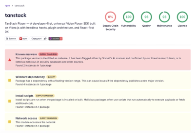
Malicious npm Package Brand-Squats TanStack to Exfiltrate Environment Variables
A brand-squatted TanStack npm package used postinstall scripts to steal .env files and exfiltrate developer secrets to an attacker-controlled endpoint.
bootstrap-grid-only-css
Advanced tools
The grid and responsive utilities classes extracted from the Bootstrap 4 framework, compiled into CSS.
Original Copyright: (c) 2011-2018 Twitter, Inc.
There are times when you only want to use the excellent Bootstrap grid functionality but don't want the extra classes and typography changes included, often when asked to work on existing client sites that do not include any responsive frameworks and you just want to get the changes done quickly and responsively. With Bootstrap 4, extracting the grid functionality is easy.
.img-fluid class (formerly .img-responsive in Bootstrap 3)clearfix utilitynpm install bootstrap-grid-css
bower install bootstrap4-grid-only
Unlike traditional Bootstrapped, the grid must be wrapped with the .bootstrap-wrapper class in an attempt to minimize potential conflicts with other libraries.
Simply download the appropriate CSS file and include it in your HTML header (you only need one):
bootstrap-grid.css - The expanded versionbootstrap-grid.min.css - The minified versionDocumentation for the grid system may be found on the Bootstrap web site.
Linking to stylesheet example:
<link rel="stylesheet" href="dist/css/bootstrap-grid.min.css" />
Supports both HTTP and HTTPS.
<link rel="stylesheet" href="//cdn.jsdelivr.net/gh/dmhendricks/bootstrap-grid-css@4.1.3/dist/css/bootstrap-grid.min.css" />
<div class="bootstrap-wrapper">
	<div class="container">
		<div class="row">
			<div class="col-md-4">.col-md-4</div>
			<div class="col-md-4">.col-md-4</div>
			<div class="col-md-4">.col-md-4</div>
		</div>
		<div class="row hidden-sm-down"> <!-- Hidden on small screens -->
			<div class="col-md-6">.col-md-6</div>
			<div class="col-md-6">.col-md-6</div>
		</div>
	</div>
</div>
See the demo for more information.
You can make your own custom build of Bootstrap by downloading the source, making changes to the SCSS files and compiling.
Here is how to accomplish what I have done here:
.bootstrap-wrapper class to scss/bootstrap-grid.scss (lines 23 and 50), included the responsive utilities (line 43) and .img-fluid class (line 48). I also ported the scss/utilities/_visibility.scss responsive utilities that were found in alpha for convenience.gulp stylesFAQs
The grid and responsive utilities classes extracted from the Bootstrap 4 framework, compiled into CSS.
We found that bootstrap-grid-only-css demonstrated a not healthy version release cadence and project activity because the last version was released a year ago. It has 1 open source maintainer collaborating on the project.
Did you know?

Socket for GitHub automatically highlights issues in each pull request and monitors the health of all your open source dependencies. Discover the contents of your packages and block harmful activity before you install or update your dependencies.

Research
A brand-squatted TanStack npm package used postinstall scripts to steal .env files and exfiltrate developer secrets to an attacker-controlled endpoint.

Research
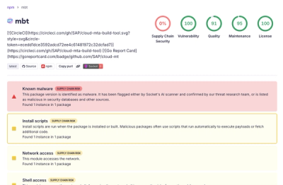
Compromised SAP CAP npm packages download and execute unverified binaries, creating urgent supply chain risk for affected developers and CI/CD environments.

Company News
Socket has acquired Secure Annex to expand extension security across browsers, IDEs, and AI tools.