bulma-floating-button
Bulma's extension to create floating buttons

Quick install
NPM
NPM package
npm install bulma-floating-button
Import
You can import the CSS or SASS file into your project using this snippet after importing 'bulma':
import 'bulma-floating-button/dist/css/bulma-floating-button.min.css'
or
import 'bulma-floating-button/dist/css/bulma-floating-button.sass'
Usage
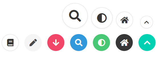
You can use .is-floating with size and color modifiers
<a href="#" class="button is-floating is-primary">
<i class="fas fa-chevron-up"></i>
</a>
<a href="#" class="button is-floating is-dark">
<i class="fas fa-home"></i>
</a>
<a href="#" class="button is-floating is-success">
<i class="fas fa-adjust"></i>
</a>
<a href="#" class="button is-floating is-info">
<i class="fas fa-search"></i>
</a>
<a href="#" class="button is-floating is-danger">
<i class="fas fa-arrow-down"></i>
</a>
<a href="#" class="button is-floating is-light">
<i class="fas fa-pen"></i>
</a>
<a href="#" class="button is-floating">
<i class="fas fa-book"></i>
</a>
<a href="#" class="button is-floating is-small">
<i class="fas fa-chevron-up"></i>
</a>
<a href="#" class="button is-floating">
<i class="fas fa-home"></i>
</a>
<a href="#" class="button is-floating is-medium">
<i class="fas fa-adjust"></i>
</a>
<a href="#" class="button is-floating is-large">
<i class="fas fa-search"></i>
</a>
Example
Integration to Bulma
- Clone the bulma repo
- Under the
sass folder, create a new folder called extensions - In this new folder, create a new file
bulma-floating-button.sass - Copy the code form the
bulma-floating-button repo's dist/css/bulma-floating-button.sass file into your new file - In the same folder create a new file
_all.sass (this is not required, but will help when you add more extensions) - In this file add this code:
@charset "utf-8"

@import "bulma-floating-button.sass"
At the end of the bulma.sass file, add this line: @import "sass/extensions/_all"
Now, you can just build the bulma project with npm run build, and the output will be available in the css folder.
OR
- Just add the 'bulma-floating-button.sass' or 'bulma-floating-button.min.css' in any way you want it.


